The Lightroom Histogram Explained: How to Read and Use It
By Jane Allan
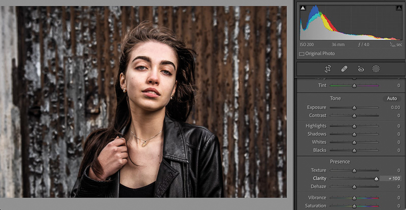
If you’re not a particularly technical photographer, the word histogram can sound intimidating.
In reality, a histogram is simply a visual representation of the tones in your photograph. Once you understand what you’re looking at, it becomes one of the most useful tools available when editing images in Lightroom.
The histogram can help you understand exposure, identify clipped highlights and shadows, assess contrast and make more informed tonal adjustments.
You don’t need to be a technical expert to use it.
What is a histogram?
A histogram is a graph showing the distribution of brightness values in an image.
The darkest tones appear on the left of the histogram and the brightest tones appear on the right.
In very simple terms:
Left = dark
Middle = midtones
Right = bright
The height of the graph shows how much image data exists at each brightness level.
This means that the shape of a histogram depends entirely on the photograph.
There is no such thing as a perfect histogram.
A photograph of a black cat against a dark background will naturally have much more information towards the left. A bright, high-key portrait may have considerably more information towards the right.
Neither is necessarily incorrectly exposed.
Where is the histogram in Lightroom?
In Lightroom Classic, the histogram is displayed at the top of the right-hand panel in both the Library and Develop modules.
The histogram is particularly useful in the Develop module because it is interactive. You can use it to make tonal adjustments as well as monitoring what is happening to your image.
If you don’t need the histogram, you can collapse the panel to make more room for your other editing controls.
Understanding the five tonal areas
The Lightroom histogram is divided into five main tonal areas:
- Blacks
- Shadows
- Exposure
- Highlights
- Whites
These correspond closely with the tonal controls you’ll find in Lightroom’s Basic panel.
This is one of the reasons the histogram is so useful.
Move your cursor across the different areas of the histogram and Lightroom identifies the corresponding tonal range.
Understanding these five areas makes it much easier to interpret what the graph is telling you.
What should a Lightroom histogram look like?
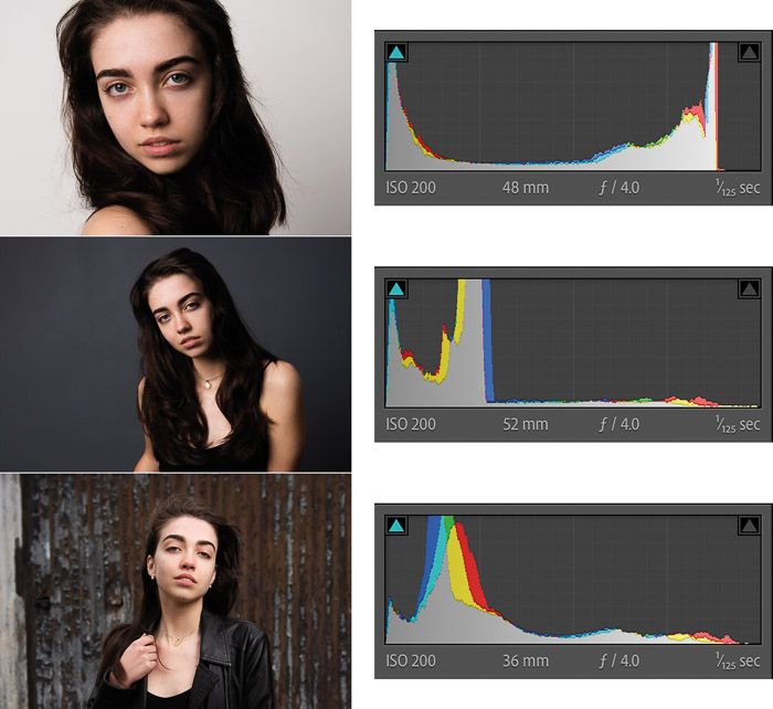
There is no ideal histogram shape.
The histogram simply reflects the content of your photograph.
For example, a light and airy photograph may contain a large amount of information towards the right-hand side of the graph, representing highlights and whites.
A high-contrast photograph might have significant information towards both ends, with less information in the middle.
A low-contrast photograph may have most of its information concentrated around the middle.
The important thing isn’t the shape of the graph.
What matters is where the image data reaches the edges of the histogram.
What do the peaks in a histogram mean?
The peaks represent concentrations of image data at particular brightness levels.
Consider three simple examples.
Light and airy photographs
A bright image might have most of its data towards the right-hand side of the histogram.
This isn’t necessarily a problem. If the highlights still contain detail, the photograph can be perfectly well exposed.
High-contrast photographs
A high-contrast photograph can have significant peaks towards both the left and right sides.
Again, this isn’t automatically a problem. It may simply reflect the subject and lighting.
Low-contrast photographs
A flat or low-contrast image may have most of its data concentrated around the middle.
You may decide to increase contrast during editing, but whether you should do so depends on the photograph and the intended result.
Don’t try to force every photograph into the same histogram shape.
How to identify clipping
One of the most useful things a histogram can tell you is whether important image information has been clipped.
Clipping occurs when pixels have reached the extreme limits of the available tonal range and no longer contain useful detail.
Highlight clipping
If image data is pushed against the extreme right-hand side of the histogram, some highlights may be clipped.
This means areas of the photograph may have become pure white with no recoverable detail.
Shadow clipping
If image data is pushed against the extreme left-hand side, some shadows may have become pure black with no recoverable detail.
Some shadow clipping can be perfectly acceptable, particularly when you’re deliberately creating a deep, dramatic image.
However, unwanted clipping can mean you’ve lost information that could otherwise have been retained.
Lightroom’s clipping indicators
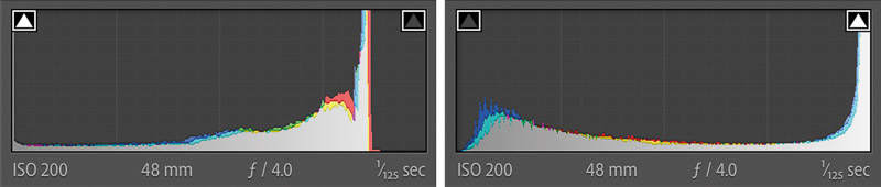
Lightroom provides clipping indicators at the top corners of the histogram.
The left indicator relates to the black point and the right indicator relates to highlights.
When clipping is present, these indicators can alert you to the problem.
You can also use Lightroom’s clipping preview to show the affected areas directly on the photograph.
In Lightroom Classic, clipped shadows are displayed in blue and clipped highlights in red.
This can be particularly useful because it shows exactly where the clipping is occurring.
You can activate or deactivate the clipping warning using the indicators above the histogram, or use the keyboard shortcut J in Lightroom Classic.
Use the RGB values to check individual pixels
The Lightroom histogram also provides useful RGB information when you’re working in the Develop module.
Move your cursor over an area of the photograph and you can see the RGB values for that location.
At the extreme ends of the scale:
- R 100 G 100 B 100% represents pure white.
- R 0 G 0 B 0 represents pure black.
This can be useful when you’re trying to determine whether an area contains detail or has reached the limits of the tonal range.
It can also help you understand how different colours are contributing to the overall image.
Understanding the colour histogram
A colour photograph doesn’t just contain brightness information.
It contains colour information too.
The Lightroom histogram therefore displays the luminance information alongside colour channels.
You’ll see red, green and blue information represented in the histogram, with additional overlapping colours appearing where the channels interact.
This can reveal information that isn’t obvious from a simple brightness histogram.
For example, adjusting the colour balance of an image can alter the position and distribution of the individual colour channels.
Black-and-white photographs
With a black-and-white photograph, the histogram is much simpler.
There is no colour information to display, so the histogram represents the luminance distribution of the image.
You can still use it to assess the distribution of blacks, shadows, midtones, highlights and whites.
You can edit directly from the histogram
One of the useful features of the Lightroom histogram is that it isn’t merely a display.
In the Develop module, you can make tonal adjustments directly from it.
Move your cursor over a section of the histogram and Lightroom identifies the corresponding tonal range.
You can then click and drag to adjust that range.
For example, if you want to make the shadows darker:
- Move your cursor over the shadow area.
- Click and drag to the left.
- Release the mouse when you’re happy with the result.
The same adjustment could be made using the Shadows slider in the Basic panel.
The histogram is therefore another way of interacting with Lightroom’s tonal controls.
Watch how the histogram changes as you edit
One of the best ways to understand histograms is simply to experiment.
Make an adjustment and watch what happens to the histogram.
Increase the exposure and the distribution of tones moves towards the right.
Reduce the exposure and it moves towards the left.
Increase contrast and you may see the tonal distribution spread further towards the extremes.
Change the colour balance and the individual colour channels can change too.
The histogram isn’t just telling you what the original photograph looked like. It is showing you how your current edits are affecting the image.
How Lightroom adjustments affect the histogram
Almost every tonal or colour adjustment you make can change the histogram.
For example, increasing clarity can alter the distribution of tones and contrast within the image.
The RGB Tone Curve can produce even more obvious changes to the individual colour channels.
If you adjust the red channel, for example, you may see the red component of the histogram move as the colour balance changes.
This makes the histogram a useful way of seeing the consequences of your editing decisions rather than relying entirely on how the image appears on your monitor.
Don’t chase a perfect histogram
Perhaps the most important lesson is that you shouldn’t edit photographs simply to create a particular histogram shape.
A histogram is a tool, not a target.
A properly exposed photograph can have a histogram heavily weighted to one side. A deliberately dramatic photograph may contain significant clipping. A high-key portrait can look completely different from a low-key portrait.
The correct histogram is the one that accurately represents the photograph you are trying to create.
Use it to identify unwanted clipping and to understand your tonal adjustments, but don’t let the graph dictate your creative decisions.
Use the histogram alongside your eyes
The histogram is particularly valuable because it provides objective information about your image.
Your monitor may not be perfectly calibrated. Ambient light can affect how you perceive brightness. Your eyes can also adapt to the screen as you work.
The histogram gives you another reference point.
But it shouldn’t replace visual judgement.
Look at the photograph.
Think about the subject, the light and the mood you want to create. Then use the histogram to help you make informed decisions about exposure, contrast and tonal range.
A simple Lightroom histogram workflow
If you’re new to histograms, try this simple approach:
1. Look at the overall distribution
Is the image predominantly dark, bright or somewhere in between?
2. Check both edges
Is important image data touching the left or right edges?
3. Check the clipping indicators
Look for unwanted clipped highlights or shadows.
4. Look at the photograph
Decide whether any clipping is actually a problem.
5. Make your adjustment
Use the Exposure, Highlights, Shadows, Whites or Blacks controls as appropriate.
6. Check the histogram again
See how your adjustment has changed the tonal distribution.
7. Stop when the photograph looks right
Don’t continue editing simply because you think the histogram needs to look a certain way.
The histogram is simpler than it looks
Once you understand the basic principle — dark tones on the left, bright tones on the right — the Lightroom histogram becomes much less intimidating.
It can tell you where the tones in your image are concentrated, warn you about unwanted clipping, show individual colour information and even provide another way to make tonal adjustments.
Most importantly, it gives you information that complements what your eyes are seeing.
So the next time you open an image in Lightroom, don’t ignore the histogram.
Spend a few minutes moving your cursor over it, making an adjustment and watching how the graph responds.
After a little practice, reading a histogram becomes second nature — and it can make your Lightroom editing considerably more controlled and consistent.