How to Create Black and White Photos in Lightroom Classic
By Jane Allan
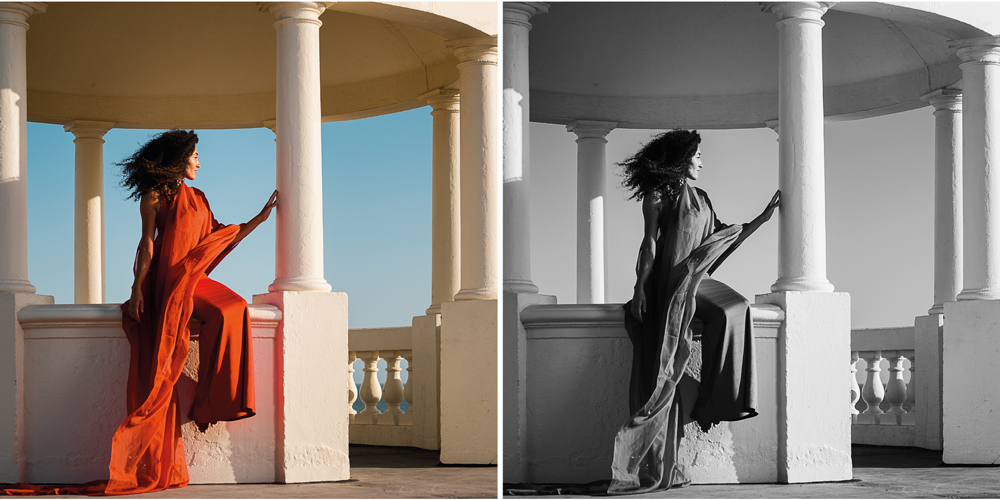
Converting a colour photograph to black and white is easy. Creating a good black and white photograph is a different matter.
You can simply remove the colour and end up with a monochrome image, but that doesn’t mean you’ve made the most of the photograph. Black and white gives you the opportunity to work with contrast, shape, texture, light and tone in ways that can completely change how an image feels.
Lightroom Classic gives you plenty of control over that process. The trick is not to throw every adjustment at the photograph, but to understand what you are trying to achieve before you start moving sliders.
Start with a photograph that suits black and white
Not every photograph becomes better when converted to black and white.
Colour can sometimes be an important part of the photograph’s story. A brightly coloured subject against a contrasting background might work beautifully in colour but lose much of its impact when converted to monochrome.
Other photographs can become considerably stronger.
Look for images with:
- Strong shapes and lines
- Interesting textures
- Good separation between light and dark areas
- Directional or side lighting
- Strong shadows
- Leading lines
- Interesting patterns
- A clear subject
- A useful range of tones
Black and white can also be particularly effective when colour is distracting from the structure of an image.
Before converting a photograph, ask yourself what the colour is actually contributing. If the answer is “not very much”, you’ve potentially found a good candidate for monochrome.
Composition becomes even more important
When you remove colour, some of the visual information disappears. That can make the underlying composition much easier to see.
Leading lines become more obvious. Shapes become more important. Texture can become a major feature of the image, particularly when directional light is involved.
This is one reason black and white photography can be such a good way to improve your understanding of composition.
If you are interested in this aspect of photography, take a look at our guide to [how to use shape in photography composition]. Black and white and composition work particularly well together because removing colour encourages you to concentrate on the underlying structure of the photograph.
Think about colour as tone
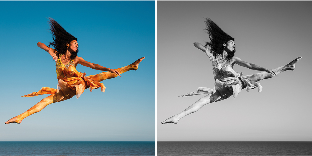
This is one of the most important things to understand about black and white photography.
When you look at a colour photograph, you can immediately see that a red object is red and a green object is green. Once you remove the colour, those two colours become different shades of grey.
But which will be darker?
You can’t always predict the answer simply by looking at the colour photograph.
Imagine photographing a red rose against green leaves. Depending on the particular shades involved, the red and green might turn into surprisingly similar tones when converted to black and white.
A yellow object, on the other hand, can become considerably lighter than many reds and greens.
This matters because two colours that look very different in the original photograph can end up looking almost identical in monochrome.
That is why the conversion process is much more than simply removing saturation.
Convert the photograph to black and white
Lightroom Classic gives you several ways to begin.
The simplest is to select Black & White under Treatment in the Basic panel. You can also press V as a shortcut.
This immediately gives you a monochrome version of the photograph, but think of it as the starting point rather than the finished image.
Lightroom Classic also has a range of black and white profiles. Profiles alter how the photograph is rendered without replacing your other editing settings, making them useful as a starting point when looking for a particular interpretation. Adobe also provides Adaptive B&W profiles for suitable raw images, which can make image-specific adjustments to tone and contrast.
Try several options rather than automatically choosing the first one.
You may find that one profile gives much better separation between the subject and background than another.
Use the Black & White Mix to control the conversion
This is where Lightroom Classic becomes particularly useful.
Once a photograph has been converted to black and white, the Black & White Mix allows you to control how the original colours are represented as shades of grey.
You will see sliders representing the original colour channels.
Moving one of these sliders doesn’t add colour back into the photograph. Instead, it changes the brightness of areas that originally contained that colour.
For example, if you have a landscape with a blue sky, moving the blue slider can make the sky considerably darker or lighter.
Darkening the blue can create a much more dramatic sky, particularly when there are clouds present.
The same principle applies to skin, clothing, foliage, buildings and many other subjects.
Don’t adjust every slider just because it’s there
It’s tempting to start moving everything.
Don’t.
Look at the photograph and identify which colours are important to the areas you want to change.
If you want the background darker, find out which colour channels are responsible for it. If you want a subject to separate more clearly from its surroundings, experiment with the relevant channels.
The aim is to improve the photograph, not to produce the most extreme tonal separation possible.
Use the Targeted Adjustment Tool
If you don’t know which colour channel is responsible for a particular part of the photograph, Lightroom’s Targeted Adjustment Tool can make things much easier.
Select the tool and move it over the area you want to change. Lightroom identifies the underlying colour and allows you to drag to lighten or darken that tonal range.
This can be particularly useful when several colours are present in a complicated scene.
It also helps you understand what’s actually happening during the conversion.
Build contrast carefully
Contrast is one of the things that can make a black and white photograph work.
Without enough tonal separation, a monochrome image can look flat and muddy.
But more contrast isn’t automatically better.
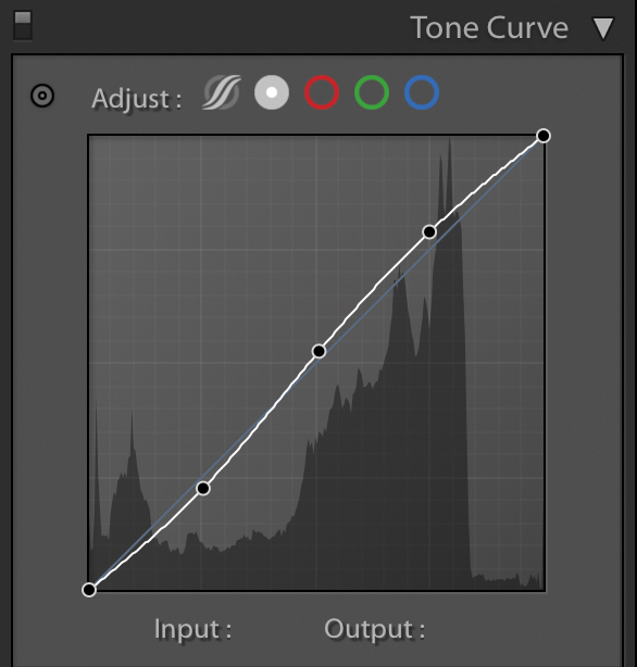
You can adjust contrast using the Basic panel, but the Tone Curve gives you considerably more control over where that contrast is introduced.
A gentle S-curve is a useful starting point:
- Bring the darker tones down slightly.
- Lift the lighter tones slightly.
- Leave the middle tones relatively controlled.
Then look at the photograph rather than the curve.
A portrait may need a much gentler treatment than a dramatic architectural photograph. A low-key image may deliberately contain very little white, while a high-key image may contain very little black.
There isn’t a correct histogram or Tone Curve for every black and white photograph.
Don’t lose your blacks
A good black and white photograph doesn’t necessarily need to contain pure black, but many images benefit from having some genuinely dark areas.
Without them, the whole image can become a collection of similar greys.
Think about the way a white object looks next to a black object. The white appears brighter because of the contrast between the two.
The same principle applies throughout a monochrome photograph. A strong dark tone can make nearby mid-greys appear lighter.
This is one reason a photograph can suddenly seem to gain more depth when you introduce a controlled black point.
Don’t destroy the highlights either
The opposite problem is pushing the whites too far.
Pure white can be exactly what you want in some photographs, but if important detail has disappeared from highlights simply because you wanted more punch, you’ve probably gone too far.
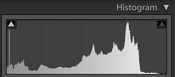
Keep an eye on the histogram as you work.
Your eyes can become accustomed to an image after staring at it for several minutes. The histogram provides a useful second opinion about the distribution of tones.
Use it as a guide rather than a target.
White balance still matters
This catches some people out.
You might think white balance becomes irrelevant once the photograph is black and white because there are no colours left.
It doesn’t.
The underlying colour information can still influence the tonal conversion, so changing white balance can alter the appearance of the resulting greys.
There is no universal “correct” white balance for a black and white photograph.
Try moving the Temperature and Tint controls and watch what happens. You may find that a slightly warmer or cooler starting point produces better separation or a more pleasing range of tones.
As always, judge the photograph rather than trying to hit a particular setting.
Add texture and clarity carefully
Black and white can make texture much more noticeable.
That can be fantastic for old buildings, landscapes, documentary photography, architecture and many other subjects.
It can also make a portrait look like it has been attacked with a sharpening tool.
Clarity and texture can add punch, but they’re easy to overdo.
Try making a fairly strong adjustment and then backing it off.
One of Jane Allan’s original tips is particularly good here: walk away from the computer for a few minutes. Make a cup of coffee, come back and look at the image again.
Your eyes will often tell you something your editing brain stopped noticing ten minutes earlier.
Use Colour Grading for subtle toning
Black and white doesn’t necessarily mean absolutely neutral grey.
You can introduce a subtle colour tone using Lightroom Classic’s Colour Grading panel. Adobe’s current tools allow colour to be applied separately to shadows, midtones and highlights, giving you much more control than simply adding a single overall colour.
A warm tone can give an image a traditional photographic feel.
A cool tone can produce a very different mood.
You can also use different colours in the shadows and highlights to create a split-toned effect.
The important word here is subtle.
If the viewer immediately notices the colour rather than the photograph, you’ve probably gone too far.
The best toning often makes the image feel slightly different without the viewer necessarily being able to explain why.
Don’t confuse black and white with extreme contrast
There is a tendency to think that a successful monochrome photograph must have deep blacks, brilliant whites and huge amounts of contrast.
That’s simply not true.
Some of the most effective black and white photographs are soft, quiet and predominantly mid-tone.
A foggy landscape, a delicate portrait or a minimalist architectural photograph may work precisely because the tonal range is restrained.
The question isn’t:
“How much contrast can I add?”
It is:
“What tonal treatment suits this photograph?”
Think about light before you edit
Although this is an editing article, much of the success of a black and white photograph is decided before you open Lightroom.
The direction and quality of light affect the amount of texture and contrast available to you.
Side lighting can reveal texture. Backlighting can create strong silhouettes. Hard light can produce dramatic shadows, while soft light can create a much gentler range of tones.
If you’re photographing specifically with black and white in mind, start looking at the light in terms of brightness rather than colour.
Ask yourself:
- Where are the brightest areas?
- Where are the deepest shadows?
- What is creating the contrast?
- Is the light revealing texture?
- Will the subject separate from the background once colour disappears?
The more you think this way while taking photographs, the less work you will need to do later.
Try photographing with your camera set to monochrome
If you know you are going to produce the final photograph in black and white, consider setting your camera’s picture style or picture control to monochrome while shooting.
This can help you see the scene without being distracted by colour.
If you’re shooting RAW, this does not mean you have permanently thrown away the colour information. Your RAW file still contains the underlying image data, while the camera’s preview can give you a useful indication of how the photograph might look in monochrome.
This can be a very useful way of training your eye.
If you’re shooting JPEG, however, the situation is different, so make sure you understand how your particular camera handles monochrome JPEG files before committing to it.
Presets are useful, but don’t let them do all the thinking
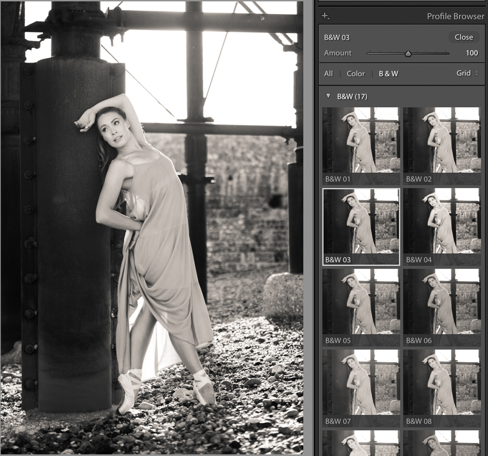
There is nothing wrong with using a Lightroom preset.
A good preset can provide a useful starting point and help you develop a consistent look across a set of photographs.
But don’t assume that because a preset looks good on one image it will automatically look good on another.
Different photographs contain different combinations of light, colour, texture and contrast.
Use a preset as a starting point, then make adjustments for the individual photograph.
You can also create your own presets once you have developed a style that you regularly use.
Make your black and whites consistent across a shoot
If you’re converting a set of photographs from the same shoot, Lightroom Classic makes it easy to copy adjustments between images.
This is particularly useful when the photographs were taken in similar lighting conditions.
Get one image looking right first.
Then copy or synchronise the appropriate settings across the other photographs and fine-tune them individually where necessary.
Don’t assume that one set of settings will work perfectly on every image. Even photographs taken seconds apart can contain different proportions of sky, skin, clothing, shadow and highlight.
Consistency doesn’t mean making every photograph identical.
What makes a good black and white photograph?
Before converting an image, look for photographs that have some of the following qualities:
- Strong composition
- Clear shapes and forms
- Leading lines
- Interesting textures
- Directional light
- Strong subject/background separation
- A useful range of tones
- Interesting shadows
- Colours that translate well into different shades of grey
But don’t treat this as a checklist.
A photograph can break every one of these rules and still make a brilliant monochrome image.
The important thing is to understand why the photograph works.
Black and white editing is about seeing differently
The biggest improvement you can make to your black and white photography probably isn’t learning another Lightroom slider.
It’s learning to see the photograph differently.
When colour disappears, you’re forced to pay more attention to light, tone, shape, texture and composition.
Lightroom Classic gives you an impressive amount of control over that process, from Profiles and the initial conversion through to the Black & White Mix, Tone Curve and Colour Grading. But the software can’t decide what the photograph should say.
That’s your job.
Start with a strong photograph, decide what you want the viewer to notice, and then use Lightroom to support that decision.
The best black and white conversion isn’t necessarily the one with the deepest blacks or the strongest contrast.
It’s the one that makes the photograph work better.