How to Create Better Monochrome Photos: From Conversion to Print
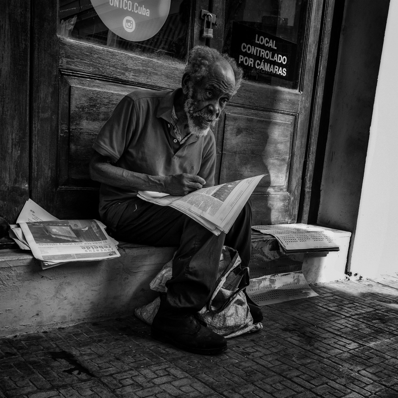
Monochrome photography has never really gone away.
Despite the fact that modern cameras can produce extraordinarily good colour, black and white remains one of the most powerful ways of presenting a photograph. It can simplify a complicated scene, emphasise shape and texture, strengthen contrast and remove colour that might otherwise distract from the subject.
The important point is that creating a good monochrome photograph is not simply a matter of removing the colour.
A colour photograph contains information about hue, saturation and brightness. When you turn it into monochrome, all those colours have to be translated into shades of grey. How that translation is handled can completely change the photograph.
That is why two black and white conversions of exactly the same original file can look surprisingly different.
Start with the photograph, not the software
Before thinking about which conversion method to use, decide whether the photograph actually benefits from being monochrome.
Some images become much stronger when colour is removed. Others lose the very thing that makes them work.
Look for photographs where shape, texture, light, contrast, expression or composition are more important than colour.
Leading lines, strong shadows, architectural forms, portraits, dramatic landscapes and photographs with interesting textures can all work particularly well.
It is also worth looking at the photograph in a different way. Instead of asking yourself what colour something is, ask:
What tone should it become?
That change in thinking is at the heart of successful monochrome photography.
Colour does not disappear – it becomes tone
When a colour photograph is converted to black and white, the original colours still matter.
A bright red object and a bright green object might look very different in colour but could end up almost identical in brightness after a basic conversion. If they are next to each other, their separation could disappear.
The reverse can also happen. Two colours that look quite similar to the eye can be translated into very different shades of grey, creating strong separation in the monochrome image.
This is why a simple desaturation is rarely the best way to approach a serious black and white image.
You want control over how the colours in the original photograph are translated into tones.
There is more than one way to make a monochrome image
Modern software gives photographers plenty of options.
In Photoshop, the Black & White adjustment provides individual controls for the main colour ranges, allowing you to decide how colours such as reds, yellows, greens, cyans, blues and magentas are rendered as grey tones. It can be used as an adjustment layer, so the original image remains intact.
Lightroom Classic takes a similar approach. Once an image is converted to black and white, the B&W Mix allows the brightness of different original colours to be adjusted independently. Lightroom also provides a Targeted Adjustment tool, which lets you work directly on an area of the photograph rather than trying to identify the appropriate colour slider yourself.
There are also more specialised options, including dedicated monochrome software such as Silver Efex.
The software is less important than understanding what the controls are actually doing.
Don’t simply choose the first black and white preset
Presets can be a useful starting point, but they are not a substitute for looking at the photograph.
A preset that produces a beautiful result on a portrait may be completely unsuitable for a landscape. A conversion that gives a dramatic sky might make foliage far too dark. Another might produce wonderful skin tones but leave a background looking flat.
Treat a preset as a suggestion.
Once you have applied it, look at the relationship between the important tones and decide what needs changing.
Think like a film photographer
Digital photographers sometimes forget that photographers working with black and white film traditionally had another way of controlling how colours were rendered.
Coloured filters could be placed over the lens to alter the tonal response of black and white film.
A yellow filter could slightly darken a blue sky and reduce haze. Orange could increase the separation between sky and buildings. A red filter could produce a much stronger effect, making a blue sky considerably darker and increasing the contrast in clouds.
Green filters could lighten foliage and could also be useful for portrait work because they altered the relationship between red and green tones.
Digital processing gives us considerably more control because we can make similar changes after the photograph has been taken.
Instead of placing a red filter over the lens and accepting its effect across the whole image, you can often adjust the blue sky and green foliage independently.
That is one of the great advantages of digital monochrome conversion.
Use the Black & White Mix selectively
The colour controls in modern software are particularly useful when two different colours need to be separated.
Imagine a landscape containing a blue sky and green trees. You might want the sky to become darker while keeping the foliage lighter.
Instead of simply increasing overall contrast, you can adjust the corresponding colour ranges in the monochrome mix.
The same principle applies to portraits.
Skin contains a mixture of warm colours, while clothing, backgrounds and hair may contain completely different colour information. Adjusting the appropriate colour ranges can give you considerably more control over the final tonal structure.
The important word is control.
Don’t move every slider simply because it is there. Make a change because you can see a reason for it.
Try the Targeted Adjustment approach
If you are not sure which colour is responsible for an area of the photograph, a targeted adjustment tool can be extremely useful.
Point at the area you want to change and adjust it directly. The software identifies the relevant colour information and changes the corresponding tones.
This is often more intuitive than looking at six sliders and trying to guess which one controls the part of the photograph you are interested in.
It also reinforces an important lesson: monochrome conversion is not just about making the photograph darker or lighter. It is about controlling the relationships between different parts of the image.
Build contrast carefully
A strong monochrome photograph normally needs a convincing range of tones.
That does not necessarily mean it needs extreme contrast.
You should have some genuinely dark tones and some convincing highlights, but the photograph should still contain useful information between those extremes.
A common mistake is to make everything punchier simply because the result initially looks more dramatic.
Zoom out and look at the photograph as a whole.
Are the important areas still readable? Do the shadows contain useful detail? Are the highlights still holding texture? Does the contrast help the subject or simply make the photograph look processed?
Good monochrome editing is often about restraint.
Don’t be afraid of deep blacks
A black and white photograph does not have to contain detail in every shadow.
Sometimes a genuinely black area gives the rest of the image much more impact.
The problem occurs when important shadow detail is lost accidentally rather than deliberately.
If the subject disappears into a mass of blocked-up black, the photograph can quickly become difficult to read.
Think about where you want the darkest tones to occur and why.
Equally, don’t destroy your highlights
The opposite problem is highlights that have been pushed so far that they contain no useful information.
This can be particularly noticeable in portraits, clouds, white clothing and reflective surfaces.
A good monochrome image can certainly contain areas of pure white, but don’t allow important highlights to become empty simply because increasing contrast makes the image look more dramatic on your monitor.
The final print may reveal problems that were less obvious on screen.
Watch out for banding and posterisation
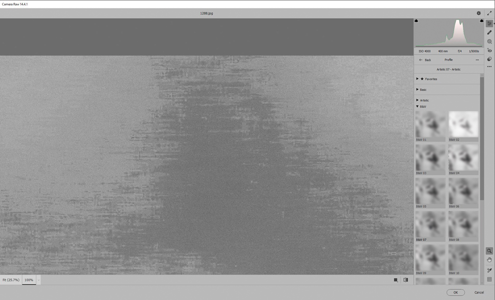
Strong monochrome adjustments can expose weaknesses in an image.
Banding and posterisation can become more noticeable when you make aggressive tonal adjustments, particularly in smooth areas such as skies.
The problem can be made worse by high ISO noise, heavy cropping, underexposure and repeated processing.
JPEG compression can also introduce artefacts.
If you are working on an important image, keep as much information as practical through the editing process and avoid repeatedly converting between low-bit-depth or heavily compressed formats.
If a sky starts showing strange steps between tones, don’t simply keep pushing the sliders. Go back and look at where the problem entered the workflow.
Sometimes the best solution is to return to the original file and start again.
Raw gives you more flexibility
For photographs captured as Raw files, monochrome conversion can normally be carried out without throwing away the original colour information.
This gives you considerable freedom to experiment.
You can make one version with a light sky, another with a dramatic sky, and another with brighter foliage without having to return to the camera and reshoot.
That flexibility is particularly useful because there is rarely one universally correct monochrome conversion.
The best result depends on the photograph.
Photoshop gives you several approaches
Photoshop offers more than one way to produce monochrome.
The dedicated Black & White adjustment is usually a sensible starting point because it provides direct control over how different colours are translated into grey and can be used non-destructively as an adjustment layer.
Channel Mixer can also be used to create monochrome images and provides another way of controlling the contribution of the RGB channels. Photoshop still provides presets based on traditional filter effects, including red, orange, yellow and green approaches.
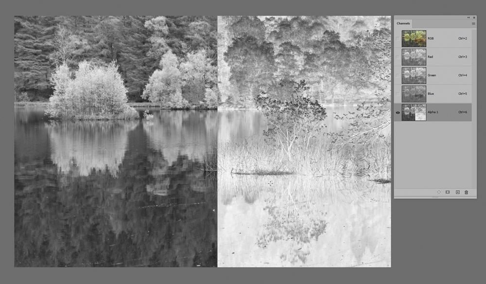
There is nothing wrong with having several methods available.
The important thing is to understand that they can produce different results.
A preset called “Red Filter” in one application is not necessarily going to produce exactly the same tonal translation as something with the same name somewhere else.
Lightroom is particularly straightforward
For photographers who prefer Lightroom Classic, the workflow is relatively simple.
Convert the image to Black & White, then use the B&W Mix to control how the original colours become tones. From there, use the Basic and Tone Curve controls to establish the overall tonal range. Lightroom also provides Colour Grading if you want to introduce a subtle tint or split-toning effect.
This is one reason it is worth keeping the original colour information rather than permanently converting the file to grayscale at the start of the workflow.
You retain the ability to change your mind.
Subtle toning can work beautifully
Monochrome does not necessarily mean absolutely neutral grey.
A very subtle warm or cool tone can change the character of a photograph without turning it into an obvious sepia effect.
Lightroom’s Colour Grading tools, for example, allow colour to be introduced into shadows, midtones and highlights independently.
The key word is subtle.
If the viewer notices the toning before they notice the photograph, you may have gone too far.
Don’t be seduced by the print
There is another trap that photographers can fall into, particularly when experimenting with different papers and printing processes.
You see a monochrome print that you absolutely love.
It has wonderful depth, beautiful blacks and an impressive surface. You then assume that the paper, printer or conversion method must be responsible for everything you are seeing.
So you buy the same paper, use the same printer and perhaps even copy the same conversion technique.
And then wonder why your photograph doesn’t suddenly look like the one you admired.
You have been seduced by the print.
The quality of the photograph itself still matters.
The composition, light, exposure, subject, tonal structure and editing decisions all contribute to the final result. A particular paper can enhance those qualities, but it cannot turn a weak photograph into a great one.
Judge the print under the right conditions
Printing introduces another variable that is easy to underestimate: the light in which you view the print.
A monochrome photograph can look very different under different illumination.
This is particularly noticeable when the image depends heavily on subtle differences in the darker tones. If your viewing environment is too dim, you may lose the separation you worked hard to create.
Before deciding that a print needs another round of editing, make sure you are judging it under sensible viewing conditions.
And don’t judge it immediately after spending hours working on it.
Step away.
Come back the next day.
It is surprisingly easy to become emotionally attached to an image simply because you have spent a long time making it.
Paper can change the character of monochrome
Different photographic papers can produce noticeably different results.
Surface texture, paper colour, ink behaviour, black density and the way the paper reflects light can all affect the appearance of a monochrome image.
A textured matt paper may suit a soft, atmospheric photograph beautifully but be less appropriate for a highly detailed architectural image.
A smoother paper may produce a very different impression of the same file.
This doesn’t mean there is a single “best” paper for monochrome.
The right choice depends on the photograph and what you want the finished print to feel like.
Don’t assume the screen tells the whole story
A monitor and a print are two very different ways of presenting an image.
The monitor produces light. The print reflects it.
That sounds obvious, but it is easy to forget when you have spent hours editing a photograph on screen.
A monochrome that looks beautifully balanced on a calibrated monitor may need some adjustment when printed. Conversely, a print that initially looks too dark or flat may simply be being viewed under unsuitable lighting.
This is why physical test prints remain valuable for photographers who care about the final printed result.
Make the conversion work for the photograph
There is no universally correct monochrome conversion.
One photograph might benefit from a very gentle tonal range with lots of midtones. Another might need deep blacks and bright highlights. A portrait may require careful treatment of skin tones, while a landscape may benefit from separating the sky from the foreground.
The same preset or slider settings won’t work equally well on all of them.
Instead of asking:
“Which is the best black and white conversion?”
ask:
“What does this photograph need?”
That is a much more useful question.
A simple monochrome workflow
If you are unsure where to begin, try this:
- Choose the photograph carefully. Make sure monochrome actually improves it.
- Keep the original file. Work non-destructively wherever possible.
- Make a basic conversion. This gives you something to assess rather than trying to predict the final result.
- Look at the colour-to-tone relationships. Which areas have become too similar?
- Adjust individual colours. Use the B&W Mix or Black & White controls to separate important areas.
- Establish the overall tonal range. Use exposure, levels or curves as appropriate.
- Protect important highlights and shadows.
- Check for banding or posterisation.
- Consider subtle toning if it suits the image.
- If you are printing, make a test print.
- View the print under sensible lighting.
- Come back to it later and judge it with fresh eyes.
Monochrome is about seeing differently
The biggest lesson from monochrome photography is not which software or preset to use.
It is learning to see photographs without relying on colour.
Once colour has been removed, shape, form, texture, contrast, light and composition become much more obvious. You start to notice relationships that may have been hidden by the colour version.
That can actually improve your colour photography too.
You become more aware of tonal structure, distracting backgrounds, the direction of light and the way different colours interact.
Modern software gives us an extraordinary amount of control over the process. Photoshop, Lightroom Classic and other applications can give photographers much more control over colour-to-tone translation than was ever possible in a traditional darkroom.
But the software isn’t the important part.
The important part is the decision you make about what the photograph should say.
A good monochrome image isn’t simply a colour photograph with the colour removed.
It is a photograph where the tones, light, contrast and composition have been deliberately brought together to make the image work.