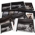
How to Tone Black and White Photos for Printing
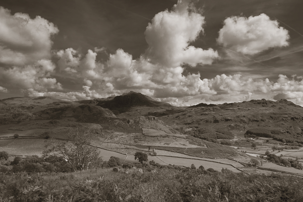
A black and white photograph doesn’t necessarily have to be completely neutral.
Add a subtle warm or cool colour and the character of the image can change considerably. A warm tone might give a portrait a softer, more traditional appearance, while a cool tone can make an architectural or landscape photograph feel cleaner and more contemporary.
Toning is not new. Photographers have been altering the colour of monochrome prints for generations, initially because colour photography was unavailable or impractical, and later because toning could become an important part of the visual character and longevity of a print.
Today the process is much easier. Photoshop, Lightroom Classic and other editing applications can introduce colour into a monochrome image without the need for a chemical darkroom.
But there is another side to the process.
If you are printing a monochrome photograph, the paper, printer, inks and viewing conditions can all influence how the final image looks.
Monochrome doesn’t have to mean black and white
Strictly speaking, monochrome means an image based around a single hue rather than necessarily being neutral black and white.
That means a photograph can be monochrome and still have a noticeable colour.
A sepia print is an obvious example, but toning does not have to be nearly that strong. A very small shift towards warm brown, blue, or another hue can be enough to change the character of a photograph.
This is often where toning works best.
The viewer may not immediately think, “That’s a toned photograph”, but simply feel that the image has a particular warmth or coolness.
Why tone a black and white photograph?
There are several reasons.
Sometimes the tone is chosen because it suits the subject. An old building, documentary image or portrait might benefit from a warmer treatment, while a stark architectural photograph could work well with a cooler appearance.
Sometimes it is simply an aesthetic choice.
Toning can also help create consistency across a series of photographs. If you are producing a book or exhibition, a carefully chosen tone can help give a collection of images a more unified appearance.
The important thing is that the tone should support the photograph rather than become the photograph.
Subtle toning is often more effective
It is very easy to overdo toning.
A strong sepia effect may look interesting for a few minutes but can quickly become the most obvious thing about the image.
Try making a much smaller adjustment than you initially think you need.
Then leave the photograph alone for a while.
Come back to it later and see whether the tone still feels right.
This is particularly important when working on a series. What looks subtle on one photograph may look excessive when several images are placed next to each other.
Toning in Photoshop
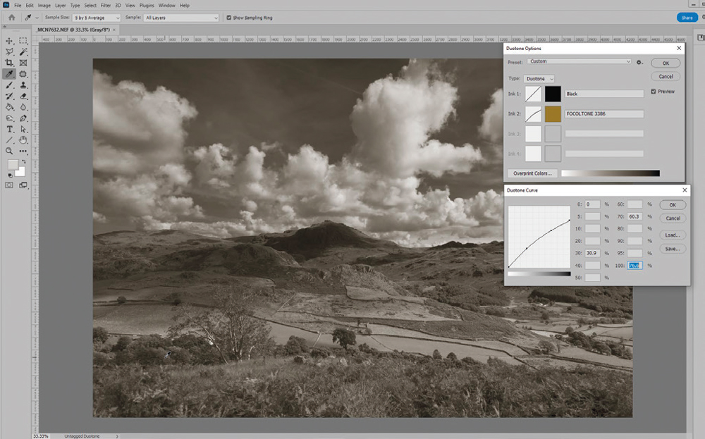
Photoshop provides several ways of adding colour to a monochrome photograph.
One straightforward approach is to use a Solid Colour adjustment layer and change its blending mode to Colour. This allows the colour information to be introduced while retaining the underlying luminosity of the photograph.
The advantage of using an adjustment layer is that you can change the colour and opacity later without having permanently altered the underlying image.
You can experiment with warm and cool colours, reduce the opacity and assess the result against the original.
The technique is simple, but the important part is deciding how much colour the photograph actually needs.
Toning in Lightroom Classic
Lightroom Classic also provides tools for introducing subtle colour into monochrome photographs.
Once the photograph has been converted to black and white, Colour Grading can be used to introduce colour into the shadows, midtones and highlights independently.
This provides considerably more control than simply applying a strong overall colour effect.
For example, you might introduce a very slight warmth into the highlights while leaving the shadows neutral, or use a cooler tone throughout the image.
Again, restraint is usually the key.
The purpose isn’t necessarily to make the photograph obviously coloured. It can simply be about changing the atmosphere.
Warm and cool tones change the way we see a print
The choice of tone can become particularly interesting when the photograph is going to be printed.
A warm-toned image can work beautifully with a warm paper, but the combination may become too yellow or brown if both are contributing strongly.
Likewise, a cool paper combined with a cool-toned photograph can push the image further towards blue than intended.
This is one reason it is useful to consider the photograph and the paper as a complete system rather than making each decision independently.
Don’t confuse toning with a colour cast
There is an important distinction between a deliberate tone and an unwanted colour cast.
If you deliberately make a monochrome image slightly warm, that’s toning.
If you intend to produce a neutral black and white print but it comes out slightly green, magenta, blue or yellow, that’s a problem.
And it can be surprisingly difficult to decide whether a very subtle cast is actually there.
Our eyes adapt to their surroundings, which means a print can look different depending on the lighting and colours around it.
Before changing your file, make sure the problem really exists.
Always judge the print at the right size
The size of a print can affect how obvious a colour cast or tonal problem appears.
A subtle problem that is difficult to see on a small print can become much more obvious when the image is enlarged.
This is one reason test prints are useful.
If the final image is going to be printed at a large exhibition size, don’t assume that a small A4 proof will reveal every problem.
Where possible, test at an appropriate scale and on the actual paper you intend to use.
Paper matters more than you might think
There is no special category of paper that automatically makes a sheet suitable for monochrome photography.
A good photographic paper that produces excellent colour prints can often produce excellent black and white prints as well.
What matters is how the characteristics of the paper interact with your particular photograph.
Consider:
- the surface finish
- the paper’s base colour
- maximum black density
- shadow separation
- highlight detail
- surface texture
- reflectivity
- paper weight
- the thickness your printer can accept
- whether optical brighteners are appropriate for your intended use
The best choice depends on what the photograph needs.
Gloss, lustre and matt papers behave differently
A smooth, glossy or lustre surface can generally provide strong blacks and good detail.
Move towards matt and heavily textured papers and the character changes.
The surface may become much less reflective, which can be an advantage for wall display, but deep shadow density can also be reduced.
Highly textured papers can be beautiful for the right photograph, but texture can become a distraction if the image depends on very fine detail.
Imagine a delicate cloudscape printed on a heavily textured watercolour paper. The paper itself may begin competing with the detail in the photograph.
The same paper could be perfect for another image.
There is no universally correct answer.
Think about the paper before you edit
This is particularly important if you are producing a fine art print.
If you know that the final photograph is going onto a relatively soft matt paper, you may need to consider how the paper will affect your deepest shadows.
A photograph that looks beautifully balanced on a monitor may print with less separation in the darker tones.
Conversely, a paper with a strong ability to reproduce deep blacks may give a high-contrast image considerably more impact.
This doesn’t mean you should edit every photograph specifically for a particular paper.
It means you should understand that the print is the final object.
Paper colour affects the image
Papers are not all the same colour.
Some have a neutral white base. Others are warmer or cooler, and some use optical brighteners to produce a brighter appearance.
The colour of the paper can influence how the photograph is perceived, particularly in areas of very light tone.
This becomes especially noticeable with monochrome photographs because there is nowhere for colour elsewhere in the image to hide the effect.
A warm paper can reinforce a warm tone.
A cool or bright paper can push the appearance in the opposite direction.
Neither is inherently better.
It depends on what you are trying to achieve.
Don’t choose paper simply because you like another photographer’s print
This is a variation on an important trap: being seduced by the print.
You see a beautiful monochrome print and assume its appearance must be mainly due to the paper.
So you buy the same paper.
But the print you admired was also the result of the photograph itself, the exposure, the conversion, the editing, the printer, the inks, the viewing light and the photographer’s judgement.
Changing one element does not reproduce the whole process.
The paper can make a very good photograph look different.
It cannot replace good photography.
Print technology has come a long way
The technical quality available from modern inkjet printing is considerably better than it was in the early days of digital photographic printing.
Older ink sets could produce obvious metamerism and other problems in monochrome prints. A print might appear neutral under one type of lighting and noticeably coloured under another.
Modern systems have improved considerably, although metamerism and colour management have not magically ceased to exist.
If a monochrome print changes noticeably when you move it between different lighting conditions, don’t immediately assume that your image is at fault.
The printing system and viewing conditions need to be considered as well.
A neutral monochrome can be surprisingly difficult
Photographers sometimes assume that producing a neutral black and white print should be easier than producing an accurate colour print.
In some respects it is the opposite.
With colour, a slight shift in one direction may be hidden among the many colours in the image.
In a monochrome photograph, a tiny unwanted shift across the entire image can be much easier to notice.
This is particularly true in large areas of neutral grey.
If your intention is a clean neutral monochrome, make sure your printing workflow is properly colour-managed and that you are using an appropriate printer setting for the paper.
Use the printer’s monochrome controls carefully
Many photographic printers provide dedicated black and white or monochrome printing controls.
These are designed to help produce neutral or deliberately toned monochrome prints and can provide useful control over the final appearance.
The exact controls vary between manufacturers and printer models, so don’t treat one manufacturer’s settings as universal instructions.
The important thing is to understand what the printer driver is doing and to make sure the correct paper and colour-management settings are being used.
If you are producing an important exhibition or fine art print, make a test rather than assuming the first output will be perfect.
Don’t judge monochrome under unsuitable lighting
A print is only as good as the conditions in which you judge it.
This is particularly important with monochrome because we are often evaluating tiny differences in neutral grey.
The colour of the room, the illumination level and the type of light source can all influence your perception.
If the print looks slightly warm under one light and slightly cool under another, don’t immediately start adjusting the file.
First check the viewing conditions.
Your eyes need a break too
There is another surprisingly important part of the process: walking away.
After spending an hour adjusting an image, your eyes and brain become accustomed to what you are looking at.
A subtle warm cast may start to look completely neutral.
An excessive amount of contrast may begin to seem normal.
The best solution is often to stop.
Come back the following day and look at the photograph again.
This is particularly valuable when you are preparing a print for someone else. Your emotional attachment to an image can make objective judgement difficult.
Make a test print before committing to a paper
If you are unsure which paper to use, print the same photograph on several candidates.
Don’t just compare the photographs on screen.
Look at the actual prints.
Consider:
- How deep are the blacks?
- Can you distinguish important shadow tones?
- Are the highlights holding detail?
- Does the surface texture help or distract?
- Does the paper colour suit the photograph?
- Is the photograph still sharp enough?
- Does the print have the atmosphere you wanted?
- Does the tone look different from how it appeared on screen?
This kind of comparison is much more useful than choosing paper based solely on a manufacturer’s description.
There is no single best paper for monochrome
It is tempting to look for a definitive answer: the best black and white paper, the best printer or the best toning method.
Photography rarely works that way.
A paper with excellent deep blacks might be perfect for a dramatic architectural image but unnecessarily strong for a delicate high-key portrait.
A textured fine art paper may give an atmospheric landscape exactly the character it needs but overwhelm a highly detailed photograph.
A warm paper might complement a portrait beautifully but fight against an intentionally cool architectural image.
The photograph should lead the decision.
Think about the final presentation
The print doesn’t exist in isolation.
If it is going into an album, the surface needs to withstand handling.
If it is being framed, consider the interaction between the print and the mount.
A warm monochrome can look very different against a bright white mount compared with a warmer cream mount.
A cool monochrome may appear even cooler when surrounded by warm tones.
The frame, mount, paper and lighting all become part of the finished presentation.
Toning should serve the photograph
The best toned monochrome photographs don’t necessarily look “toned”.
The colour is there because it contributes something.
It may soften a portrait, reinforce the age of a documentary image, create a particular atmosphere in a landscape or simply make a series of photographs feel more coherent.
But the tone should not distract from the subject.
If the first thing somebody says is, “That’s a really strong sepia effect”, you might want to ask whether the effect has become more important than the photograph.
A simple workflow for toned monochrome prints
If you are producing a monochrome photograph for printing, a sensible approach is:
- Create the monochrome conversion first. Get the tonal structure right before adding colour.
- Decide whether the photograph needs toning. Don’t add colour simply because the software makes it easy.
- Try subtle warm and cool variations.
- Leave the image for a while. Come back and judge it with fresh eyes.
- Choose a suitable paper. Think about surface, texture, paper colour and shadow density.
- Make a test print.
- Judge the print under appropriate lighting.
- Check for unwanted colour casts.
- Compare papers if necessary.
- Make the final print only when you are happy with the complete combination of photograph, tone, paper and presentation.
The print is the final photograph
Digital photographers can become so focused on the file that the physical print becomes an afterthought.
But a print is not simply a screen image transferred onto paper.
The paper has a surface. It has a colour. It reflects light differently. Its ability to reproduce deep blacks and subtle highlights varies. The viewing environment changes how we perceive it.
All of those things contribute to the final result.
So by all means experiment with toning, different papers and different printing methods.
Just don’t lose sight of the photograph itself.
A beautiful paper cannot rescue a weak image, and a clever toning effect cannot replace good monochrome conversion.
The best result comes when the photograph, the tonal treatment, the paper and the presentation all work together.