How to Choose Fine Art Paper for Photography: A Photographer’s Guide
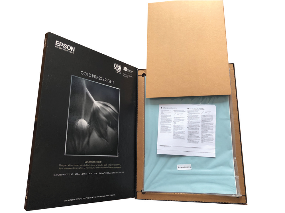
A photograph doesn’t necessarily finish when you press the shutter. For many photographers, the final expression of an image is the print.
Choosing the right paper can make a surprisingly large difference to how that print looks and feels. The same photograph printed on a smooth, bright paper can have a very different character from one printed on a heavily textured, natural-white cotton rag.
Paper won’t turn a poor photograph into a great one, but the wrong paper can work against a good image. Choose well, however, and the paper can provide the final touch that brings the image together.
So how do you choose the right paper for photography?
Paper is part of the image
When we look at a photograph on screen, we’re largely seeing an image produced by a display. Once that image becomes a physical print, another set of characteristics comes into play.
The paper has:
- a particular colour or white point
- a particular surface texture
- a particular level of smoothness
- a particular weight and stiffness
- a particular way of absorbing or receiving ink
- a particular way of reflecting the viewing light
All of these can influence the appearance of the finished photograph.
This is why there is no universally “best” fine art paper.
The best paper is the one that supports the characteristics of the particular image.
Why are there so many different papers?
Walk into a specialist photography or fine art printing supplier and the choice can be bewildering.
There are smooth papers, textured papers, cotton rag papers, baryta papers, glossy papers, satin surfaces, etching papers, watercolour papers and many other variations.
Manufacturers also use terminology that can appear confusing if you haven’t encountered traditional printmaking.
Much of this language has been inherited from centuries of artistic printing.
Terms such as etching, watercolour, vellum, wove, laid, hot pressed and cold pressed originally described papers used with traditional artistic processes. Today, similar descriptions are often used for modern inkjet papers because they describe the character or surface of the paper.
Understanding the terminology can therefore make choosing a paper considerably easier.
Paper texture has a major influence
Of all the characteristics of a fine art paper, its surface texture can have one of the most obvious effects on the finished print.
At one extreme you have extremely smooth papers with little visible surface texture. At the other are heavily textured papers that can have an almost tactile appearance.
A smooth paper can be particularly effective when you want:
- fine detail
- crisp edges
- a clean contemporary appearance
- subtle tonal transitions
- detailed portraits
- architectural photography
- images containing lots of small detail
A more textured paper can introduce a completely different character.
Texture can work particularly well with:
- fine art photography
- painterly images
- atmospheric landscapes
- still life
- creative portraits
- images intended to have an artistic or traditional feel
The important thing is that the texture should support the photograph.
If the photograph contains delicate fine detail, a very aggressive paper texture may compete with it. Conversely, an image deliberately designed to look painterly may benefit enormously from a paper with a pronounced surface.
What does “hot pressed” mean?
Hot-pressed papers are generally manufactured with a very smooth surface.
The paper is pressed through smooth rollers under pressure, producing a relatively flat finish.
For photography, this can be useful when you want the paper to interfere as little as possible with the fine detail in the image.
Hot-pressed papers are therefore often worth considering for detailed photographs where sharpness and subtle tonal transitions are important.
What does “cold pressed” mean?
Cold-pressed papers retain more surface character.
They are associated with traditional artistic papers and can have a noticeably textured surface.
For photographers, this texture can become part of the visual experience of the print.
It can be particularly effective where a completely smooth photographic surface would feel too clinical.
What is cotton rag paper?
Many premium fine art inkjet papers are made from cotton fibres or cotton rag.
Cotton has a long history in papermaking and provides a suitable base for high-quality archival papers.
The term rag paper traditionally refers to paper made using textile fibres rather than wood pulp.
Modern fine art papers can use cotton and other fibre sources, with manufacturers developing a wide variety of surfaces and characteristics.
The important point for photographers isn’t simply whether a paper says “cotton” on the packet. It is how the complete paper performs with your printer, inks, image and intended presentation.
White paper or natural paper?
Not all photographic papers have the same base colour.
Some have a bright white appearance while others have a warmer or more natural white.
This can have a significant effect on the final photograph.
A bright white paper can help maintain a clean, crisp appearance and may suit images where neutral whites and strong contrast are important.
A warmer natural-white paper can give a print a softer, more traditional character.
This is particularly worth considering with black-and-white or fine art images.
The paper’s base colour effectively becomes part of the photograph, particularly in areas containing highlights or very pale tones.
Matte, glossy and textured surfaces
The surface finish is another important consideration.
Glossy and high-gloss papers can produce strong contrast, deep blacks and vibrant colour. They can be excellent for photographs where impact, saturation and detail are important.
The downside is that glossy surfaces can produce reflections and fingerprints, and their appearance can change significantly depending on the viewing light.
Matte papers produce a much more subdued reflection and can give a print a softer, more artistic appearance.
Textured matte papers take this further by introducing a visible physical surface.
There is no universally correct choice. Think about the image and where the finished print will be displayed.
Think about the photograph before choosing the paper
One of the easiest mistakes is to choose a paper because you like the paper itself.
Instead, start with the photograph.
Ask yourself:
What is this image trying to say?
Then consider which paper characteristics reinforce that idea.
A highly detailed architectural photograph may benefit from a smooth surface.
A delicate portrait might suit a soft, natural-white paper.
A dramatic black-and-white image may work beautifully on a paper capable of producing strong blacks.
A painterly creative image may benefit from texture that adds to its artistic character.
The paper should support the photograph rather than become a distraction.
Don’t ignore black levels
Different papers can produce different maximum black densities.
This is particularly important with images containing deep shadows or strong blacks.
A paper designed for a particular type of printing can produce very different results from another surface, even when the same printer and ink set are used.
This is one reason why paper manufacturers provide printer profiles for many of their products.
Using the correct ICC profile, where available, allows the colour-managed workflow to take the characteristics of the paper into account.
Test before committing to a large print
If you have spent hours creating an image, it is worth spending some time finding the right paper.
Don’t necessarily print the entire image on every paper you own.
Instead, create a small test print containing areas that will reveal differences between papers.
Include:
- deep shadows
- highlights
- skin tones if relevant
- saturated colours
- subtle colour transitions
- fine detail
- areas of texture
Compare the results under the lighting in which the final print will normally be viewed.
A paper that looks spectacular under one type of lighting may behave differently under another.
Keep a paper sample book
One of the best ways to become familiar with different papers is to build your own collection of samples.
Paper manufacturers and specialist suppliers often provide sample packs or swatch books.
Don’t simply look at the paper in isolation. Print the same test image on several surfaces and keep the samples together.
Over time you will start to recognise which papers suit particular types of work.
You may eventually develop a small selection of favourite papers rather than trying to use dozens of different products.
That can make your workflow much more consistent.
Paper weight matters too
Paper isn’t defined only by its surface.
Its weight and thickness affect how the finished print feels in the hand and how it behaves when mounted or displayed.
A substantial fine art print can feel like a premium object before the viewer has even studied the photograph.
This matters particularly when selling wall art or presenting competition and exhibition prints.
The physical experience of a print is part of its perceived value.
Think about the complete presentation
The paper is only one part of the finished object.
If the print is being mounted, framed or submitted for competition, consider the complete presentation.
A beautifully printed photograph can be let down by poor mounting.
Mount boards should be accurately cut, clean and properly aligned. Lines should be straight, corners should meet correctly and the window should be clean.
The colour of the mount matters too.
A bright white mount surrounding a natural-white paper can make the paper appear noticeably warmer or duller by comparison.
The mount and paper should therefore be considered as a pair.
Fine art printing is about more than the paper
It is tempting to think that buying an expensive paper automatically produces a better print.
It doesn’t.
The final result depends on the whole chain:
Photograph → editing → monitor → printer → ink → paper → viewing light → presentation
A problem anywhere in that chain can affect the result.
This is why monitor calibration, colour management, printer profiles and appropriate lighting are all important parts of a serious printing workflow.
The paper cannot compensate for an image that has been badly edited or incorrectly colour managed.
Don’t be afraid to experiment
There are an enormous number of fine art papers available, and that can initially feel overwhelming.
You don’t need to try all of them.
Start by experimenting with a few very different surfaces:
- A smooth bright paper
- A smooth natural-white paper
- A textured fine art paper
- A paper with a more pronounced artistic surface
- A high-quality photographic surface such as baryta, where appropriate
Print the same photograph on each and compare them.
You may be surprised by how much the character of the image changes.
The exercise is also useful because it teaches you what to look for when selecting paper in the future.
Choose paper for the final purpose
The best paper for a competition print may not be the best paper for a wedding album or a wall portrait.
Consider where the photograph will end up.
For a competition or exhibition, presentation and visual impact may be particularly important.
For a client wall portrait, you also need to think about durability, viewing conditions, framing and the overall premium feel of the product.
For a portfolio, consistency between prints may be more important than finding a unique surface for every image.
For fine art work, the physical qualities of the paper may be an integral part of the artistic statement.
The print is still the final photograph
Digital photography has made it incredibly easy to create, store and share images without ever producing a physical print.
But a print is different.
It is something that exists in the physical world. You can hold it, frame it, exhibit it and live with it.
The paper becomes part of that experience.
A good paper choice doesn’t make a photograph better than it is. What it can do is allow the qualities already present in the image to come through in the most sympathetic way possible.
So rather than asking:
“What is the best paper for photography?”
ask:
“What is the best paper for this photograph?”
That small change in thinking can make choosing paper much easier — and can lead to much better prints.