How to Print Black Clothing Without Losing Shadow Detail
By Mike McNamee and Cristina Pascu-Tulbure
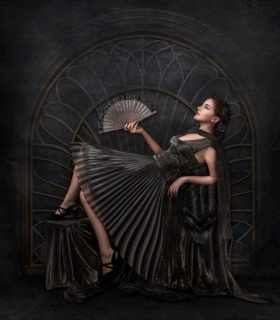
Black clothing can look fantastic in a photograph – but reproducing it successfully in a print can be surprisingly difficult. Here’s how to preserve texture, folds and shadow detail when printing dark images.
There is something particularly unforgiving about photographing and printing black clothing.
A black dress, suit or jacket might look perfectly acceptable on your monitor, with plenty of visible texture and detail. Yet when you send the image to your printer, those carefully captured shadows can disappear, leaving you with a large area of featureless black.
The problem becomes even more noticeable when using fine-art matte papers, where the deepest blacks generally cannot reach the same density as they can on high-quality gloss or baryta media.
So how do you make sure your black clothing remains black – without turning into a featureless silhouette?
Why is black so difficult to print?
In photographic printing, black isn’t simply a matter of selecting the darkest possible value.
The deepest black a printer can produce depends on the combination of printer, inks, paper and ICC profile. The maximum density that a particular printing system can achieve is commonly referred to as Dmax.
A higher Dmax generally means the print is capable of producing deeper blacks. But achieving a deep black isn’t the whole story. The photographer also needs enough separation between the deepest shadows for subtle differences in tone to remain visible.
This is where black clothing can cause problems.
A black dress might contain folds, texture and subtle changes in illumination that are clearly visible in the original photograph. If those tones are compressed too close to the printer’s black point, however, the differences can disappear.
The result is a dress that looks less like fabric and more like a solid black shape.
Your monitor isn’t your print
One of the biggest traps in photographic printing is assuming that because you can see shadow detail on your monitor, that detail will automatically appear in the finished print.
Your monitor is producing light. A print is reflecting light.
The two systems therefore have very different characteristics.
Your display can show extremely dark tones with considerable separation, while the paper and ink combination you’re using may have a much more restricted range at the bottom end of the tonal scale.
Ambient lighting also affects how we perceive a print. A photograph viewed under controlled lighting can look very different from the same print examined under bright household lighting.
This is one reason professional printers pay so much attention to both colour management and viewing conditions.
Matte paper can make the problem worse
Fine-art matte papers are hugely popular because of their beautiful surface and distinctive appearance. They can be an excellent choice for many photographic subjects.
However, they aren’t always the best choice for very dark, low-key images.
The surface characteristics of matte paper mean that its maximum black density is generally lower than that of many gloss and baryta papers. As you approach that limit, shadow contrast can fall away.
That doesn’t mean you should never print a dark photograph on matte paper.
It simply means that you need to understand what your chosen printer and paper combination can actually reproduce.
For an image dominated by black clothing, deep shadows or very dark backgrounds, a high-quality baryta or semi-gloss paper may provide a significantly better result.
Look at your shadows before you print
Before sending the image to the printer, examine the darkest areas carefully.
Don’t just look at the overall image. Zoom into the black clothing and ask yourself:
- Can I see the folds in the fabric?
- Is there texture in the material?
- Are there subtle changes in illumination?
- Are important areas already clipped to pure black?
- Are the shadows noticeably darker than they need to be?
Adobe Camera Raw and Photoshop provide several ways of examining the tonal range of an image.
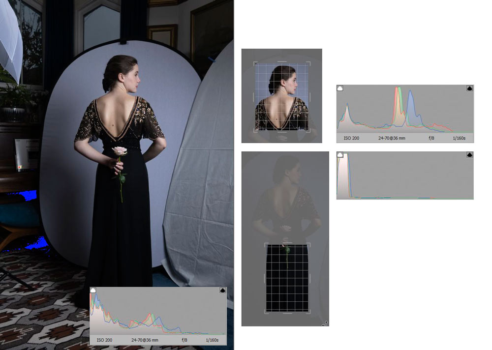
The histogram is particularly useful. If the shadows are heavily stacked against the far-left edge, you may have areas that are approaching or already reaching black.
That doesn’t automatically mean the image is wrong. Some photographs deliberately contain completely black areas.
The important question is whether the detail you want to retain is being lost.
Use the Shadows and Blacks controls carefully
If black clothing is losing detail, your first instinct might be to increase the Shadows slider.
This can work, but it is easy to go too far.
A large increase can make the clothing look grey rather than black and can also reduce the overall contrast of the photograph.
Instead, make small adjustments while concentrating specifically on the areas where you need to recover detail.
Curves can provide even more precise control.
Rather than lifting the entire shadow range, you can gently raise the darkest part of the curve and use additional control points to protect the midtones.
This allows you to introduce enough separation into the deepest shadows without making the whole image look washed out.
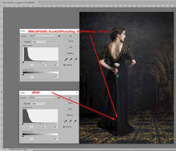
Soft proof your image before printing
One of the most useful tools available to photographers is soft proofing.
A soft proof allows Photoshop to simulate the appearance of your image using the profile for a particular printer and paper combination.
In Photoshop, you can access this through:
View > Proof Setup > Custom
From there, you can select the appropriate printer/paper ICC profile and examine how the image changes.
The exact options available will depend on your setup, but soft proofing can reveal problems before you waste paper and ink.
Pay particular attention to:
- deep shadows
- black clothing
- dark backgrounds
- subtle textures
- low-contrast areas
If shadow detail suddenly disappears when the soft proof is enabled, that is a warning that your chosen paper may struggle to reproduce those tones.
But a soft proof isn’t a substitute for a real print
Soft proofing is extremely useful, but it isn’t perfect.
The display is still a display, and the final print is still a physical object being viewed under real lighting.
For critical work, nothing completely replaces making a test print on the actual printer and paper you intend to use.
This is especially important when producing a large or expensive fine-art print.
A small proof can reveal problems that weren’t obvious on screen and allows you to make adjustments before committing to the final print.
Check the black point
Your printer’s ICC profile contains information about the characteristics of the printer and paper combination, including the deepest tones it can reproduce.
This is why colour management matters.
When a correctly created ICC profile is used, Photoshop and the printer workflow can map the image’s tonal range into the printable range.
Black Point Compensation can also play an important role when using certain rendering intents, helping to preserve shadow detail when the black point of the image and the output device don’t match.
For photographers who are new to colour management, the important lesson is simple:
Your image has a tonal range, and your printer has a different tonal range. The colour-managed workflow helps translate one into the other.
Use the right paper for the photograph
Paper choice can have a surprisingly large impact on the appearance of black clothing.
If your photograph relies heavily on deep blacks and subtle shadow detail, consider testing a high-quality baryta or semi-gloss paper alongside your preferred matte fine-art paper.
The difference can be considerable.
Gloss and baryta-type papers can generally produce deeper blacks and stronger contrast than many matte papers, making them particularly useful for low-key photographs.
That doesn’t mean one surface is universally better.
A matte paper might be exactly the right creative choice for a particular image. The key is understanding the compromise you’re making and adjusting the image accordingly.
Don’t try to rescue everything in post-production
There is another lesson from working with black clothing: sometimes the problem starts at the camera.
Lighting plays a huge role.
If the folds and texture of a black dress are already badly underexposed, recovering them later can be difficult and can introduce noise or an unnatural appearance.
Whenever possible, create enough light and separation during the shoot to record the texture you want to retain.
For studio photography, this might mean repositioning a softbox, adding fill light or changing the angle of the lighting.
A little more information captured at the time of the photograph can save a considerable amount of work later.
Examine the actual fabric
Black isn’t necessarily a single tone.
A black dress might contain:
- glossy highlights
- deep shadows
- reflected light
- subtle colour shifts
- folds and creases
- different textures across the fabric
These differences are what make the clothing look three-dimensional.
When editing, don’t simply aim to make every part of the dress as dark as possible.
Instead, look for the tonal relationships that tell the viewer what the material looks and feels like.
The deepest shadows can remain close to black while the surrounding tones are lifted enough to reveal the structure of the fabric.
A practical workflow for printing dark photographs
If you’re preparing a photograph containing a significant amount of black clothing, try this workflow:
1. Check the original exposure
Make sure the important detail was actually captured in the file.
2. Examine the histogram
Look for excessive shadow clipping and determine whether important areas are compressed against the black point.
3. Make controlled shadow adjustments
Use Shadows, Blacks or Curves rather than simply brightening the entire image.
4. Soft proof for your chosen paper
Use the correct printer/paper ICC profile and examine the deepest tones carefully.
5. Compare paper types
If the photograph is particularly dark, test a baryta or semi-gloss paper against your preferred matte option.
6. Make a small test print
Whenever the final print matters, use a proof to check the actual result.
7. Adjust and print again
Don’t expect the first attempt to be perfect. Fine-art printing is often an iterative process.
The little black dress – a lesson in printing
The little black dress has been a fashion icon for decades, but it also provides an excellent lesson for photographers.
A black subject isn’t necessarily simple.
The challenge isn’t simply producing black. It’s reproducing the subtle range of tones between black and the lighter areas that surround it.
That is why an image that looks superb on screen can sometimes produce a disappointing print.
Understanding your printer, paper, ICC profiles and black point – and being prepared to soft proof and make test prints – gives you far greater control.
And if the image is dominated by very dark tones, don’t be afraid to experiment with your paper choice.
Sometimes the best solution isn’t another Photoshop adjustment.
It’s simply choosing a surface that can reproduce the photograph you created.
Key takeaway
If your photograph depends on deep blacks and subtle shadow detail, always test the printer and paper combination before committing to the final print.
For particularly dark images, high-quality baryta and semi-gloss papers can often provide the depth and tonal separation that matte fine-art papers struggle to achieve.