Grey Card Photography: How to Get Accurate Exposure and White Balance
Getting accurate colour and exposure is an important part of producing consistent photographs. While modern cameras are remarkably good at judging exposure and white balance automatically, there are situations where taking control can make a significant difference.
One of the simplest tools available to photographers is the humble grey card.
A grey card can be used to establish a reliable reference for both exposure and white balance. For photographers working in the studio, photographing products, creating artwork reproductions or simply wanting greater consistency from their images, it can be an inexpensive and extremely useful piece of equipment.
But how does a grey card actually work, and when should you use one?
What is a grey card?
A traditional photographic grey card is designed to provide a known, neutral reference against which a camera can measure light and colour.
The familiar 18% grey card became widely used because it approximated the average reflectance that exposure meters were designed around. By photographing the card under the same lighting as your subject, you can use it as a reference when determining the appropriate exposure and white balance.
The important word here is neutral.
A good grey card should reflect light evenly across the visible spectrum without introducing a noticeable colour cast. If the card itself is slightly warm, cool, green or magenta, using it as a white-balance reference can actually introduce an error rather than correcting one.
This is one reason that not all grey cards are necessarily equal.
Why is white balance important?
Light sources have different colour characteristics.
Daylight, shade, tungsten lighting, fluorescent lighting and LED sources can all produce different colour temperatures and colour casts. Your camera attempts to compensate for these differences using its white-balance system.
Auto White Balance is remarkably effective in many situations, but it is still making an interpretation of the scene.
A grey card gives you a known neutral reference.
If the card is photographed under the same light as your subject, software can identify the neutral area and calculate the appropriate correction. This can be particularly useful when accurate skin tones or product colours are important.
It is also one reason why shooting RAW is so useful. Rather than permanently committing to a white-balance interpretation in-camera, you retain considerably more flexibility when processing the image.
How to use a grey card for photography
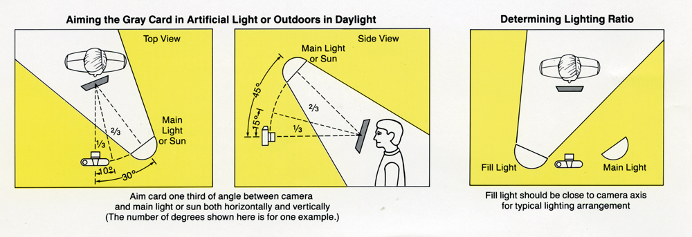
Using a grey card doesn’t have to be complicated.
1. Place the grey card in the same light as your subject
The card needs to receive essentially the same illumination as the subject you are photographing.
This is particularly important outdoors, where moving the card into a different area of light can produce a misleading reading.
For a portrait, for example, hold the card approximately where the subject’s face will be and angle it so that it receives the same light.
2. Photograph the grey card
Take a reference photograph with the card clearly visible.
You don’t necessarily need the card to fill the entire frame. It simply needs to be large enough for your software or camera to obtain a reliable reading from it.
3. Use the card to establish white balance
When processing your RAW file, use the white-balance eyedropper to select the neutral grey area.
The software can then calculate a white balance based on that known neutral reference.
If you are photographing a series of images under identical lighting conditions, the same white-balance setting can usually be applied across the entire sequence.
4. Use the grey card as an exposure reference
A grey card can also provide a useful reference for exposure.
However, it is worth remembering that exposure meters and modern digital cameras don’t necessarily interpret a traditional 18% grey card in exactly the same way as older photographic systems did.
The practical advantage of RAW photography is that you have considerable latitude for making small exposure corrections during processing.
The grey card should therefore be regarded as a repeatable reference, rather than a magic exposure setting that removes the need to assess highlights, shadows and the overall lighting of the scene.
Grey card, white card and black card
Some calibration targets go further than a simple grey card.
A three-tone target may contain:
- White – useful as a reference for highlights and white point
- Mid-grey – useful for exposure and neutral colour
- Black – useful for establishing shadow levels
This gives the photographer more information about the tonal range of an image.
More sophisticated colour targets add a series of coloured patches. These can be used to create camera profiles and make much more comprehensive corrections than a single grey card.
For everyday photography, however, the extra complexity is not always necessary.
Grey card or colour checker?
This depends on what you photograph.
For a photographer taking portraits, landscapes, events or general social photography, a good neutral grey card can provide a simple and inexpensive way of establishing consistent white balance.
A colour checker provides considerably more information.
Colour targets contain multiple known colours as well as neutral patches. When used with compatible software, they can help create camera profiles and provide a more controlled approach to colour management.
This becomes particularly valuable in:
- Product photography
- Commercial photography
- Artwork reproduction
- Copying paintings and documents
- Studio photography
- Advertising photography
- Scientific and technical photography
For these applications, colour accuracy may be considerably more important than simply making an image look pleasing.
Does accurate colour mean a better photograph?
Not necessarily.
This is an important distinction.
A technically accurate colour reproduction is not automatically the most successful photograph.
A photographer may deliberately warm an image to create a particular mood. A landscape photographer might prefer a cooler interpretation of dawn light. A portrait photographer may make subtle colour adjustments to achieve a particular aesthetic.
Calibration gives you a known starting point.
Once you have an accurate and repeatable baseline, you can then make creative decisions with greater confidence.
The objective isn’t necessarily to make every photograph mathematically perfect. It is to understand what your equipment is doing and have the ability to reproduce colour consistently when you need to.
Why colour accuracy can be difficult outdoors
Studio photography provides relatively controlled conditions. Outdoor photography is considerably more complicated.
Light changes constantly.
Cloud cover, reflected light, surrounding vegetation, buildings and even the colour of the ground can influence the light reaching your subject.
Nature photographers face an additional problem: your subject may not be particularly cooperative.
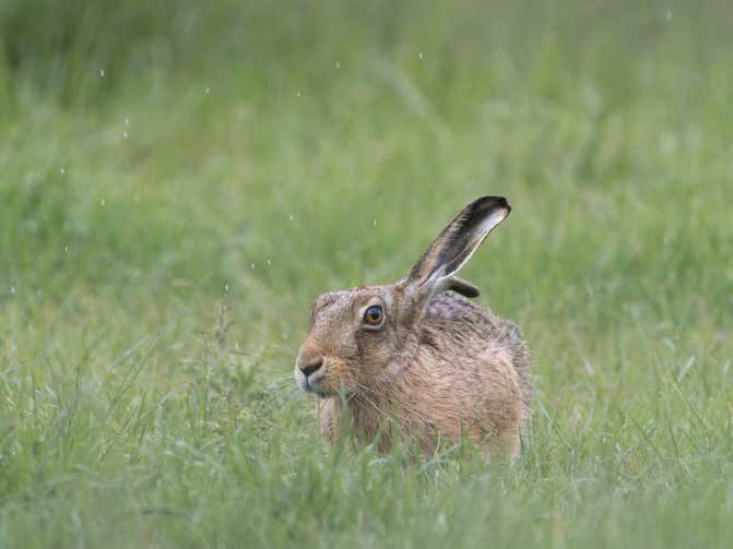
Imagine trying to photograph a hare in a garden. The animal may be sitting in grass surrounded by green reflected light. You can’t exactly expect it to wait patiently while you position an expensive colour target!
A simple, weather-resistant grey reference can therefore be surprisingly useful when photographing wildlife or working on a long-term project where consistency matters.
Watch out for reflected colour
One of the biggest challenges when setting white balance is that the light illuminating your subject may already contain reflected colour.
A subject sitting beneath green vegetation, for example, can receive green light reflected from the surrounding environment.
Correcting this completely isn’t always desirable.
If you remove every trace of the green influence, the animal may begin to look unnaturally magenta against its natural environment.
This highlights an important principle of colour correction:
Accurate colour and natural-looking colour aren’t always exactly the same thing.
Photography is ultimately about interpretation as well as measurement.
How accurate does your grey card need to be?
This is where the 80/20 rule becomes useful.
There are extremely sophisticated colour-management systems capable of measuring and profiling cameras to a very high degree of accuracy.
For most photographers, however, you don’t need a laboratory.
A simple, reliable neutral reference combined with RAW capture and sensible post-processing can make a substantial improvement to consistency without turning photography into a scientific experiment.
The more specialised your work becomes, the more worthwhile advanced calibration can be.
A useful way of thinking about it is:
Simple photography → grey card
More demanding studio work → colour checker
High-end commercial reproduction → full colour-management workflow
The exact requirements will depend on your subject, lighting and the level of colour accuracy your client expects.
Can you make your own grey card?
Technically, you can create a surface that is close to a neutral grey, but there is an important caveat.
A material may look grey to your eyes without being spectrally neutral.
Different materials and pigments can reflect different wavelengths of light in different proportions. This can result in metamerism, where a surface appears neutral under one light source but develops a colour cast under another.
For casual photography, this may not matter enormously.
For commercial colour-critical work, it can matter a great deal.
A properly manufactured photographic reference target is therefore preferable when accuracy is important.
Don’t forget your monitor and printer
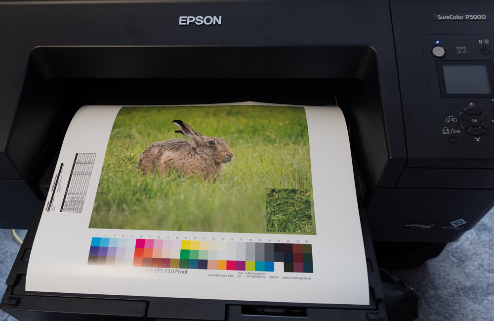
There is little benefit in achieving accurate colour at the camera if everything downstream is inaccurate.
The complete colour-management chain can include:
Light → Camera → RAW processing → Monitor → Printer → Paper
Each stage can influence the final result.
A carefully calibrated camera profile won’t make an uncalibrated monitor accurate, and a perfectly calibrated monitor cannot compensate for a printer and paper combination that has not been properly profiled.
For photographers producing physical prints, this becomes particularly important.
Sometimes an image that looks perfectly acceptable on a highly saturated modern display can reveal considerably more subtle colour issues when it is printed.
The simplest approach is often the best
Photography technology has made colour management considerably easier than it was during the days of colour film.
Modern cameras can automatically assess white balance, RAW processing software provides powerful correction tools, and sophisticated colour targets can create highly accurate camera profiles.
But the basic principle remains remarkably simple.
If you want consistency, give your camera a reliable reference.
A grey card is inexpensive, lightweight and easy to use. It won’t solve every colour-management problem, but it can provide a solid starting point for getting exposure and white balance under control.
And once you have a technically sound starting point, you can concentrate on the part that ultimately matters most:
making the photograph look the way you want it to look.
A practical checklist
Before your next colour-critical shoot:
- Use a reliable neutral grey card or colour target.
- Place it in the same light as your subject.
- Shoot RAW where possible.
- Take a reference frame at the start of a lighting setup.
- Use the grey card to establish your white balance during processing.
- Check your exposure rather than relying solely on the camera meter.
- Be aware of reflected colour from surrounding surfaces.
- For commercial work, consider using a colour checker and camera profiling.
- Keep your monitor calibrated if colour accuracy is important.
- Remember that technically accurate colour is a starting point, not a restriction on your creativity.
Photography doesn’t always need to be scientifically perfect. But understanding what is happening gives you the freedom to make deliberate creative choices.