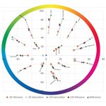
Vibrance vs Saturation: What’s the Difference in Lightroom?
By Jane Allan
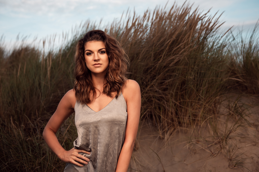
Understanding the difference between vibrance and saturation is an important part of learning how to control colour in your photographs.
Both adjustments can make colours appear more intense or reduce their intensity, but they work in different ways. Saturation affects colours more uniformly, while vibrance is a more selective adjustment that primarily targets less-saturated colours.
Knowing when to use each can help you create photographs with rich, natural-looking colour without pushing your images too far.
What is saturation in photography?
Saturation refers to the intensity or purity of a colour.
A highly saturated colour appears strong and vivid, while a less saturated colour appears muted. As saturation is reduced further, colours eventually move towards greyscale.
Saturation is affected by the light you use when taking a photograph as well as by the adjustments you make during post-processing.
The quality, direction and intensity of light can all influence how strongly colours appear in a photograph. For example, the same colourful subject can look quite different when photographed in bright, direct sunlight compared with softer, more controlled light.
The colour of the light source also affects the colours recorded by your camera. Warm evening light can emphasise reds, oranges and yellows, while the cooler light around blue hour can enhance blue tones.
What is saturation in photo editing?
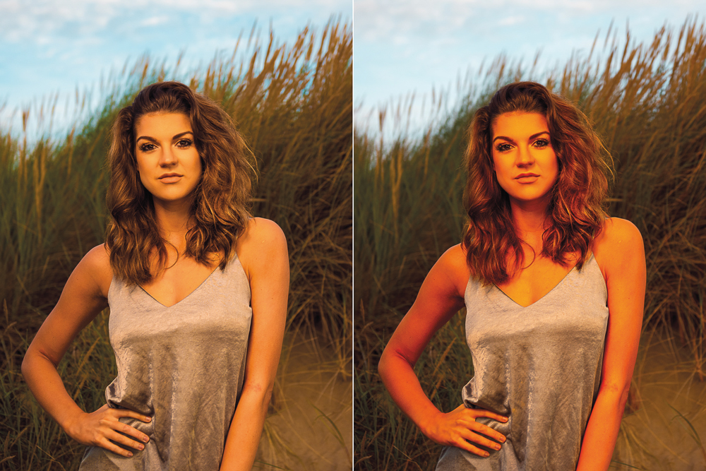
In Lightroom, saturation can be adjusted in several ways.
The Saturation slider in the Basic panel makes a broad adjustment to the colours throughout your photograph. Increasing it makes colours more intense, while decreasing it reduces their intensity.
Because it affects the image broadly, saturation can be a powerful tool — but it can also be easy to overdo.
For example, increasing global saturation in a portrait can make skin tones look unnaturally orange or red.
It can also make already-strong colours become excessively intense, potentially distracting from the subject.
Using HSL saturation
Lightroom also provides individual saturation controls within the HSL/Color panel.
HSL stands for:
- Hue – changes the actual colour
- Saturation – changes the intensity of a particular colour
- Luminance – changes the brightness of a particular colour
This gives you much more control than the global Saturation slider.
For example, if you want to make the blue in a sky more intense without dramatically changing the skin tones of a person in the foreground, you can target the blue tones specifically.
This selective approach can be particularly useful when working with landscapes, portraits, product photography and images containing strong brand colours.
What is vibrance?
Vibrance is a colour-intensity adjustment designed to work more selectively than global saturation.
In Lightroom, increasing vibrance generally gives more attention to colours that are already relatively muted, rather than immediately pushing every colour equally.
This makes vibrance useful when you want to give an image more colour without making the strongest colours excessively intense.
It is often described as a more subtle or intelligent alternative to global saturation.
However, vibrance isn’t a magic “make my photograph look better” button. Push it too far and colours can still become unnatural.
Vibrance vs saturation: what’s the difference?
The simplest way to remember the difference is:
Saturation affects colour intensity broadly. Vibrance is more selective, giving greater emphasis to less-saturated colours.
Imagine a photograph containing:
- a muted green background
- a moderately saturated blue shirt
- a strongly saturated red flower
Increasing global saturation will affect all three.
Increasing vibrance will generally give greater attention to the less-saturated colours first, meaning the muted green is likely to receive more adjustment than the already-intense red.
This is why vibrance can be a useful starting point when you want to increase overall colour intensity while maintaining a more natural appearance.
A simple comparison
Saturation:
- Makes colours more or less intense across the image
- Affects already-saturated colours as well as muted colours
- Can produce dramatic changes quickly
- Useful when you deliberately want a strong global colour adjustment
Vibrance:
- Primarily targets less-saturated colours
- Produces a more restrained colour increase
- Can help preserve the appearance of already-strong colours
- Often useful for subtle colour enhancement
Neither adjustment is inherently better. The right choice depends on the photograph and the look you are trying to achieve.
Why vibrance can be useful for portraits
Portrait photographers often need to be particularly careful when increasing colour intensity.
Skin contains naturally warm tones, and a strong global saturation adjustment can quickly make skin appear overly orange, red or yellow.
Vibrance can often provide a more controlled starting point because it prioritises less-saturated colours rather than simply increasing the intensity of everything equally.
However, this doesn’t mean that skin tones are completely protected.
If vibrance is pushed too far, skin can still become unnatural. Always judge the effect on the entire photograph rather than assuming that vibrance is automatically safe for portraits.
How to make colours pop without overdoing them
Increasing colour intensity isn’t always the best way to improve a photograph.
Before reaching for the Saturation or Vibrance slider, consider whether the colours are already being affected by other adjustments.
For example, changes to:
- Exposure
- Contrast
- White Balance
- Highlights and Shadows
- Tone Curve
can all alter how colour is perceived.
A photograph can sometimes appear more colourful simply because contrast has been increased or the exposure has been corrected.
This is one reason colour editing is best approached as part of the overall image rather than as an isolated adjustment.
Use the Before and After view
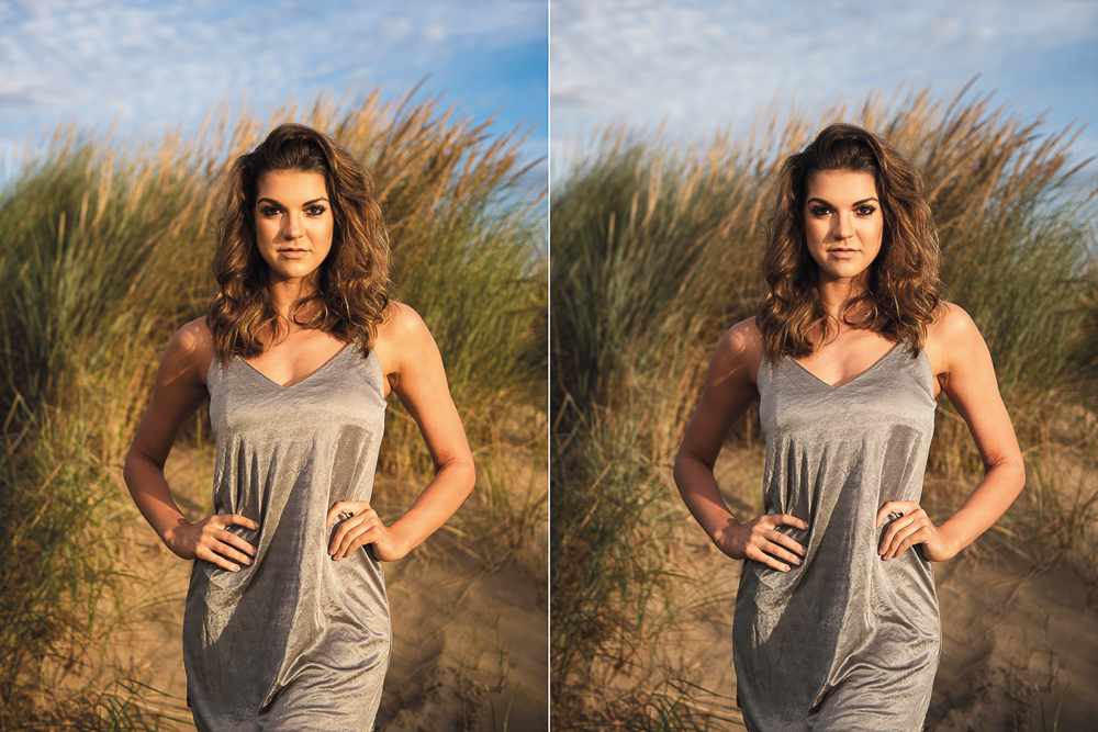
One of the easiest ways to over-edit colour is simply to stare at the photograph for too long.
As you work on an image, your eyes gradually adapt to what you are seeing on screen. An adjustment that initially looks strong can start to appear normal after several minutes.
Use Lightroom’s Before and After view regularly.
Step away from the image, compare the edited version with the original and ask yourself:
Does the colour enhancement actually improve the photograph?
If the answer is difficult to judge, try reducing the adjustment slightly.
Subtle colour is often more convincing than maximum colour.
Don’t assume the natural world is fully saturated
Real-world colour varies considerably.
Light changes throughout the day, atmospheric conditions affect colour, and different surfaces reflect light differently. There is no requirement for every colour in a photograph to be as intense as possible.
In many photographs, allowing some colours to remain muted creates contrast with the stronger colours.
For example, a relatively subdued background can make a colourful subject stand out without requiring extreme saturation.
This is an important principle:
Colour contrast can be more effective than simply increasing colour intensity.
What about saturation and posterisation?
Extreme editing can introduce unwanted artefacts.
Posterisation, sometimes referred to as banding in certain contexts, occurs when smooth tonal or colour transitions become visibly separated into distinct bands.
A classic example is a sky that should contain a smooth transition from one blue tone to another but instead shows visible steps or bands.
Excessive processing can contribute to this problem, particularly when working with heavily edited gradients.
This is another reason to avoid automatically pushing colour adjustments to their maximum values.
When should you use saturation?
Global saturation can be useful when:
- The entire photograph needs more or less colour
- You deliberately want a bold, stylised look
- You are creating a particular artistic effect
- You want to reduce colour intensity across the whole image
- The photograph has relatively consistent colour characteristics
For more precise adjustments, consider using the HSL/Color controls instead of changing global saturation.
When should you use vibrance?
Vibrance can be useful when:
- Your photograph looks slightly dull or muted
- You want to enhance colour without immediately intensifying everything equally
- You are working with portraits
- Some colours are already strong while others are subdued
- You want a more restrained starting point for global colour enhancement
It is still important to judge the result visually. There is no universally correct vibrance setting.
Vibrance vs saturation: which should you use?
There isn’t a single correct answer.
A useful approach is to start with vibrance when the overall colour needs a gentle lift, particularly if your photograph contains a mixture of muted and already-saturated colours.
Use saturation when you want a broader, more obvious change.
And when you only want to change a particular colour, use the HSL/Color controls for greater precision.
You can also use all three approaches together. For example, you might make a small vibrance adjustment, then use individual HSL controls to refine a particular colour.
A simple Lightroom colour workflow
When you are unsure where to start, try this approach:
1. Correct the exposure and white balance
Make sure the photograph has a sound tonal and colour foundation before adjusting colour intensity.
2. Assess the existing colours
Look for colours that are already strong and those that appear muted.
3. Try a small vibrance adjustment
See whether a modest increase improves the overall colour.
4. Check skin tones and important subjects
Make sure people, products or other key subjects still look natural.
5. Use HSL/Color for specific colours
Target individual colours rather than increasing global saturation unnecessarily.
6. Use global saturation carefully
If the photograph genuinely needs a broad colour adjustment, make it deliberately and assess the result at different zoom levels.
7. Compare with the original
Use Before and After to make sure the adjustment has improved rather than simply intensified the photograph.
The most important lesson
The goal of colour editing isn’t necessarily to make colours as vibrant or saturated as possible.
The goal is to use colour deliberately.
Sometimes a photograph needs richer colour. Sometimes reducing saturation creates a better mood. Sometimes leaving muted colours alone makes one important colour stand out.
As you become more experienced, you’ll start noticing these differences in the same way that experienced photographers become more aware of the direction, quality and intensity of light.
And that is a valuable part of developing your photographic eye.