The Golden Ratio in Photography: Does It Really Improve Composition?
Photography is full of compositional rules.
There is the rule of thirds, leading lines, symmetry, negative space, dynamic symmetry, the Golden Ratio and the Golden Spiral. Search online for almost any of them and you’ll find diagrams showing how successful photographs can apparently be explained by drawing a series of lines over the image.
But there is an important question worth asking:
Do these geometric systems actually help us create better photographs, or are we sometimes just finding patterns after the event?
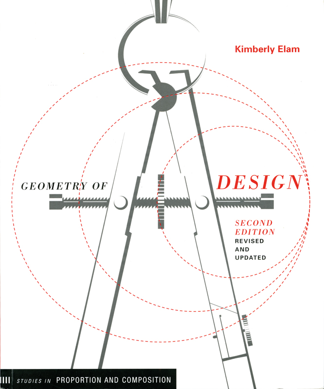
One book that explores this fascinating subject in considerable depth is Geometry of Design: Studies in Proportion and Composition by Kimberly Elam. The revised edition examines the relationships between proportion, geometry and visual design, using examples from graphic design, architecture, illustration and fine art. It covers subjects including the Golden Section, Fibonacci sequence, root rectangles and geometric analysis.
Although the book isn’t specifically about photography, many of its ideas are surprisingly relevant to photographers.
What is the Golden Ratio?
The Golden Ratio is approximately 1:1.618.
It is also known as the Golden Section or Golden Mean and is commonly represented by the Greek letter phi (φ).
One way of visualising it is through a Golden Rectangle. If you remove a square from the rectangle, the remaining rectangle has the same proportions as the original. Repeat the process and you can construct a series of squares and, from them, a spiral.
This is where photographers often encounter the Golden Spiral.
The idea is that important elements of an image can be positioned along, or near, this spiral to create a visually pleasing composition.
It sounds wonderfully scientific.
But that doesn’t necessarily mean it is a recipe for a successful photograph.
The Golden Ratio isn’t a magic composition formula
This is perhaps the most important thing to understand.
The existence of a mathematical relationship does not automatically make an image better.
You can take almost any successful photograph and start drawing geometric shapes over it. With enough imagination, you may find thirds, diagonals, triangles, spirals, circles or other relationships between different elements.
That doesn’t prove that the photographer deliberately constructed the photograph using that system.
And even when a photographer does use a particular geometric framework, it is only one part of the composition.
Subject matter, light, colour, timing, perspective, gesture, emotion and visual storytelling can all be more important to the finished image.
The Golden Ratio is therefore better thought of as a compositional tool rather than a rule.
Why proportions matter in photography
There is another aspect of geometry that photographers encounter every day: the shape of the frame itself.
A photograph isn’t simply a collection of objects. It also exists inside a rectangle.
Change the proportions of that rectangle and you change the relationship between everything inside it.
Compare a square image with a 3:2 landscape photograph. Then compare both with a panoramic crop.
The subject hasn’t changed, but the photograph can feel completely different.
This is why cropping is such an important part of composition.
Sometimes the original camera frame isn’t the most effective shape for the photograph you are trying to create.
Your camera doesn’t always give you the right proportions
Most photographers are familiar with the 3:2 proportions of a full-frame or APS-C camera.
But that isn’t the only proportion we work with.
A photograph might eventually appear as:
- a square social media image
- a 4:5 portrait
- a 16:9 screen image
- an A-series print
- a magazine spread
- a website banner
- a photographic competition entry with its own requirements
The same image can work beautifully in one format and feel cramped or unbalanced in another.
That means composition doesn’t necessarily finish when you press the shutter.
The intended final image space should sometimes be part of the creative decision.
The Golden Rectangle
A Golden Rectangle uses the 1:1.618 proportion.
It’s an interesting shape because it sits between some of the more familiar photographic and print formats.
But don’t feel that you need to force every photograph into it.
If you crop a photograph to a Golden Rectangle and it looks better, that’s useful.
If a 4:5, 3:2, square or completely irregular crop works better, use that instead.
The photograph doesn’t know what mathematical ratio you have chosen.
What about Fibonacci?
The Golden Ratio is closely associated with the Fibonacci sequence.
The sequence begins:
0, 1, 1, 2, 3, 5, 8, 13, 21, 34…
Each number is produced by adding the previous two numbers together.
As the numbers become larger, the ratio between consecutive numbers approaches the Golden Ratio.
Fibonacci patterns are also found in some natural structures, which is one reason the relationship between mathematics, nature and design has fascinated artists and designers for centuries.
But this is where we need to be careful.
The fact that Fibonacci numbers occur in nature doesn’t mean that photographs based on Fibonacci proportions are automatically more attractive.
Mathematics can explain a relationship.
It doesn’t necessarily explain why an individual photograph works.
Geometric analysis
One of the more interesting ideas in Geometry of Design is the use of geometric analysis.
The basic idea is to examine an existing design and look for relationships between its elements.
Lines can be drawn between important points. Shapes can be extended. Margins can be examined. Proportions can be compared.
Suddenly an apparently complicated composition can reveal an underlying structure.
For photographers, this can be a useful exercise.
Take a photograph you admire and don’t simply ask:
“Why do I like this?”
Instead ask:
- Where does my eye go first?
- What leads me there?
- How large is the main subject relative to the frame?
- What is happening around the edges?
- Which elements balance each other?
- Are there repeated shapes?
- Do lines connect different parts of the image?
- Is there symmetry?
- How does the empty space contribute?
- What happens if I change the crop?
You may discover geometric relationships you hadn’t noticed before.
Don’t confuse analysis with a recipe
This is where composition advice can sometimes become misleading.
It is tempting to believe that if we learn enough rules, we will eventually be able to construct a perfect photograph.
Photography rarely works that way.
A geometric framework can help you make decisions, but it doesn’t remove the need to make those decisions.
Consider a portrait.
You might position the eyes according to the rule of thirds. You could also use a Golden Spiral, centre the subject, use symmetry or deliberately place the face close to the edge of the frame.
All of those choices can work.
The question is not:
“Which rule is correct?”
The better question is:
“What does this composition communicate?”
Learn to see relationships
Perhaps the biggest value of studying geometric composition isn’t learning where to put a subject.
It is learning to see relationships.
A small object can balance a much larger one if it has sufficient visual weight.
A bright patch of colour can attract attention from across the frame.
A diagonal can connect two otherwise unrelated elements.
An empty area can give a subject somewhere to move into.
A change in the crop can completely alter the balance of an image.
These things don’t always need a mathematical explanation.
But geometry can give us a useful language for examining them.
Try analysing your own photographs
Here’s a simple exercise.
Choose five photographs of your own that you think work particularly well.
Don’t choose them because they have won awards or received lots of likes. Choose photographs that you believe have good composition.
Now look at them without changing anything.
Then try drawing some simple guides over them.
Mark:
- the centre of the frame
- thirds
- diagonals
- major horizontal and vertical lines
- important shapes
- repeated forms
- significant areas of empty space
- major points of visual weight
You can also experiment with a Golden Rectangle or Golden Spiral.
But don’t try to prove that your photographs obey a particular rule.
Instead, look for patterns.
You may discover that you naturally place subjects in particular areas of the frame. Perhaps you repeatedly use diagonals. Maybe you leave more space in front of a moving subject. Perhaps you prefer symmetry or strongly dislike it.
That information is potentially much more useful than memorising another composition rule.
Composition is about choices
The danger with composition rules is that they can make photography feel like a test.
Put the subject here.
Keep the horizon there.
Use the Golden Ratio.
Follow the leading line.
Don’t put the subject in the centre.
But creative photography doesn’t have to work that way.
The more useful approach is to treat these ideas as tools in a toolbox.
Sometimes the rule of thirds will give you the arrangement you need.
Sometimes symmetry will be more effective.
Sometimes a deliberately uncomfortable composition will communicate something that a perfectly balanced one cannot.
And sometimes the right answer is simply to crop the photograph until it looks right.
The final frame matters
One particularly useful lesson from studying proportion is that photographers should think about the shape of the final image.
Before cropping, ask yourself what the photograph is trying to do.
Does the subject need breathing space?
Would a tighter crop create more impact?
Would a square crop remove distracting areas?
Would a wider frame strengthen the relationship between the subject and its surroundings?
Would changing the proportions make the image feel calmer, more dynamic or more confined?
These decisions are part of composition.
There is no requirement to preserve every pixel captured by the camera.
Should you use the Golden Ratio?
Yes — if it helps you.
But don’t use it because you have been told that the Golden Ratio produces better photographs.
Try it.
Use a Golden Rectangle when cropping an image. Experiment with a Golden Spiral when composing a photograph. Look for Fibonacci relationships in natural subjects.
Then compare the results with photographs composed using completely different approaches.
If you prefer one, you have learned something about your own visual preferences.
And if you discover that you prefer thirds, symmetry, central composition or simply following your instinct, that’s equally useful.
A framework, not a formula
The real value of geometric composition is not that it gives photographers a secret formula for making successful images.
It gives us another way of looking.
Studying proportion encourages us to consider the frame itself, the relationships between objects and the balance of visual elements.
That can make us more conscious photographers.
And consciousness is useful — right up until it gets in the way.
The aim isn’t to look through the viewfinder thinking about Fibonacci numbers.
It is to understand enough about composition that you can make deliberate choices, recognise when something isn’t working and know when to ignore the rules altogether.
Geometry of Design is an interesting starting point for anyone who wants to explore that subject in greater depth. It isn’t a photography manual, but its examination of proportion and geometric analysis offers plenty for photographers to think about.
Ultimately, the most useful composition rule may be a very simple one:
Understand the tools, experiment with them, and then decide for yourself when they help your photograph.