Photography Composition: Think Beyond the Rule of Thirds
By Joe Lenton
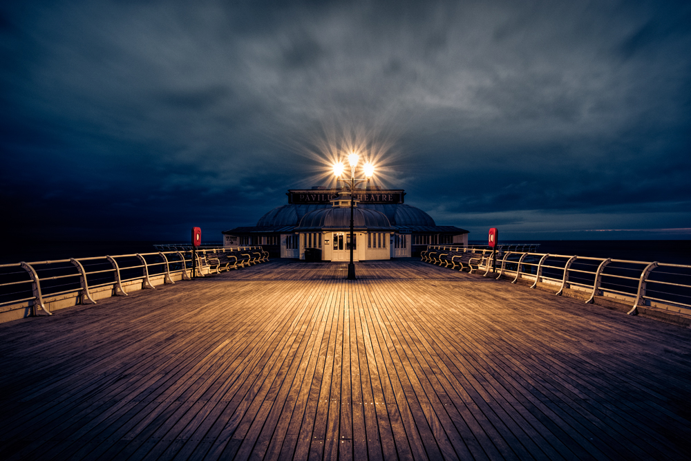
Composition can sometimes feel like a list of rules that photographers are expected to learn before they are allowed to be creative.
The rule of thirds. Leading lines. Balance. The golden ratio. Symmetry.
Learn the rules, apply them correctly and your photographs will supposedly improve.
But composition doesn’t have to work that way.
Rather than thinking of composition as a collection of rules that tell you what you should do, it can be much more useful to think of it as a toolbox.
Different photographs need different tools.
Sometimes placing your subject on a third will work beautifully. Sometimes putting it right in the middle of the frame is exactly what the photograph needs. Sometimes an image works because it is deliberately unbalanced.
The important thing is understanding why you are making the choice.
What is composition in photography?
At its simplest, composition is the way the different elements of an image are arranged within the frame.
But composition is about more than deciding where to put your subject.
It includes the relationship between everything in the photograph: shapes, lines, colour, light, shadows, texture, size, space and visual weight.
Ultimately, composition is about communication.
Every time you make a photograph, you are deciding what to include, what to leave out and how you want the viewer to experience what remains.
Sometimes the purpose is obvious. You might be photographing a client, recording a family moment or creating an image for a commercial brief.
Sometimes the purpose is simply to create something that interests you.
Either way, composition helps determine how that photograph is understood.
Good composition doesn’t necessarily mean following a recognised formula. It means making deliberate decisions about the elements within your frame.
Stop thinking of the rule of thirds as a rule
The rule of thirds is one of the first compositional techniques many photographers learn.
Imagine your frame divided into nine equal sections by two horizontal and two vertical lines. Placing important elements near those lines or their intersections can create an effective and balanced composition.
It works.
But that doesn’t make it a rule.
There are countless successful photographs where the subject is placed centrally, pushed towards the edge, or positioned somewhere that doesn’t correspond to any familiar grid.
The danger comes when the rule of thirds becomes automatic.
If you always place your subject on a third simply because you’ve been told that is where it belongs, you aren’t really making a compositional decision.
You’re following an instruction.
Instead, ask yourself:
Where does this subject need to be for this particular photograph?
Sometimes the answer will be the rule of thirds.
Sometimes it won’t.
Think about what you want the viewer to notice
One of the most useful ways to approach composition is to identify the main point of the photograph.
What do you want the viewer to notice first?
Once you know that, you can decide how the rest of the frame should support it.
You might make the main subject larger.
You might place it against a simple background.
You could use light or colour to draw attention towards it.
You might use lines within the scene to lead the eye towards it.
Or you might deliberately make the subject small within a much larger environment.
There isn’t one correct answer.
The important thing is that the choices work together.
Use size and placement to create importance
Size is a powerful compositional tool.
If one element is much larger than everything else, it is likely to attract attention.
That can be useful when you want a subject to dominate the photograph.
But sometimes making the subject small can be much more effective.
A lone person standing in a vast landscape can communicate isolation or scale in a way that wouldn’t be possible if the person filled half the frame.
Placement works in a similar way.
A subject placed centrally can feel strong, direct and deliberate. Moving it towards the edge can introduce tension or create a sense of space.
Try moving the subject around the frame before automatically settling for the first composition that looks acceptable.
Look for lines and connections
Lines can be extremely useful for controlling how a viewer moves through a photograph.
Roads, fences, buildings, shadows, arms, branches, paths and even the direction someone is looking can all create visual lines.
Sometimes those lines lead towards the main subject.
Sometimes they divide the frame.
Sometimes they create movement from one part of the image to another.
There can also be connections between separate elements.
A person looking towards another subject creates a relationship between the two. A pointing hand can direct attention. A line in the background might appear to connect two objects.
These relationships can help turn a collection of objects into a photograph with a sense of story.
Don’t forget visual balance
Imagine placing physical objects on either side of a set of scales.
A large object on one side might need several smaller objects on the other to create a sense of balance.
Photographs can work in a similar way.
A large, dark or strongly coloured element can have considerable visual weight. A smaller element may balance it because of its position, brightness or colour.
This doesn’t mean every photograph needs to be perfectly balanced.
In fact, deliberately creating imbalance can be extremely effective.
Ask yourself what the photograph needs.
Do you want harmony and stability?
Or would a little tension make the image more interesting?
Once again, composition is about choosing the appropriate tool rather than following a universal rule.
Use colour as part of your composition
Colour isn’t simply something that happens to be present in a photograph. It can be an important part of the composition.
A strong colour can immediately attract attention.
Two contrasting colours can create visual tension, while related colours can create a quieter and more harmonious image.
Look for relationships between colours rather than simply asking whether a scene is colourful.
A bright red object against a muted background, for example, can become the visual anchor of the photograph.
You can also use colour to create balance.
A small area of strong colour may have more visual impact than a much larger area of a muted colour.
Try removing colour altogether
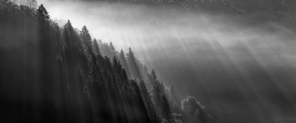
Black and white photography provides another useful way of thinking about composition.
Without colour, the viewer is more dependent on brightness, darkness, shape, texture and form.
This can reveal compositional relationships that might be less obvious in a colour photograph.
A complicated scene may suddenly become much simpler.
Strong shapes can become more prominent. Lines and patterns may become easier to see.
This is one reason black and white can be particularly effective when the strength of an image comes from its structure rather than its colour.
Explore symmetry and the centre of the frame
Central composition is sometimes dismissed as something beginners do before they learn the rule of thirds.
That’s unnecessarily restrictive.
Putting the main subject in the centre can be extremely effective.
It can create a feeling of order, symmetry or strength, particularly when the subject and surroundings support that approach.
Architecture is an obvious example, but central composition can also work with portraits, wildlife, still life and many other subjects.
The lesson isn’t that central composition is always better.
It is that no useful compositional tool should be discarded simply because it doesn’t work for every photograph.
Consider the golden ratio and other frameworks
The rule of thirds isn’t the only way of dividing up a frame.
The golden ratio has been used as a compositional concept in art, design and architecture, while other approaches use grids, diagonals and geometric relationships to organise an image.
You don’t need to memorise every system.
The value comes from experimenting with different ways of looking at the frame.
A compositional framework can help you see relationships between elements that you might otherwise overlook.
Think of these systems as measuring tools rather than laws.
They can help you make decisions, but they don’t have to dictate them.
Composition depends on context
There is no single visual language that every person interprets in exactly the same way.
Our experiences, cultures, interests and expectations all influence how we respond to images.
That doesn’t mean there are no useful compositional principles. It simply means we should be careful about treating them as universal laws.
A photograph created for a particular audience may benefit from familiar visual conventions.
Another photograph might deliberately challenge those conventions.
If you’re creating work for a client, understanding their audience is part of the compositional decision.
If you’re creating personal work, you have much more freedom to experiment.
And if you’re entering competitions, it can be useful to study how successful images communicate without assuming that there is one formula responsible for their success.
Study photographs rather than just learning rules
One of the best ways to improve your composition is to look carefully at photographs.
Don’t just decide whether you like an image.
Ask yourself why it works for you.
Where did your eye go first?
What did you notice next?
How has the photographer arranged the elements?
Is the image balanced or deliberately unbalanced?
What role does colour play?
Are there lines directing your attention?
How much empty space is being used?
What has the photographer deliberately left out?
You can do the same with paintings, films, advertisements, graphic design and other visual media.
The more you analyse images, the more aware you become of the decisions that go into creating them.
Try giving yourself a compositional challenge
Rather than trying to remember every possible technique when you go out with your camera, choose one idea to explore.
For one shoot, try deliberately placing subjects in the centre.
Next time, concentrate on negative space.
Another time, look specifically for lines.
Try photographing only patterns.
Shoot the same subject using both balanced and deliberately unbalanced compositions.
You aren’t trying to discover a new rule.
You’re learning what happens when you change one of the variables in your image.
That experimentation is where composition becomes useful rather than restrictive.
Build your own compositional toolbox
There is nothing wrong with learning established compositional techniques.
The problem comes when we confuse a useful technique with a compulsory rule.
The rule of thirds is a tool.
So are symmetry, leading lines, colour, visual weight, negative space, central composition, contrast, scale and many other approaches.
You don’t need to use all of them.
In fact, you probably shouldn’t.
The aim is to develop enough understanding that you can recognise which tool might help with the photograph in front of you.
Over time, you will probably develop favourites. You may find yourself naturally drawn towards particular types of balance, colour or geometry.
That becomes part of your photographic voice.
Make your photographs deliberately
The most important change may simply be becoming more conscious of the decisions you’re making.
Before pressing the shutter, take a moment to look around the frame.
Is there something distracting the viewer?
Could you move closer?
Would a different viewpoint simplify the image?
Would placing the subject somewhere else make the photograph stronger?
Could colour help?
Would removing an element improve the composition?
You don’t need to spend five minutes analysing every photograph.
Sometimes instinct is exactly what you need.
But the more you understand composition, the more informed that instinct becomes.
Composition isn’t something you have to get past before you can be creative.
It is one of the things that gives you more creative choices.
Learn the rules, certainly.
Then start treating them as tools.