How to Get Accurate Colour When Scanning: A Photographer’s Guide
Scanning a photograph, print or piece of artwork can seem straightforward. Put the original on the scanner, press scan and open the resulting file in Photoshop.
The problem is that getting a scan that looks roughly right is very different from getting one that is genuinely colour accurate.
For photographers, artists and anyone reproducing physical originals, colour management can make a significant difference. A carefully calibrated workflow can give you a much better starting point than relying entirely on automatic scanner adjustments and trying to correct everything afterwards.
Why colour accuracy matters
Every scanner makes decisions about how it interprets the original in front of it.
The scanner has a light source, sensors and software that work together to turn the physical original into digital information. The resulting file is then displayed on your monitor, where another colour-managed system comes into play.
At every stage there is an opportunity for colour to change.
That might mean a subtle shift in skin tones, a change in the colour of a particular pigment or a loss of detail in shadows and highlights.
For everyday scanning, these differences may not matter very much.
If you’re scanning an original artwork for reproduction, however, they can become extremely important.
Automatic scanning isn’t always enough
Modern scanners do a remarkably good job of producing an attractive image with very little effort.
Automatic exposure, colour correction, sharpening and other adjustments can make a scan look good straight away.
That’s useful for everyday work.
The problem is that “looks good” and “matches the original” aren’t necessarily the same thing.
If you’re scanning artwork for reproduction, you generally want the scanner to capture the original as faithfully as possible before you make creative adjustments yourself.
That means taking control of the process rather than allowing the scanner software to make every decision.
What is a colour target?
One of the simplest ways to bring some objective reference into a colour-managed workflow is to use a known colour target.
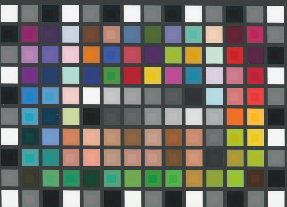
A ColorChecker-style target contains a series of colour patches whose intended values are known.
You can capture or scan the target and compare the resulting values with the reference values.
The differences provide information about how accurately the system is reproducing colour.
The same basic principle is used in many colour-management workflows: rather than relying entirely on your eyes, you introduce something with known characteristics that can be measured.
Using a colour target with photography
Colour targets are particularly useful when photographing artwork or products.
The target should be photographed under the same lighting as the subject.
The resulting image can then be used to create or apply an appropriate camera profile, depending on the software and workflow being used.
Once the lighting remains consistent, that profile can be applied to the other images made under the same conditions.
This can provide a much more controlled starting point than simply adjusting white balance until the image looks right.
It is important to remember that a profile is not a magic correction for every lighting situation. Change the light significantly and the colour response can change too.
Using a profile when scanning artwork
The principle is similar when working with a scanner.
A scanner can be profiled using an appropriate reference target and profiling software. The resulting ICC profile describes how that particular scanner behaves under the conditions used for the profiling process.
The profile can then form part of a colour-managed scanning workflow.
For critical reproduction, a useful approach is to make the scan with unnecessary automatic corrections disabled, apply the scanner’s profile appropriately and then convert the resulting file into a suitable working colour space.
The exact steps depend on the scanner, software and profiling system you’re using, so it’s important to follow the workflow recommended for your equipment.
The underlying principle is straightforward:
Capture as accurately as possible first. Make creative corrections afterwards.
Assigning a profile and converting a file
Two terms that are sometimes confused in colour-managed workflows are assigning a profile and converting to a profile.
They aren’t the same thing.
Assigning a profile tells the software how to interpret the existing numerical colour information. It doesn’t change those numbers.
Converting to another profile changes the colour values so that the appearance can be maintained as closely as possible within the destination colour space.
This distinction matters.
If you assign the wrong profile to a scan, you can dramatically alter how the image appears because the same numerical values are now being interpreted differently.
A properly colour-managed workflow therefore needs you to understand what profile belongs to the source file before deciding what to convert it to.
Why a perfectly calibrated image might not look perfect
One of the most interesting problems with colour management is that technical accuracy and visual preference aren’t always identical.
Consider a portrait.
You might photograph a colour target alongside your subject and produce an extremely accurate technical profile. You then apply that profile to the portrait and discover that the subject’s skin doesn’t look quite as you expected.
The colour measurement may be correct.
The picture may still look wrong to you.
This can happen for a variety of reasons, including the interaction between lighting, makeup, surrounding colours and the way we perceive skin.
Photography isn’t simply about reproducing numbers. The final image still needs to look convincing.
Accurate doesn’t always mean pleasing
This is particularly important with skin tones.
A technical colour-management workflow can help prevent unwanted colour casts, but photographers still need to make aesthetic decisions.
If an image has technically accurate colour but the skin looks unpleasant, the answer isn’t necessarily to accept the result simply because the measurements say it is correct.
The sensible approach is to understand why the difference exists and then make a controlled adjustment.
The important word is controlled.
A small, selective adjustment to a skin tone is very different from making a broad colour correction across the entire image and hoping it works.
Be careful when correcting colour by eye
Our eyes are excellent at judging photographs, but they are also remarkably adaptable.
Look at a warm-coloured room for long enough and your perception begins to compensate for it. Move somewhere with different lighting and the same colour can appear quite different.
This is one reason colour management is useful.
A reference target and measured values give you something objective to work from.
That doesn’t mean you should ignore your eyes.
Instead, use measurement to establish a reliable starting point, then use your judgement to create the final image.
Why artwork can be particularly difficult
Photographic prints are relatively predictable compared with some original artworks.
Paintings can contain pigments with unusual spectral characteristics, and some colours can behave differently depending on the light under which they are viewed.
This is known as metamerism.
Two colours can appear similar under one light source and noticeably different under another.
A scanner also has its own spectral response, which means it doesn’t necessarily “see” an artwork in exactly the same way that the human eye does.
This is one reason why scanning valuable or colour-critical artwork can require more care than simply placing it on a flatbed scanner and pressing Scan.
A good monitor is part of the workflow
There is little point in creating a carefully calibrated scan if the monitor you’re using to judge it is giving you inaccurate information.
Colour management therefore needs to extend beyond the scanner.
For critical work, consider the whole chain:
Original → scanner → ICC profile → working colour space → calibrated monitor → output
Every part contributes to the final result.
If one part of the chain is significantly out of control, it becomes much harder to make reliable decisions.
Don’t try to fix everything in Photoshop
Photoshop is incredibly powerful, but it shouldn’t have to rescue every scan.
If the initial scan has a significant colour error, you may spend a considerable amount of time making corrections, masking individual areas and trying to recover colours that should have been captured more accurately in the first place.
Starting with a good scan is usually much more efficient.
That doesn’t mean the scan has to be absolutely perfect. Some originals will present genuine technical challenges.
It simply means that the better your starting point, the less time you are likely to spend chasing problems later.
A practical workflow for colour-critical scanning
If you’re scanning artwork or photographs where colour accuracy matters, a sensible workflow might look something like this:
- Clean the original and scanner carefully. Dust and marks can become very obvious during scanning.
- Allow the scanner to reach a stable operating condition if the manufacturer recommends doing so.
- Use an appropriate colour target for your scanner and workflow where profiling is required.
- Create or use the correct scanner profile rather than relying entirely on generic corrections.
- Disable unnecessary automatic adjustments when making a critical scan, where your workflow permits this.
- Capture at an appropriate resolution and bit depth for the intended use.
- Open the file in colour-managed software and make sure the correct source profile is being used.
- Convert to an appropriate working colour space where required by your workflow.
- Check the result on a calibrated monitor.
- Make creative corrections only after establishing a reliable technical starting point.
- Compare the digital result with the original under suitable viewing conditions.
- Make a proof or test output if the final purpose is reproduction or printing.
Not every scan needs this level of control.
For a quick family photograph, automatic settings may be perfectly adequate.
For an artwork that is going into a book, exhibition catalogue or fine-art reproduction, the extra care can be worthwhile.
What about an Epson V850?
The Epson V850 Pro featured in the original testing that inspired this article was an example of a high-quality flatbed scanner designed for photographic and film scanning as well as other applications.
However, scanner technology and software change over time, so it’s better not to treat the performance of one particular model as a universal benchmark for scanning today.
The more useful lesson is the workflow behind the test.
A capable scanner is only one part of an accurate reproduction system.
How you profile it, how you scan, how you manage colour afterwards and how you judge the final result can all have a significant effect.
Colour management is about control
You don’t need to measure every colour patch in every photograph you scan.
The appropriate level of colour management depends on what you’re trying to achieve.
For casual scanning, automatic correction may be all you need.
For professional reproduction, however, introducing known references, appropriate profiles and a controlled workflow can make the process far more predictable.
Perhaps the most useful principle is this:
Get the capture as accurate as you reasonably can before you start correcting it.
That applies whether you’re scanning an old photograph, reproducing a painting or preparing an original for a high-quality printed reproduction.
The more accurate your starting point, the more freedom you have to make creative decisions later.