Perspective in Photography: How to Create Realistic Composites
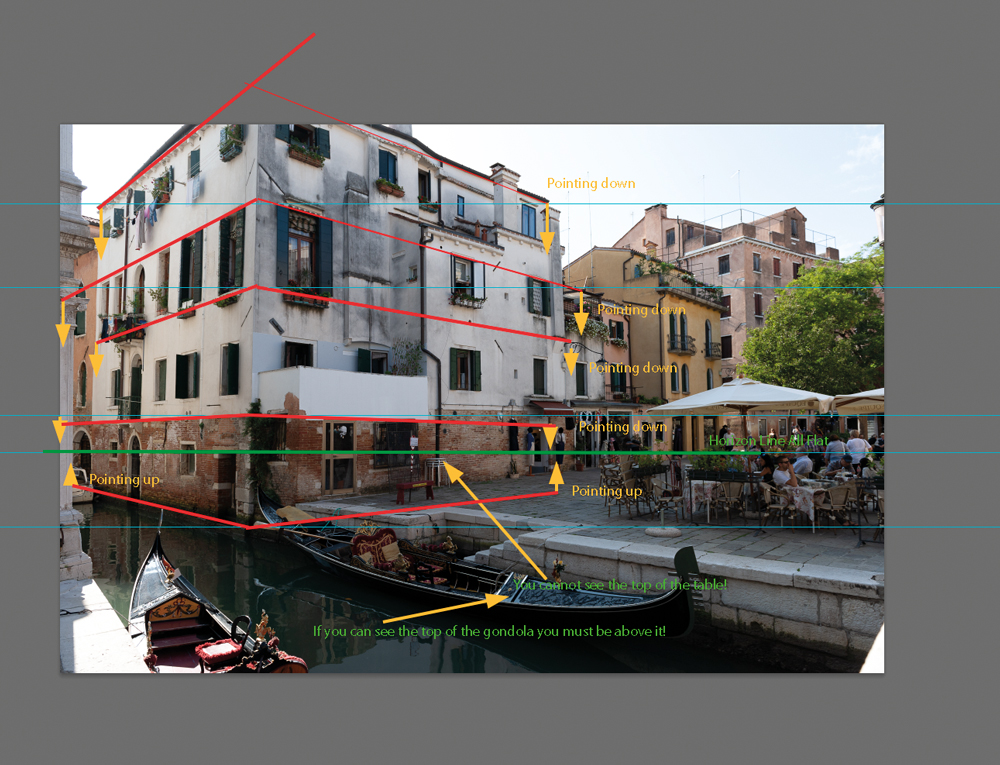
Perspective is one of those things that photographers often understand intuitively without necessarily being able to explain it. We know when something in an image “looks wrong”, but identifying exactly why can be much harder.
This becomes particularly important when creating photo composites.
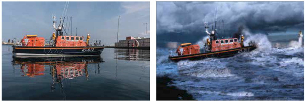
You can have two beautifully exposed photographs, excellent masking and a convincing colour grade, yet the finished composite can still look obviously artificial. Very often, the problem is perspective.
Our eyes are remarkably good at interpreting perspective. We are used to seeing how objects change with distance, how buildings converge towards the horizon and how detail gradually disappears. When those visual cues don’t agree in a composite, the image immediately feels wrong.
Understanding a few basic rules of perspective can therefore make a huge difference to your composite photography.
The seven effects of perspective
There are seven basic effects that help us interpret depth and perspective. The first three are particularly important when photographing or compositing subjects.
1. Convergence
Parallel lines appear to converge as they move into the distance.
Railway tracks are the classic example. Although the rails are physically parallel, they appear to move towards one another as they get further away.
The same effect can be seen when photographing architecture. Look upwards at a tall building and its vertical edges may appear to come closer together towards the top.
Convergence is one of the first things to check when adding a photographed object to a new environment. If the lines in the inserted object don’t agree with the perspective of the background, the composite can quickly look artificial.
2. Foreshortening
Foreshortening occurs when the apparent length or spacing of objects changes because of their position relative to the viewer.
Consider a fence running away from the camera. The gaps between the slats appear progressively smaller with distance, even though the physical gaps are identical.
This becomes particularly important when photographing objects that have significant depth.
A flat photograph of a doorway, window or architectural feature may look perfectly convincing when viewed straight on. However, if you attempt to place it around the corner of a building in a composite, you may discover that simply applying a perspective transformation doesn’t produce the correct result.
The photograph contains real depth that cannot always be reproduced by simply stretching or skewing a flat image.
3. Diminution
Objects appear smaller as they move further away from the viewer.
This sounds obvious, but scale is one of the easiest things to get wrong when building a composite.
A person, animal, building or prop has to be the correct apparent size relative to the surrounding environment. Even a small error can make the subject appear to be standing in the wrong part of the scene.
The key point is that scale isn’t considered in isolation. It works together with the position of the subject and the horizon line.
4. Shadows help establish form
Lighting and shadows provide important information about the shape and position of objects.
When creating a composite, the shadows on the inserted subject need to make sense in relation to the background.
If the background suggests that the sun is coming from the left but the subject has clearly been lit from the right, the composite will feel wrong even if the perspective and scale are perfect.
Shadows also help the viewer understand the three-dimensional form of an object.
5. Detail diminishes with distance
As objects move further away, we see progressively less detail.
Look at a nearby tree and you can see individual leaves, branches and bark texture. Move that tree into the distance and those details gradually merge together.
Eventually, a distant tree may be represented by little more than a mass of colour and tone.
This is particularly useful when compositing.
Imagine photographing a tree at full resolution and then reducing it dramatically in size to place it in the distant background of another photograph. If you leave all the original detail intact, it may actually look less realistic than a slightly blurred version.
The distant tree should contain an appropriate amount of detail for its apparent distance.
This is one reason why blur can be an important compositing tool. However, don’t stop there. Reducing detail also affects the apparent texture and noise of the object, so you may need to add some noise back afterwards to make it sit naturally within the image.
6. Colour and tone change with distance
Atmospheric conditions affect distant objects.
As the distance increases, atmospheric haze can reduce contrast and saturation, often giving distant objects a cooler or bluer appearance.
This provides another powerful depth cue.
If a distant mountain has exactly the same contrast, saturation and colour intensity as a foreground object, it may appear to have been pasted into the scene.
Reducing contrast and saturation, and sometimes cooling the colour balance slightly, can help push an element further into the background.
Again, the effect should be subtle. The goal is to reproduce the visual characteristics of distance rather than apply an obvious filter.
7. Textures and patterns become less distinct
Patterns also lose definition with distance.
A brick wall close to the camera may show individual bricks clearly. Further away, the bricks become harder to distinguish until the wall becomes a relatively uniform texture.
The same applies to grass, paving, fabric, foliage and many other subjects.
When compositing, ask yourself whether the amount of visible texture in each element agrees with its apparent distance from the camera.
Finding the horizon line
The horizon line is one of the most useful concepts when constructing a composite.
In simple terms, the horizon line represents the level of the viewer’s eye. In a photograph, it doesn’t necessarily have to be visibly marked by the physical horizon.
This distinction is important.
A photograph taken indoors can still have a horizon line even though there is no visible sea or landscape horizon.
For a standing photographer, the horizon line will generally correspond to the photographer’s eye level. If the camera is positioned lower, the horizon line moves lower in the scene; if the camera is positioned higher, it moves higher.
Why does the horizon line matter?
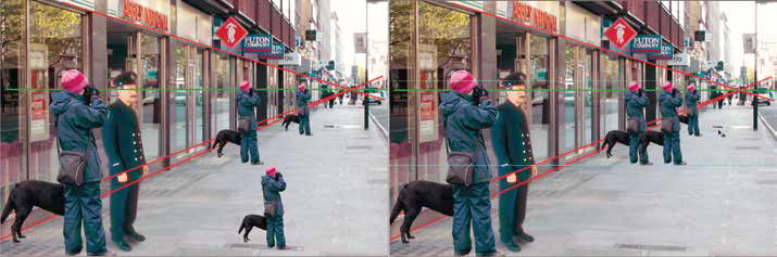
Imagine photographing an adult and a small child.
If the child’s eyes are positioned on the same horizon line as the adult’s eyes, the child can appear unnaturally large. The image is telling our visual system that the child’s eyes are at the same height as the photographer’s.
The same principle applies when adding people or animals to a composite.
You can’t simply resize a person until they look about the right size. Their position relative to the horizon also needs to make sense.
Camera height changes perspective
One of the simplest ways to understand this is to change your own camera position.
Take a photograph while standing up, then take another from a much lower position.
The relationship between the foreground, background and horizon changes significantly.
This is why photographing a subject specifically for a composite is often preferable to trying to make an existing stock photograph fit later.
If you know where the subject will ultimately appear, you can reproduce the camera height and viewpoint much more accurately at the time of capture.
Why straight-on photographs can cause problems
Photographers who create composites often build a library of useful stock images.
Doorways, windows, buildings, trees, clouds, steps, walls, architectural details and other objects can all become valuable ingredients for future projects.
But when photographing these elements, it is tempting to take a single photograph straight on and assume that perspective can be fixed later.
Sometimes it can.
Sometimes it can’t.
The problem becomes particularly obvious when the object has significant depth.
Consider a stained-glass window photographed directly from the front. The photograph shows the window almost exactly as the eye would see it from that position.
Now imagine trying to install that window into an opening viewed from a much more oblique angle.
A simple perspective transformation can alter the shape of the window, but it cannot magically recreate the three-dimensional geometry of the original object.
Parts of the nearer sections may become much more prominent, while sections further away may become partially hidden.
This is why some perspective problems cannot be solved by simply dragging the corners of an image in Photoshop or Affinity Photo.
Shoot for the final perspective whenever possible
If you know that an image is going to be used in a particular composite, the best solution is often to photograph the component specifically for that project.
Before taking the photograph, consider:
- Where will the camera be positioned?
- What will the camera height be?
- What focal length will give an appropriate perspective?
- Where will the subject sit in relation to the horizon?
- What direction is the light coming from?
- How large will the subject appear in the final image?
- What depth of field will be appropriate?
- Will the background need to contain visible texture or detail?
A few minutes of planning at the shooting stage can save hours of manipulation later.
Build a stock library intelligently
You won’t always have the opportunity to shoot specifically for a project.
Photographers often encounter useful subjects while travelling and can build a library of potential composite elements over time.
If you find an interesting doorway, architectural feature, tree, cloud formation, wall or other potentially useful subject, don’t necessarily take just one photograph.
Consider photographing it from several viewpoints.
Shoot from different heights and distances, and where practical record different angles.
This gives you a much better chance of finding a suitable perspective when the image is eventually needed.
It is particularly valuable when visiting somewhere you may never return to.
Don’t rely entirely on perspective transformation tools
Perspective transformation, distortion and vanishing-point tools are extremely useful, but they have limitations.
They manipulate the two-dimensional photograph you already have. They don’t contain all the three-dimensional information that would have been captured from another camera position.
This distinction is easy to overlook.
A window photographed straight on doesn’t contain all the information needed to convincingly reproduce the same window viewed from around a corner.
The more three-dimensional the subject, the more important this becomes.
Making a composite look realistic
Once the perspective is correct, several other factors need to agree.
Match the scale
Check the size of the subject against objects whose dimensions you understand.
People, doors, windows, cars and furniture can all provide useful reference points.
Match the exposure
A subject photographed in bright sunlight will be difficult to integrate convincingly into a darker environment.
Matching exposure and contrast is often more important than achieving an exact colour match at the beginning.
Match the colour
Different photographs may have different white balances, colour casts and levels of saturation.
These differences need to be harmonised.
Match the lighting direction
Look carefully at the shadows in the background.
If the light is coming from one direction, the subject should respond to the same apparent light source.
Reduce distant detail
Background elements generally require less visible detail than foreground subjects.
Blur, reduced texture and carefully controlled sharpening can help establish depth.
Consider atmospheric colour
Distant elements may need reduced saturation, contrast and colour intensity to reproduce the appearance of atmospheric haze.
Check the edges
Poor masking is one of the quickest ways to reveal a composite.
Look closely around hair, clothing, foliage, buildings and other difficult edges. Watch for halos, bright outlines, remnants of the original background or unnaturally sharp edges.
Keep perspective guides in your working file
A useful technique is to create perspective guides on a separate layer at the top of the document.
These can help you check:
- horizon position
- convergence lines
- vanishing points
- architectural angles
- subject placement
- scale
Keeping these guides separate means they can remain available throughout the project without becoming part of the final image.
It is also worth keeping your document organised.
Name your layers and use sensible layer groups. On a complicated composite, good organisation can save considerable time when you need to return to an earlier component or make changes.
Don’t forget the final depth treatment
Once the individual components have been assembled, look at the image as a whole.
Ask whether the depth feels consistent.
You may need to introduce subtle combinations of:
- blur
- noise
- reduced saturation
- reduced contrast
- cooler colour
- atmospheric haze
- tonal adjustments
Be careful with blur, however. Blurring an image also reduces the visibility of its original noise and texture. If everything else in the photograph contains visible grain or digital noise, an aggressively blurred component can look unnaturally clean.
Adding an appropriate amount of noise back can help it integrate with the rest of the image.
Use dodge and burn to control attention
Perspective isn’t only about making the composite technically believable.
It can also be used creatively.
Once the image is assembled, use tonal adjustments such as dodge and burn to guide the viewer towards the important parts of the photograph.
The eye will naturally be attracted to areas with strong contrast, detail, colour and sharpness.
That means you can reinforce the sense of depth by allowing foreground or primary subjects to retain greater visual impact while reducing competing detail in the background.
A practical checklist for realistic composites
Before considering a composite finished, check the following:
Perspective
- Does the horizon line make sense?
- Are convergence lines consistent?
- Is the camera height believable?
- Does the subject have the correct apparent scale?
Depth
- Does detail decrease appropriately with distance?
- Are textures becoming less distinct?
- Do distant elements have appropriate contrast and saturation?
Lighting
- Does the light come from the same direction?
- Do shadows agree between the different photographs?
- Is the quality of the light consistent?
Colour
- Do the components share a believable colour balance?
- Are distant elements appropriately affected by atmospheric haze?
Edges
- Are there halos around the subject?
- Are masks clean?
- Are some edges unnaturally sharp?
Finishing
- Does the noise level match?
- Does the depth of field make sense?
- Have tonal adjustments been used to direct the viewer’s eye?
Perspective is the foundation of a convincing composite
Good compositing isn’t simply about cutting one photograph out and placing it into another.
Every element has to obey the visual rules established by the scene.
Perspective, scale, lighting, detail, colour, texture and depth all work together to tell the viewer where objects are positioned in three-dimensional space.
Get those relationships right and the composite can become remarkably convincing.
Ignore them and even the most technically perfect masking and retouching may not save the image.
The best composite photographers therefore think about perspective before they start editing — and, whenever possible, before they press the shutter.