Colour Theory for Photographers: Harmony, Palettes and Colour Management
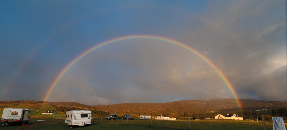
Mike McNamee explores why colour is so difficult to control — and how photographers can use colour theory, palettes and colour management to their advantage.
Colour has fascinated artists and scientists for centuries.
For artists, understanding how colours interact makes it possible to create harmonious paintings, repeat a particular colour mixture and deliberately attract the viewer’s eye. For scientists, the challenge is rather different: how do you describe colour accurately enough that another person, somewhere else in the world, can measure or reproduce the same thing?
For photographers, we sit somewhere between the two.
We want our colours to look beautiful, but we also need to understand what happens to them as an image moves from camera to monitor, from monitor to printer and sometimes from one person’s computer to another.
And this is where colour becomes unruly.
Why is colour so difficult?
Colour seems simple until you try to define it precisely.
Colour wheels have been used for centuries to help artists understand relationships between colours. Isaac Newton famously demonstrated in the seventeenth century that white light could be separated into its constituent spectral colours using a prism.
Since then, countless colour systems have been developed.
There are circular colour wheels, triangular diagrams, cubes, spheres and three-dimensional colour spaces. Different systems have been developed for different purposes because no single diagram can completely describe the complicated relationship between physical light and human colour perception.
This distinction is important.
A colour wheel is extremely useful when deciding which colours work well together. It is much less useful when we need to measure whether one colour is precisely the same as another.
That is where colour science and colour management take over.
Colour harmony and photography
When two colours are placed next to one another, they can influence how we perceive each of them.
This is one reason colour relationships are so important in photography.
A strong red against a green background can create considerable visual tension. Put several closely related greens together and the effect can be much more harmonious.
Photographers can use these relationships deliberately.
A landscape might contain predominantly greens and blues, with a small area of red clothing providing an accent. Although the red object might occupy only a tiny proportion of the frame, it can become the first thing the viewer notices.
This is one of the simplest and most effective ways of using colour to control visual attention.
Complementary colours
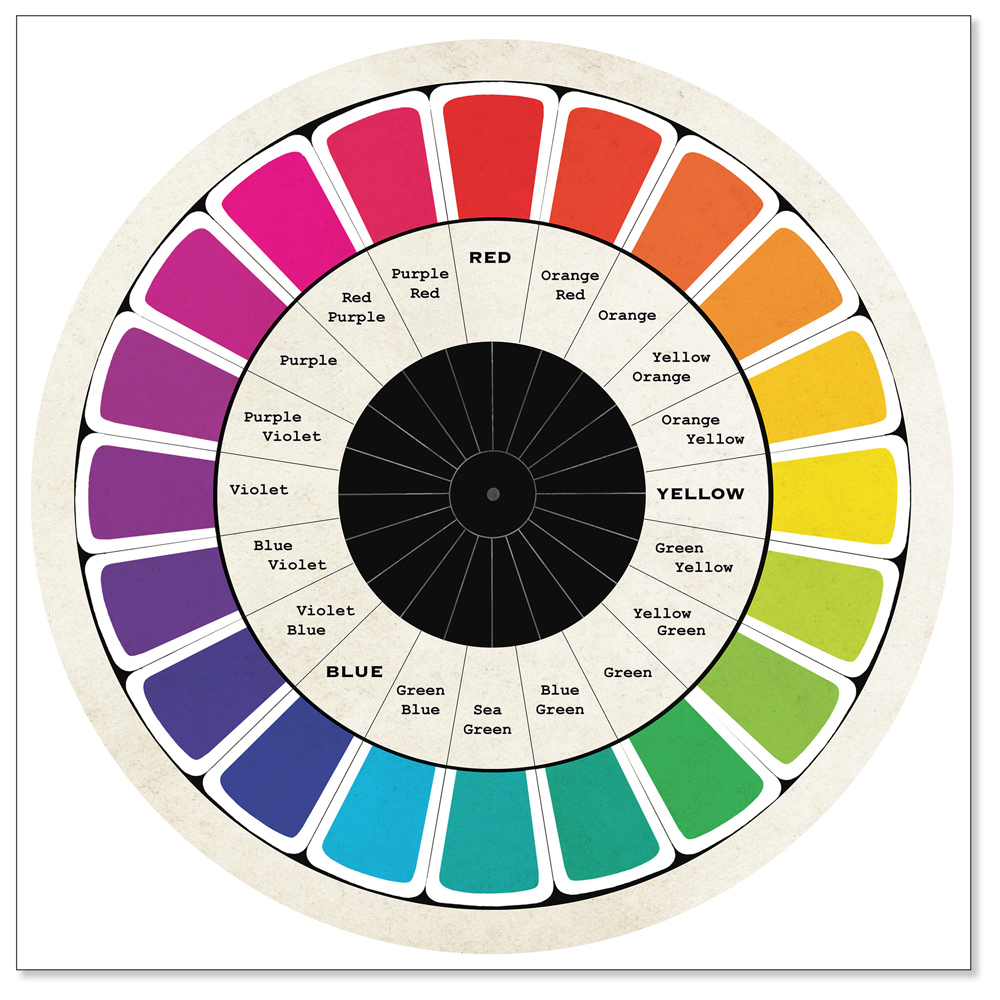
One of the best-known colour relationships is the complementary pair.
Complementary colours sit opposite one another on a colour wheel. Common examples include:
- Red and green
- Blue and orange
- Yellow and violet
Used carefully, complementary colours can produce images with considerable impact.
Think of a warm yellow wall beneath a deep blue sky, or a person wearing a red jacket against predominantly green surroundings.
The important word is balance.
You don’t necessarily need equal quantities of both colours. In fact, using one colour as the dominant tone and its complement as a small accent can often produce a stronger result.
This is particularly useful in photography because the accent colour can become a natural point of attention.
Building a photography colour palette
You don’t need every colour in the rainbow to make an interesting photograph.
In fact, too many competing colours can make an image feel confused.
If you are deliberately creating a series of images, designing an album, producing promotional material or putting together a page layout, limiting the number of dominant colours can help establish a visual identity.
A useful starting point might be three to five principal colours.
You can then introduce variations through:
- Tints – lighter versions of a colour
- Shades – darker versions of a colour
- Tones – colours modified towards a more muted or neutral appearance
- Accents – a contrasting colour used sparingly for emphasis
This approach works particularly well for photographers creating branded marketing material.
For example, if your main promotional image contains muted blue, cream and warm brown tones, those colours can become the starting point for your website, brochure, exhibition graphics or album design.
The photograph itself becomes the source of the visual identity.
Extracting a palette from a photograph
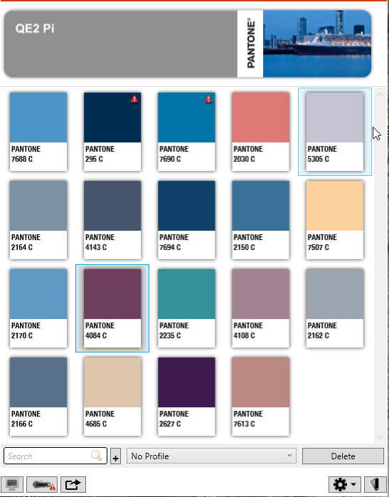
Modern colour tools make this remarkably easy.
Adobe Color, for example, allows you to create colour themes from scratch or extract colours from an image. It can also generate colour combinations using different harmony rules and work with colour values including RGB, LAB and CMYK.
This is particularly useful when designing around an important photograph.
Instead of choosing colours arbitrarily, you can take the colours that already exist in the image and build your design around them.
The result is usually much more cohesive.
This can be useful for:
- Photography websites
- Exhibition graphics
- Wedding albums
- Marketing brochures
- Social media graphics
- Posters
- Model books
- Magazine layouts
- Presentation material
The same principle can also be applied before the photograph is taken.
If you know that an image will eventually be used within a particular design, you can choose clothing, backgrounds and props that establish the colour palette during the shoot.
Colour can guide the viewer’s eye
Colour isn’t just decorative.
It can be used as a compositional tool.
Imagine a predominantly blue and green landscape containing a single person wearing a red jacket. The red is not necessarily important because of the subject itself; it is important because it is different from everything surrounding it.
Our eyes are drawn towards that difference.
Photographers can therefore use colour in much the same way they use:
- Contrast
- Sharpness
- Brightness
- Depth of field
- Lines
- Shape
- Position within the frame
Colour becomes another way of directing the viewer.
This can be done at the point of capture by choosing backgrounds, clothing and props, or later in post-production by carefully adjusting the existing colours.
The key is subtlety.
If every colour is highly saturated, nothing is particularly special.
Understanding colour spaces
This is where colour becomes considerably more complicated.
A photograph doesn’t simply contain “red”, “green” and “blue” in some universal sense.
Digital imaging systems describe colour using defined colour spaces and numerical values. Different colour spaces have different gamuts — the range of colours they can represent.
The familiar RGB colour model is based on combinations of red, green and blue, but the exact colour gamut depends upon the particular RGB colour space being used.
sRGB, Adobe RGB and wider-gamut working spaces therefore don’t represent exactly the same range of colours.
This matters when moving an image between devices and output methods.
A colour that can be represented on a wide-gamut monitor may not be reproducible by a particular printer, paper and ink combination.
What is gamut?
Gamut is essentially the range of colours that a particular device or colour space can reproduce.
This is one of the most important concepts to understand when working with colour.
Your camera may capture colours that your monitor cannot display.
Your monitor may display colours that your printer cannot reproduce.
And your printer may produce colours that cannot be represented in another colour space.
When a colour falls outside the available gamut, something has to give.
The software has to find a way of converting that colour into something the destination system can reproduce.
The result may be a less saturated colour or a change in the relationship between neighbouring colours.
This is why a photograph can look spectacular on one screen but considerably less impressive when printed.
The problem with spectacular colours
Mike’s original article makes an excellent point about the extremely vivid greens that some colour-selection tools can tempt us towards.
A colour can look fantastic as a theoretical digital value but prove impossible to reproduce in the final output.
This is where soft proofing becomes useful.
Rather than waiting until the print arrives, you can use the appropriate output profile to simulate how an image is likely to behave when converted to a particular printing process.
For photographers producing fine-art prints, this can be particularly valuable.
The important lesson is simple:
Don’t choose colours solely because they look impressive on your monitor. Think about where the image is going next.
Why calibration matters
This brings us to colour management.
If you are working seriously with colour, your monitor needs to provide a reliable reference.
Calibration and profiling help establish a known relationship between the computer and the display.
Without this, you could spend considerable time adjusting an image only to discover that another monitor — or your printer — interprets those colours differently.
Colour management becomes particularly important when photographs are being passed between different people.
A photographer might edit an image in the UK, send it to a designer elsewhere in the world, and eventually have it printed by another company.
The goal is to maintain predictable colour throughout that chain.
That is one reason colour management exists in the first place.
CIE colour science: putting numbers to colour
Behind modern colour management is a considerable amount of science.
The CIE 1931 standard colorimetric system provides a mathematical framework for describing colour using tristimulus values.
The familiar CIE chromaticity diagram is often shown as a strange, tongue-shaped area containing the colours visible within the system.
It is fascinating, but it is important to understand what it does — and what it doesn’t do.
The CIE 1931 chromaticity diagram isn’t perceptually uniform. Equal distances on the diagram do not necessarily correspond to equal perceived differences between colours.
This led to later colour spaces, including CIELAB, which were designed to provide a more useful representation of perceptual colour relationships.
The CIEDE2000 colour-difference formula goes further, providing a more sophisticated calculation for estimating how different two colours appear. The CIE describes it as an improved colour-difference formula designed to better correlate with the perceived magnitude of colour differences.
For most photographers, you don’t need to calculate these values yourself.
But understanding that colour can be measured — and that the measurement is more complicated than simply comparing RGB numbers — helps explain why professional colour management can become such a technical subject.
White balance and the neutral point
Photographers encounter another important part of colour science every time they adjust white balance.
A neutral object should appear neutral rather than carrying an unwanted colour cast.
Changing white balance effectively changes the interpretation of the colours in the image relative to the illumination under which they were captured.
In practical photography terms, this is why a photograph made under tungsten lighting can appear excessively orange if the camera is expecting daylight.
White balance corrections move the image towards a more appropriate neutral reference.
The same underlying colour relationships can be represented in different mathematical systems, including the Lab* colour space, where:
- L* represents lightness
- a* represents the green-to-red axis
- b* represents the blue-to-yellow axis
This is one reason colour-management software can describe colours in ways that seem very different from the RGB values photographers normally encounter.
Pantone and communicating colour
For photographers who also work in graphic design, branding or commercial production, another colour system you will encounter is Pantone.
Pantone provides standardised colour references used extensively in areas such as graphic design, printing, textiles and manufacturing.
However, the way photographers access Pantone colours within software has changed.
Adobe and Pantone no longer rely on the old built-in Pantone libraries in Adobe applications. Pantone’s current solution is Pantone Connect, which provides access to its current digital colour libraries and integrates with Adobe Creative Cloud applications through an extension.
Pantone says its current system contains more than 15,000 colours and allows users to work between Pantone values and digital colour representations such as RGB, CMYK, Hex and Lab*.
For photographers, this becomes relevant when an image needs to work alongside an established corporate colour or when a client expects a particular brand colour to be reproduced consistently.
The exact software and subscription arrangements will inevitably change over time, so it is better to regard Pantone Connect as an example of a modern colour-management workflow rather than a permanent software instruction.
Colour is about more than accuracy
It is tempting to think that successful colour management simply means making everything technically accurate.
It doesn’t.
A perfectly accurate colour isn’t automatically a beautiful colour.
Photography is a creative medium, and colour can be manipulated deliberately.
You might cool the shadows, warm the highlights, mute a background or emphasise a particular colour because it strengthens the story.
Colour grading is therefore not necessarily about reproducing reality.
It can be about creating a particular emotional response.
The important distinction is between creative control and accidental colour error.
You want to make the decision.
You don’t want your monitor, printer, software or colour conversion making the decision for you.
Using colour before you press the shutter
Colour theory is particularly powerful when it is considered before the photograph is made.
For portrait photographers, think about:
- What the subject is wearing
- The background colour
- Props
- The location
- The colour of available light
- Complementary or contrasting colours
- Which colour should attract the viewer’s attention
For commercial photographers, the client’s brand colours may provide the starting point.
For wedding photographers, the colour scheme may already be present in the flowers, bridesmaids’ dresses, venue decoration and stationery.
For landscape photographers, colour can help establish depth. Warmer colours often appear to advance while cooler colours can help create a feeling of distance.
None of these rules should be treated as absolute laws.
They are tools.
Using colour after the photograph is made
Post-production provides another opportunity to control the relationship between colours.
You can selectively alter hue, saturation and brightness to strengthen the existing colour structure of an image.
But restraint is important.
If you increase the saturation of every colour, the image can quickly become garish.
A more sophisticated approach is often to decide which colours matter most and allow the others to become supporting players.
You might mute a background so that a subject’s clothing becomes more prominent.
You might introduce a warmer tone into skin while keeping the surrounding environment cooler.
Or you might reduce a distracting colour that competes with the subject.
The best colour adjustments are often the ones the viewer doesn’t consciously notice.
They simply make the image feel right.
Colour tools can help — but they don’t replace judgement
Modern photographers and designers have extraordinary colour tools available to them.
Colour wheels can suggest harmonious combinations.
Image-based palette generators can extract colours from photographs.
Colour-management systems can translate colours between devices and output processes.
Pantone provides reference systems for industries where colour consistency is critical.
And modern printers can produce extraordinarily wide and accurate colour gamuts.
But none of these tools understands your photograph in quite the same way you do.
A software package can tell you that two colours are mathematically related.
It cannot necessarily tell you whether they make the photograph better.
That remains the photographer’s job.
Keeping colour under control
Colour has come an extraordinarily long way.
Modern digital cameras, monitors, printers and colour-management systems allow us to control colour with a precision that previous generations of photographers could scarcely have imagined.
We can extract palettes from photographs, share colour information between applications and maintain considerably more consistency between screens and printed output.
Yet colour remains unruly.
Human colour perception is complicated. Different devices have different gamuts. Printing processes have limitations. Software can introduce unexpected conversions. And, perhaps most importantly, other people may be making decisions about our photographs without fully understanding the colour workflow.
So stay vigilant.
Understand your colour spaces.
Calibrate your monitor.
Soft-proof when the final output matters.
Think about colour relationships when you shoot.
And most importantly, remember that colour isn’t simply something that needs to be corrected.
It is one of the most powerful creative tools available to a photographer.
Use it to create harmony.
Use it to create contrast.
Use it to establish mood.
Use it to create depth.
And, when appropriate, use a single splash of colour to make sure your viewer looks exactly where you want them to look.