Acrobat Colour Management: Why PDF Colours Can Look Wrong
If you work with photography and print, there are few things more likely to produce a cold sweat than a PDF that suddenly doesn’t look the same as the image you created.
You can have a perfectly colour-managed Photoshop file, an InDesign document that looks right and a contract proof that agrees with both of them – and then open the finished PDF in Acrobat and discover that somebody has turned the saturation knob to eleven.
This happened to us while producing Professional Imagemaker, and the eventual cause was one of the more bizarre software problems we encountered.
It started with a red dress
The problem appeared while we were preparing a magazine cover.
A photograph containing a red dress looked perfectly normal in Photoshop and InDesign. However, once the PDF was opened in Acrobat, the red became noticeably more vibrant.
That immediately raises all sorts of horrible possibilities.
Had the Photoshop colour profile been wrong? Had InDesign converted something incorrectly? Was the PDF export using the wrong settings? Had something happened during the conversion to the press-ready file?
Fortunately, we had a contract proof which agreed with the original Photoshop image, so it was increasingly clear that the problem was not actually in the artwork.
Then we discovered something rather more worrying.
It wasn’t just the cover. Acrobat was displaying all our PDFs with colours that looked wrong.
And this was happening at exactly the point in the production process when you really don’t want to be questioning whether your PDF is correct.
When the PDF and the original disagree
Colour management exists to make sure that colour information is interpreted consistently between different devices and applications.
A photograph might contain an embedded ICC profile which tells the software how its RGB values should be interpreted. A PDF can contain images and other objects using different colour spaces, and PDF/X workflows can also contain an Output Intent describing the intended output condition.
Acrobat’s current colour-management system takes these colour spaces and profiles into account when displaying and processing PDF content.
That means that when two applications display the same PDF differently, you shouldn’t immediately assume that somebody has accidentally changed the photograph.
The problem can be in the way the application is interpreting or displaying the colour information.
And that was exactly what made our particular problem so difficult to diagnose.
The great Acrobat investigation
We tried the obvious things first.
Acrobat was restarted. The computer was restarted. Acrobat was uninstalled and reinstalled. Adobe’s cleaning utilities were used. Different PDF builds were produced and compared.
Nothing solved the problem.
The workstation was also working hard in unusually hot weather, with its cooling fans running constantly, so even the computer itself became a suspect.
We went through different combinations of export settings, colour profiles and PDF workflows. There were trial PDFs everywhere, annotated with notes about what had been changed and what had happened.
The magazine deadline, naturally, continued to approach at exactly the same speed it always does when something is going wrong.
Eventually the magazine went to press and, thankfully, everything turned out correctly.
But the Acrobat problem remained.
For months we had to rely on other applications, physical proofs and other people’s eyes to reassure us that the colours were actually correct.
The really strange part
Eventually, after more searching, we came across reports from other Acrobat users describing very similar problems with excessively saturated colours.
What followed was the sort of troubleshooting sequence that makes you question whether you’re fixing software or performing an obscure ritual.
One suggestion involved changing Acrobat’s security settings. Another suggested that zooming the PDF in a particular way could somehow cause the colour display to change.
We tried it.
And, astonishingly, the colour management appeared to return.
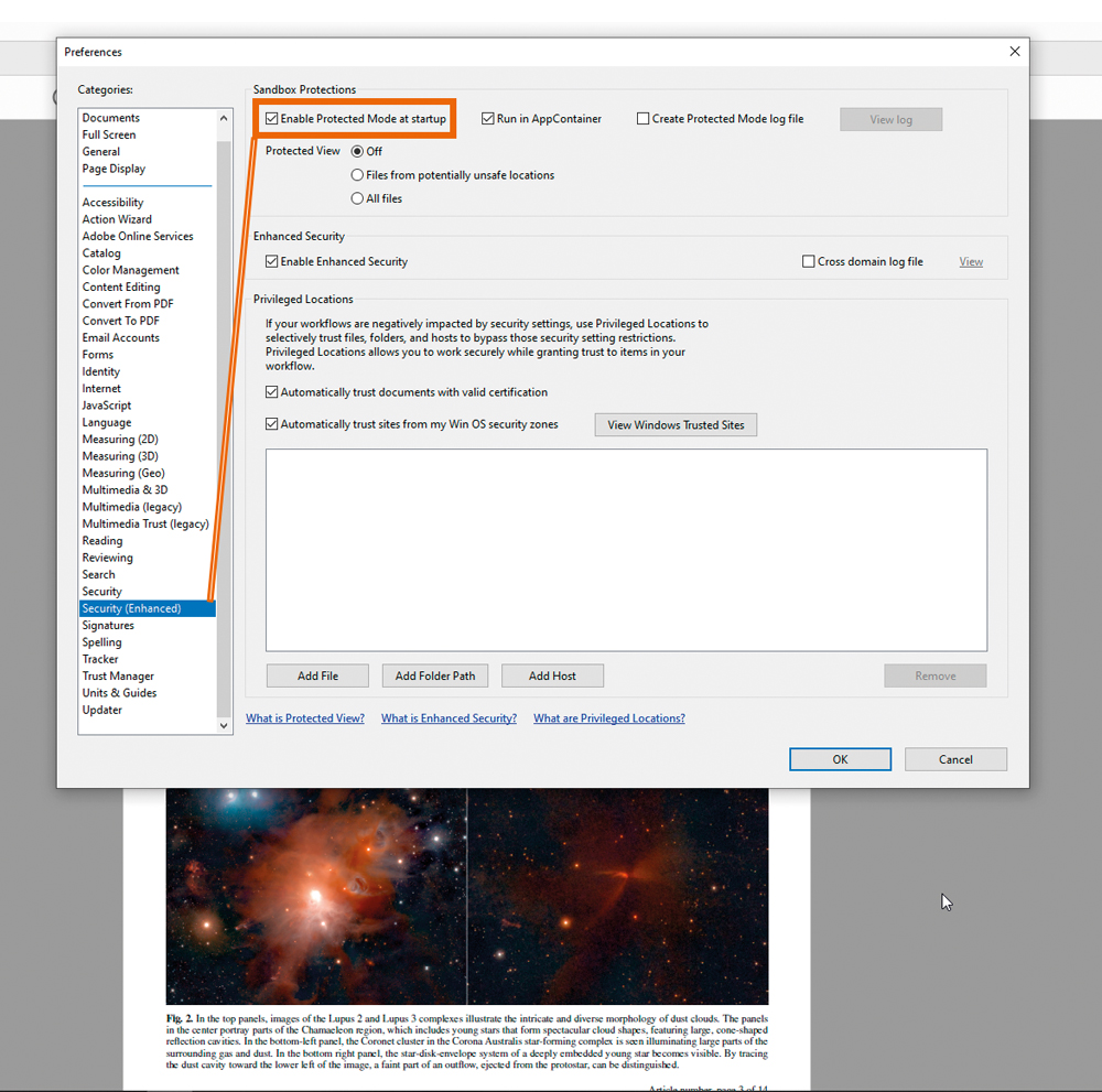
There was a particularly bizarre sequence involving zooming to 100 per cent and changing the Acrobat sandbox/security settings. It appeared to work – at least temporarily.
That was both a relief and deeply unsatisfactory.
Why disabling Acrobat’s security isn’t a proper solution
This is an important part of the story to treat differently today.
Acrobat’s sandbox and enhanced-security features exist for a very good reason. PDFs are no longer simply static pages. They can contain interactive elements, scripts and other functionality, and Adobe uses security restrictions to reduce the risk of malicious content.
Adobe currently recommends keeping Protected Mode enabled and describes it as an important security feature.
So while disabling security happened to be part of our historical troubleshooting process, it isn’t something I’d recommend as a general solution to a colour-management problem.
If Acrobat is behaving strangely, it is much better to establish whether the problem is genuinely with the PDF, the application’s colour-management settings, the monitor or the viewing environment.
Check the PDF rather than trusting one screen
This is perhaps the most useful lesson from the whole episode.
If you’re preparing a PDF for professional printing, don’t make a critical colour decision simply because something looks right or wrong in the normal Acrobat window.
Acrobat Pro provides Output Preview, which allows you to inspect colour separations, colour warnings and the effect of different output conditions. It can also simulate things such as paper colour and overprinting.
For a print workflow, this is considerably more useful than simply staring at the PDF and wondering whether the red looks a little too red.
A properly calibrated and profiled monitor is also important. Adobe notes that accurate ICC profiles are fundamental to reliable colour management, because otherwise the same colour information can be interpreted differently by different applications and devices.
Don’t forget the PDF itself
There are several places where colour can go wrong in a photography-to-print workflow.
For example:
- the original image may have an embedded profile that isn’t being handled as expected
- images and other objects in the PDF may use different colour spaces
- an export preset may convert colours when you weren’t expecting it
- the PDF may contain an Output Intent intended for a particular printing condition
- the monitor may not be accurately calibrated
- the application displaying the PDF may not be rendering the colours correctly
- you’re looking at the PDF under conditions that make colour judgement unreliable
Adobe’s current documentation explains that Acrobat uses embedded colour profiles where available and can use the Output Intent in PDF/X files when managing colour.
That is why a good print workflow involves checking the document at several stages rather than assuming that the final PDF window is the absolute authority.
The irony of the whole thing
The original problem produced one of those wonderfully ridiculous situations that you couldn’t make up.
The article that prompted all this was about an extraordinary astronomical image produced from more than a million images captured by the European Southern Observatory’s VISTA telescope.
The image showed young stars emerging from thick clouds of dust, using infrared wavelengths to reveal structures that ordinary visible light cannot easily see.
The accompanying material described measurements of stellar movement on an almost absurdly precise scale – effectively measuring something comparable to the width of a human hair from around 10 kilometres away.
In other words, spectacularly clever science.
And yet here we were, looking at the resulting PDF and wondering why a red dress looked wrong.
There is something wonderfully appropriate about discovering a colour-management problem while looking at an image produced using technology capable of seeing through astronomical clouds of dust.
Software isn’t always the weakest link
The experience also reinforced something that anyone involved in photographic production eventually learns.
When something looks wrong, don’t immediately start changing everything.
Work backwards.
Is the original image correct?
Does the image look correct in Photoshop?
Does it look correct in the layout application?
Does the exported PDF contain the expected colour information?
Does Acrobat’s Output Preview show the expected result?
Does another PDF viewer behave differently?
Does a physical proof agree with the screen?
That process can save a huge amount of unnecessary editing.
If the original image is correct and the print proof is correct, but one application displays the PDF incorrectly, the temptation to start altering the photograph is potentially disastrous.
You can end up “correcting” an image that wasn’t wrong in the first place.
The bigger lesson about colour management
Colour management is one of those subjects that tends to become interesting only when it goes wrong.
When everything works, nobody notices it.
A properly profiled photograph goes into a properly configured layout, becomes a correctly exported PDF and eventually becomes a printed page that looks as expected.
Wonderful.
But when one part of that chain stops behaving, suddenly you need to understand ICC profiles, colour spaces, rendering intents, PDF/X, Output Intents, soft proofing and the capabilities of the software you’re using.
Acrobat’s current colour-management tools are considerably more comprehensive than simply opening a PDF and looking at it. Acrobat Pro provides colour conversion controls, rendering-intent options and print-production tools for examining how colour will be handled.
The important thing is to use those tools as part of a controlled workflow rather than trying to fix colour by eye.
And yes, software bugs happen
The original Acrobat problem eventually became one of those stories that was almost funny once the magazine had safely gone to press.
At the time, it was anything but funny.
A production deadline doesn’t care whether the problem is caused by your colour profile, your PDF export, your monitor, your operating system or an obscure application bug. The PDF still has to go to the printer.
The lesson isn’t that Acrobat is inherently unreliable. It is that even mature, professional software can occasionally behave in ways that make absolutely no sense.
So if your carefully colour-managed PDF suddenly looks wildly oversaturated in one application, don’t panic and start rebuilding your photographs.
Check the workflow first.
And if the PDF is being prepared for print, use the proper colour-management and output-preview tools rather than trusting a single on-screen view.
That might just save you from a very long afternoon – and a few more grey hairs.