What Photographers Can Learn from Picasso’s Guernica
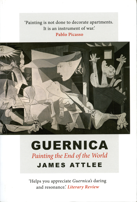
Guernica – Painting the End of the World by James Attlee
Few paintings have been examined, interpreted and reinterpreted as extensively as Pablo Picasso’s Guernica.
Painted in 1937 in response to the bombing of the Basque town of Guernica during the Spanish Civil War, it has become one of the most recognisable anti-war images in the world.
But Guernica is interesting to photographers for reasons that go beyond its historical importance.
Look closely at the painting and you can find lessons about composition, contrast, symbolism, visual storytelling and perhaps most importantly, the fact that an image doesn’t necessarily need to explain everything to communicate something powerful.
An image doesn’t have to tell you everything
One of the fascinating things about Guernica is that its individual elements have been interpreted in many different ways.
What does the horse represent?
What does the bull represent?
Why is the figure holding a lamp?
What is happening to the people?
There are plenty of interpretations, but Picasso himself was not always consistent when discussing the meaning of individual elements.
That uncertainty is important.
As photographers, we sometimes become obsessed with making sure the viewer understands exactly what we intended.
But an image can be successful without providing a single, definitive answer.
Photography can leave room for the viewer to bring their own experiences, emotions and assumptions to the picture.
Sometimes that makes an image more powerful rather than less.
Composition can create emotion
Guernica is not a calm, neatly arranged scene.
The composition is crowded with fractured bodies, angular shapes, distorted faces and overlapping forms.
There is a tremendous amount of visual tension.
This is a useful lesson in composition.
We often learn photography composition through rules: thirds, leading lines, balance, symmetry and so on. These are useful tools, but composition is ultimately about controlling how the viewer experiences an image.
A photograph intended to communicate confusion, fear or chaos probably shouldn’t necessarily feel perfectly calm and orderly.
The arrangement of elements within the frame can become part of the story.
Look at the shapes
One of the most useful things a photographer can do when studying Guernica is temporarily forget what the individual figures represent.
Look at the shapes instead.
There are triangles, diagonals, curves and sharp angular forms. Figures overlap and intersect. Light and dark areas divide the painting into different zones.
This is composition stripped back to its fundamentals.
The same exercise works with photography.
Take one of your own images and imagine that all of the detail has disappeared. What would remain?
Perhaps a dark triangle created by a shadow.
A bright rectangle formed by a window.
A diagonal created by a road.
A circular shape created by a person’s head.
A series of repeated vertical lines.
Those shapes can determine how we move through the photograph.
Black and white can strengthen the visual structure
Guernica is famously monochrome.
That wasn’t simply an aesthetic choice. The lack of colour contributes to the stark, documentary quality of the work and makes us concentrate on luminosity, contrast and form.
Photographers can learn something from this.
Remove colour from a photograph and ask yourself whether the composition still works.
If colour was doing all the work of separating your subjects, attracting attention or guiding the eye, the photograph may suddenly become much less effective.
But if the image still works through its shapes, tones, contrast and relationships, you have a much stronger underlying composition.
Monochrome can therefore be a useful way of analysing your own photographs, even when you ultimately intend to keep them in colour.
Contrast doesn’t just make an image dramatic
Contrast is one of the strongest visual tools available to both photographers and painters.
In Guernica, the restricted tonal palette makes the light and dark areas particularly important.
Photographers can use the same principle.
A bright subject surrounded by darker tones will attract attention. A deep shadow can conceal information and create mystery. A highlight can isolate an important detail.
But contrast also affects mood.
Hard tonal transitions can create tension. Softer transitions can feel calmer and more subtle.
The question isn’t simply whether an image has enough contrast.
It’s what the contrast is doing.
Symbols can make a photograph say more
Another important lesson from Guernica is the power of symbolism.
A photograph can communicate more than what is literally visible.
A broken object might suggest loss.
An empty chair might suggest absence.
A discarded child’s toy might suggest innocence.
A particular gesture might suggest fear, grief or resistance.
These associations aren’t universal, and that’s precisely why symbolism can be so interesting.
The viewer completes part of the story.
For photographers, the challenge is to avoid making every symbol so obvious that there is nothing left to discover.
The photograph doesn’t have to show the whole story
One of the most powerful things about visual storytelling is that you don’t necessarily have to photograph the event itself.
You can photograph its consequences.
You can photograph a detail.
You can photograph an object.
You can photograph someone’s reaction.
You can leave part of the story outside the frame.
This is particularly relevant to documentary and editorial photography.
The strongest image from an event isn’t always the one containing the most information. Sometimes a carefully chosen detail tells us more because it makes us think about what happened outside the frame.
Learn from artists outside photography
Photographers can sometimes become too focused on looking at other photographers.
Of course, studying great photography is essential. But painters, sculptors, filmmakers, illustrators and designers have spent centuries thinking about visual communication too.
Picasso’s Guernica is an excellent example.
So are the works of artists such as Caravaggio, Rembrandt, Goya and many others.
Look at how painters use:
- Light
- Shadow
- Shape
- Colour
- Negative space
- Perspective
- Gesture
- Repetition
- Visual hierarchy
Then ask how those ideas might translate into photography.
You don’t need to reproduce the style.
You are simply expanding your compositional vocabulary.
There is no single way to interpret an image
Photography is often discussed as though there is a correct interpretation.
The photographer intended X, therefore the viewer should see X.
Realistically, things aren’t always that simple.
A photograph can acquire meanings that the photographer never anticipated.
Different viewers can see the same photograph in completely different ways.
That doesn’t necessarily mean the photographer has failed.
Sometimes it means the photograph has enough visual and emotional depth to support different readings.
Guernica demonstrates this particularly well.
Its continued relevance comes partly from the fact that people have repeatedly found ways to connect it with their own time.
The idea of the ‘new Guernica’
One of the fascinating aspects of Guernica is the number of later works that have deliberately referenced or reinterpreted it.
Artists have created their own versions in response to very different crises and conflicts.
That tells us something important about visual language.
A powerful image can become a kind of visual vocabulary.
Once people recognise its structure and symbolism, artists can borrow, adapt and challenge it to talk about something new.
Photographers do this too.
A familiar visual reference can give a new photograph another layer of meaning, provided the reference is relevant and deliberate.
Photography can be more than decoration
Picasso famously rejected the idea that painting existed simply to decorate a room, describing painting instead as an instrument of war.
Photography has also played a significant role in recording conflict, exposing injustice and shaping public opinion.
But the broader lesson doesn’t only apply to war photography.
Photography can challenge, question, provoke, celebrate, document or simply make us look more carefully at something we might otherwise ignore.
The photographer decides what to include.
The photographer decides what to leave out.
The photographer decides where to place the viewer.
Those decisions are acts of communication.
Study Guernica as a photographer
You don’t need to be an art historian to learn from Guernica.
Spend a few minutes looking at the painting and ignore the historical explanation.
Instead, ask yourself:
Where does my eye go first?
Why?
What is the strongest shape?
Where are the darkest areas?
Where is the lightest?
What creates tension?
What has Picasso chosen not to show?
How would the image change if it were in colour?
What would happen if some of the elements were removed?
Then take the same approach with one of your own photographs.
You may discover that your photograph contains far more compositional information than you initially realised.
The bigger lesson
Guernica has survived as a powerful visual statement for generations because it does more than record an event.
It communicates emotion.
It creates questions.
It uses composition to control our attention.
It leaves room for interpretation.
And it has become a visual reference point that later artists can use to talk about their own time.
Those are useful lessons for photographers.
A technically perfect photograph can still be empty.
A powerful photograph doesn’t necessarily need to explain everything.
Sometimes the most effective image is the one that gives the viewer just enough information to begin asking questions.