How to Use a Colour Checker for Better White Balance and Consistent Colour
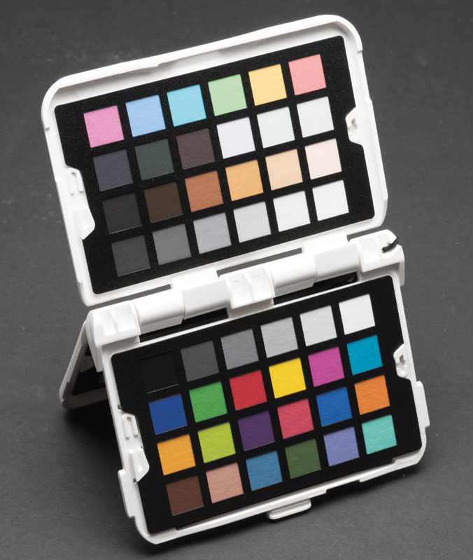
Getting colour right in photography sounds simple.
Set the white balance, take the photograph and adjust it later if necessary.
In practice, it can be rather more complicated.
Different light sources have different colour characteristics, cameras interpret colour differently, and the colours around your subject can influence what you see. Even two photographs taken minutes apart can require noticeably different adjustments if the lighting has changed.
This is where a colour checker can be useful.
A colour checker gives you a set of known reference colours that you can photograph alongside your subject. You can then use those references to establish a more consistent starting point for your RAW files.
But there is an important qualification.
A colour checker is a tool, not a magic button.
Used properly, it can be extremely useful. Used without understanding what it is doing, it can introduce just as much confusion as it removes.
What is a colour checker?
A colour checker is a photographic reference target containing a series of colour and neutral patches.
Some patches represent familiar colours such as skin tones, foliage and sky, while others cover different parts of the colour and tonal range.
The neutral patches can be used to help establish white balance and exposure, while the wider selection of colours can be used for more sophisticated camera profiling and colour correction.
Products vary considerably in their design and software, but the basic principle is the same:
Photograph a known reference under the same lighting as your subject, then use that reference to help correct or profile the image.
This is particularly useful when shooting RAW.
Why use a colour checker with RAW files?
RAW gives you considerable control over white balance and colour during processing.
That is one of its major advantages.
However, having the ability to change something later doesn’t necessarily mean you should leave everything to guesswork.
If you photograph a reference target under the same lighting as your subject, you have something objective to work from.
Instead of asking:
“Does that white look about right?”
you have a known reference in the photograph.
This can be particularly valuable for:
- Portrait photography
- Product photography
- Commercial photography
- Copying artwork
- Studio photography
- Food photography
- Catalogue photography
- Multi-camera shoots
- Any situation where colour needs to remain consistent
For casual photography, you may never need one.
For work where colour consistency matters, it can become a very useful part of the workflow.
A colour checker isn’t just a fancy grey card
A grey card and a colour checker perform related but different jobs.
A neutral grey reference can be useful for establishing exposure and white balance.
A colour checker adds a much wider range of known colours.
That gives you the opportunity to go beyond simply asking whether the overall image has a warm or cool cast.
You can also investigate how the camera is rendering particular colours.
This is important because correcting white balance doesn’t necessarily correct every colour in the photograph.
You could have a perfectly sensible white balance while still having some colours reproduced differently from the original scene.
Start with white balance
The simplest use of a colour checker is establishing white balance.
Photograph the target in the same light as your subject.
The important words here are same light.
The target needs to be illuminated by the light you are trying to measure.
If your subject is standing beside a window but the colour checker is in direct sunlight, the reference isn’t telling you about the same illumination.
Likewise, if your subject is lit by a flash but the target is sitting outside the effective area of the light, the result won’t necessarily be useful.
Once you have photographed the target, use a neutral patch to establish a white balance in your RAW-processing software.
This gives you a much more reliable starting point than simply choosing a temperature because the image looks slightly warm or cool.
Photograph the target before photographing the subject
It doesn’t need to be complicated.
Place the colour checker where the subject will be, make sure it is receiving the same light, and take a reference photograph.
You can then photograph your subject normally.
If the lighting remains consistent, that reference frame can be used for the rest of the sequence.
If the lighting changes significantly, photograph the target again.
This is particularly useful during long shoots where daylight is changing or when moving between different lighting setups.
Pay attention to the angle of the target
One of the easiest mistakes is assuming that the target is receiving perfectly even illumination because the scene looks evenly lit to your eyes.
It may not be.
A slight change in angle can affect how light falls across the target, particularly with directional lighting.
Reflections can also become a problem.
The target should be positioned so that it is receiving the intended light without producing unwanted reflections or glare back towards the camera.
With studio lighting, this is relatively straightforward.
With natural light, particularly outdoors, it can require more care.
Don’t let your own clothing contaminate the result
This sounds slightly obsessive until you see how easily reflected colour can affect a reference target.
If you are standing close to the target wearing a brightly coloured jacket, that colour can potentially be reflected back onto the target.
The same applies to brightly coloured surfaces nearby.
A neutral environment is preferable when taking a reference photograph.
You don’t need a laboratory.
You simply need to avoid introducing obvious sources of colour contamination.
Exposure matters too
A colour checker can also provide useful information about exposure.
The neutral patches give you known tonal references that can help you assess whether the image has been exposed sensibly.
This is particularly useful in controlled photography.
However, don’t assume that a particular grey patch must always be placed at one universal RGB value.
Different targets can use different reference values, and the appropriate value also depends on how the target and software are designed to work together.
This is one reason why it is important to understand the instructions for the particular target you are using.
Don’t assume that every grey patch is the same grey.
Creating a camera profile
This is where colour checking becomes considerably more sophisticated.
Some colour-checking systems allow you to create a camera profile using the photographed target.
The profile describes how the camera is rendering the reference colours and allows compatible RAW-processing software to compensate for some of those differences.
The basic process is:
- Photograph the colour target under controlled lighting.
- Make sure the target is correctly exposed.
- Process the reference image according to the profiling software’s instructions.
- Create the camera profile.
- Apply the profile when processing your photographs.
- Make further creative adjustments as required.
The exact process varies between manufacturers and software.
The important thing is that a camera profile is different from simply clicking a white-balance eyedropper.
White balance deals primarily with the overall colour temperature and tint.
A profile can address a much wider range of colour behaviour.
Don’t confuse calibration with making an image look good
This is one of the most important points.
Technically accurate colour and aesthetically pleasing colour aren’t necessarily the same thing.
Suppose you photograph a sunset.
The warm orange light is part of the photograph.
If you completely neutralise that warmth because the colour checker says the light is warm, you may end up with an image that is technically closer to a neutral reference but visually much less successful.
The same applies to portraits, landscapes and creative photography.
A reference target gives you a controlled starting point.
It doesn’t tell you what your finished photograph should look like.
Once the technical correction has been made, you can still make creative decisions.
Accuracy depends on the lighting
A colour checker cannot compensate for every problem in the lighting.
If your target is receiving uneven illumination, the reference measurements become less reliable.
This is particularly important with larger targets.
Ideally, the target should be illuminated as evenly as possible.
In a studio, that might mean carefully positioning and balancing the lights.
Outdoors, soft overcast conditions can provide relatively even illumination, but even then it is worth checking the target carefully.
Don’t assume that something which looks evenly lit to your eyes is necessarily perfectly even.
What about mixed lighting?
Mixed lighting is one of the situations where colour management becomes particularly difficult.
Imagine a portrait subject illuminated partly by daylight from a window and partly by a tungsten lamp.
There isn’t necessarily one white-balance setting that will make both light sources neutral.
A colour checker can’t change the physical lighting.
It can help you understand what the camera is seeing, but sometimes the better solution is to control the lighting itself.
Where possible, try to keep the illumination consistent.
A colour checker can save time later
The biggest practical advantage may not be achieving laboratory-level colour accuracy.
It may simply be consistency.
Imagine photographing 200 products under the same lighting.
If you photograph a colour reference at the beginning of the session, you have a useful reference for processing the entire batch.
The same principle applies to a portrait session.
Rather than individually guessing the colour of every photograph, you can establish a sensible starting point and synchronise the basic corrections across the set.
That can save considerable editing time.
You don’t need to photograph the target in every frame
If the lighting remains unchanged, there is usually little point in having the colour checker permanently visible in every photograph.
A reference photograph at the beginning of a lighting setup may be sufficient.
Photograph it again whenever something important changes:
- The light source changes
- The position of the subject changes significantly
- The lighting ratio changes
- You move outdoors or indoors
- The weather changes substantially
- You change the lighting setup
The reference frame then becomes part of your workflow rather than something that has to clutter every photograph.
Look after your colour checker
A colour reference is a measurement tool.
That means you should treat it with some care.
The printed patches are not indestructible.
Avoid:
- Touching the colour patches unnecessarily
- Getting the target dirty
- Spilling liquids on it
- Leaving it in strong sunlight for long periods
- Storing it somewhere excessively hot or damp
Colour references can age.
If the physical colours change, the reference data supplied by the manufacturer no longer perfectly describes what is actually in front of your camera.
For that reason, don’t treat a colour checker as something that can be thrown into the bottom of your camera bag and forgotten about for ten years.
Do you need one?
Not necessarily.
If you mainly photograph landscapes, street scenes, family photographs or personal projects, you may never feel the need for a dedicated colour reference.
Your RAW-processing software already gives you extensive control over white balance and colour.
But a colour checker becomes more useful when consistency matters.
It can be particularly valuable for:
- Commercial photographers
- Product photographers
- Portrait photographers
- Studio photographers
- Photographers working with artwork
- Photographers producing images for reproduction
- Anyone photographing large batches under controlled lighting
The more important colour consistency becomes, the more useful a reference target can be.
A colour checker isn’t a substitute for a calibrated monitor
There is another important distinction.
A colour checker helps you establish and evaluate colour in the captured image.
Monitor calibration deals with how that image is displayed on your screen.
They are different parts of the colour-management chain.
You could photograph a target perfectly and create an excellent camera profile, then look at the resulting photograph on a poorly calibrated monitor and make incorrect adjustments because the display is misleading you.
For serious colour-critical work, the whole workflow needs consideration:
Light → Camera → RAW processing → Monitor → Output
Each stage can introduce differences.
How accurate do you actually need to be?
This is where photographers sometimes disappear down a very deep rabbit hole.
It is possible to measure colour differences extremely precisely.
You can compare reference values, calculate colour differences and build sophisticated profiles.
That can be fascinating if you enjoy the technical side of photography.
But most photographers aren’t photographing laboratory samples.
They are photographing people, products, landscapes, buildings and real-world scenes.
The goal should be to achieve a reliable and repeatable workflow that produces photographs which look right for their intended use.
Don’t let the pursuit of technical perfection stop you from taking photographs.
The important thing is consistency
A colour checker is most useful when you understand what problem you are trying to solve.
If you simply want a reliable white-balance reference, you don’t necessarily need the most complicated colour-management system available.
If you need highly consistent colour reproduction for commercial or reproduction work, you may need a much more comprehensive profiling workflow.
There is no single correct level for every photographer.
Start with the problem.
Then choose the appropriate tool.
A simple colour-checker workflow
For many photographers, the process can be surprisingly straightforward:
1. Set up your lighting.
Get the lighting as consistent as possible before taking the reference photograph.
2. Position the colour checker.
Place it where the subject will be and make sure it receives the same light.
3. Photograph the target.
Take a properly exposed reference photograph.
4. Photograph your subject.
Continue shooting while the lighting remains consistent.
5. Establish white balance.
Use the neutral reference in your RAW-processing software.
6. Create a profile if required.
If your workflow requires more sophisticated colour correction, use the appropriate profiling software.
7. Make your creative adjustments.
Once the technical starting point is established, make the photograph look the way you want it to look.
8. Repeat when the lighting changes.
A new lighting situation requires a new reference.
Don’t make colour management more complicated than it needs to be
The temptation with colour management is to keep going.
Once you discover that you can measure one thing, you discover another thing that can be measured. Then another.
Before long you can spend more time worrying about colour than taking photographs.
A colour checker is a useful tool because it gives you something concrete to work from.
Use it when it solves a genuine problem.
Understand what the reference patches are telling you.
Keep your lighting consistent.
And remember that calibration is there to give you a reliable starting point — not to make creative decisions for you.
Good colour management should make photography easier, not more complicated.