How to Choose Paper for Black and White Photography
There is a surprisingly simple answer to the question of which paper is best for black and white photography: there isn’t one.
Unlike some specialist papers of the past, modern inkjet papers are not fundamentally designed for either colour or monochrome. A good photographic paper should be capable of producing an excellent monochrome print as well as a colour one.
That doesn’t mean paper choice is unimportant. Far from it.
The paper is the final physical surface on which your photograph exists, and its characteristics can have a considerable effect on how the image looks and feels. The right choice depends on the photograph, the tonal range you need, the viewing conditions and the appearance you want the finished print to have.
Start with the photograph
Before choosing a paper, look carefully at the image you are going to print.
A photograph containing deep shadows may benefit from a paper capable of producing strong blacks and good shadow separation. A delicate high-key portrait might be better suited to a paper with a softer appearance.
Likewise, a highly detailed landscape may not benefit from a heavily textured surface if the texture begins to compete with fine detail.
Think about the photograph first and the paper second.
Paper colour matters
At the lightest end of a monochrome print there may be very little, or no, ink on the paper. The colour of the paper itself therefore becomes part of the image.
Papers can range from cool or bright whites through neutral whites to warmer cream-coloured bases. This can have a subtle but important effect on the appearance of a black and white photograph.
A warm paper can complement a portrait or give a nostalgic feel to a documentary image. A bright, cool white can make a contemporary architectural or landscape photograph feel cleaner and more graphic.
Neither is inherently better.
The important thing is that the paper colour works with the photograph.
What about optical brighteners?
Optical brightening agents, often abbreviated to OBAs, are used in some photographic papers to make the surface appear brighter or whiter.
Whether that matters to you depends on the type of print you are making.
For some photographers, the brighter appearance is desirable. Others prefer papers with a more natural, stable base, particularly when producing fine art prints intended for long-term display.
It is worth checking the manufacturer’s specifications rather than assuming that a brighter-looking paper is necessarily the better choice.
Gloss, lustre or matt?
Surface finish is one of the most obvious differences between papers.
Glossy and lustre surfaces can produce strong blacks and a high degree of apparent contrast. They can be particularly effective for photographs containing a wide tonal range, fine detail and deep shadows.
Matt and textured fine art papers have a very different character. They generally produce a softer-looking image and can give a print a more tactile, traditional appearance.
There is no universal winner.
A dramatic monochrome landscape might look superb on a high-quality lustre or baryta paper, while a quiet portrait could become much more interesting on a soft matt surface.
The paper should complement the photograph rather than simply being chosen because it is fashionable.
Dmax and the importance of deep blacks
Dmax is a measure of how dark a printed surface can become. In simple terms, a higher Dmax generally means the paper can produce deeper blacks.
This is particularly relevant to monochrome photography because the difference between a convincing deep black and a slightly washed-out shadow can have a major effect on the image.
But maximum black density isn’t the whole story.
A photograph can have very deep blacks and still fail if all the shadow detail has disappeared. What matters is the combination of black density and the ability to distinguish subtle tones above black.
When assessing a paper, don’t simply ask:
How black is the black?
Also ask:
How much detail can I still see in the shadows?
Shadow detail and highlight separation
Monochrome prints depend heavily on the relationship between tones.
At one end you have the paper white and highlights; at the other, the deepest shadows. Between them is the grey scale that gives the photograph its structure.
A good print should allow you to see useful separation throughout this range.
This is one reason that a paper which produces spectacularly deep blacks isn’t necessarily the best paper for every photograph. If your image relies on subtle shadow detail, a slightly softer paper may actually produce a more satisfying result.
The same applies to highlights. A delicate portrait containing pale skin, white clothing and bright backgrounds can be easily damaged if subtle differences between light tones disappear.
Texture can change the photograph
Fine art papers come in an enormous range of surfaces, from almost completely smooth to heavily textured.
Texture can add character to a print, but it should be considered part of the composition.
Imagine a photograph of misty mountains with delicate clouds. A heavily textured watercolour paper might introduce a surface character that competes with those subtle details.
On the other hand, the same type of paper could be wonderfully effective for an expressive portrait or an image deliberately intended to resemble a traditional art print.
Texture isn’t automatically an improvement. It is another visual element.
Think about how the print will be displayed
The intended use of the print should also influence your choice.
A print destined for a portfolio box can be treated differently from one that will be framed and displayed on a wall. An image going into an album has different practical requirements again.
Consider:
- How reflective do you want the surface to be?
- Will the print be viewed behind glass?
- Does the paper need to withstand frequent handling?
- Will the print be mounted?
- Does the texture complement the image?
- Is the paper substantial enough for the presentation you have in mind?
The physical qualities of the print matter just as much as the image itself.
Don’t choose paper by looking at somebody else’s photograph
Paper manufacturers quite reasonably produce sample books showing what their papers can do.
They are useful, but remember that the photograph has been selected to demonstrate that particular paper.
A photograph that looks beautiful on a warm, textured matt surface doesn’t necessarily mean your photograph will.
Your own image is the best test.
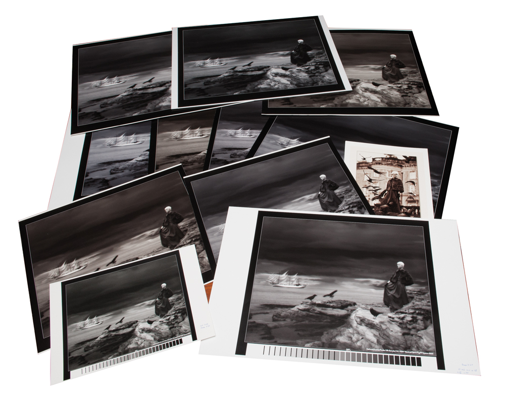
If possible, print the same photograph on several different papers and compare them side by side. The differences can be much more obvious when the image, rather than the paper, remains constant.
There is no single ‘black and white paper’
The old idea that monochrome photographs need a particular type of paper is misleading.
Modern inkjet systems can produce excellent black and white prints on a wide variety of surfaces. The printer doesn’t know that you have chosen a monochrome image; it simply follows the instructions in its print workflow.
What matters is how the combination of printer, inks, paper and profile produces the tonal range you need.
This is also why a paper marketed primarily for colour photography can produce an outstanding monochrome print.
A monochrome print has its own grey scale
When you make a black and white print, the grey ramp runs from the colour of the paper at the highlight end through the intermediate greys to the character of the ink set in the deepest shadows.
In a well-controlled system, the transitions should be smooth and subtle.
This is one area where modern inkjet printing has developed enormously. Today’s systems can produce extremely sophisticated monochrome prints, with smooth tonal transitions and levels of control that would have been difficult to achieve with many traditional printing processes.
That doesn’t make the old processes irrelevant. Traditional silver-based prints, particularly carefully made and toned darkroom prints, still have a character that many photographers love.
But digital printing gives us an extraordinary range of surfaces and tonal possibilities.
Don’t forget the ink set
The paper isn’t working in isolation.
The appearance of a monochrome print depends on the interaction between the paper, printer, inks and print driver or profile. Two papers that look very similar when held in the hand can produce quite different results when printed.
The same applies to different printers.
This is why paper reviews and recommendations should be treated as a starting point rather than a guarantee. A combination that works beautifully in one photographer’s workflow may not produce exactly the same result in another.
Test before committing to a large print
The best way to evaluate a paper is to print your own photograph on it.
Ideally, choose an image that contains:
- deep shadows
- subtle midtones
- delicate highlights
- areas of fine detail
- any skin tones or other subjects that are important to your work
Then compare the results under sensible viewing conditions.
Don’t just look at which print appears to have the deepest blacks. Look at the overall balance of the image. Are the shadows open enough? Do the highlights retain detail? Does the paper colour complement the photograph? Does the surface add something, or distract from it?
And don’t forget to look at the print from normal viewing distance. A paper that looks spectacular under a desk lamp at 30cm may not necessarily be the best choice when the finished photograph is framed on a wall.
Your favourite paper may not be my favourite paper
This is perhaps the most important point.
There are excellent glossy, lustre, baryta, matt and textured papers available, but photographers don’t all want the same thing from a print.
Some want maximum contrast and deep blacks. Others prefer a softer, more traditional appearance. Some want a warm paper base, while others want the cleanest possible white.
The photograph itself should ultimately make the decision.
Choose the paper to suit the image
One of the great pleasures of digital monochrome printing is the sheer range of possibilities.
You can produce a highly detailed black and white landscape on a smooth, high-Dmax paper, then print a completely different photograph on a textured fine art surface and get an entirely different character.
There is no need to find one paper and use it for everything.
Instead, think of paper as another creative decision.
The conversion to monochrome determines how the photograph uses its tones. The print process determines how those tones are reproduced. The paper then becomes part of the final presentation.
The best paper is not necessarily the one with the highest Dmax, the whitest base or the most impressive texture. It is the one that helps your particular photograph become the print you intended it to be.