How to Use Colour in Photography Composition
By Joe Lenton
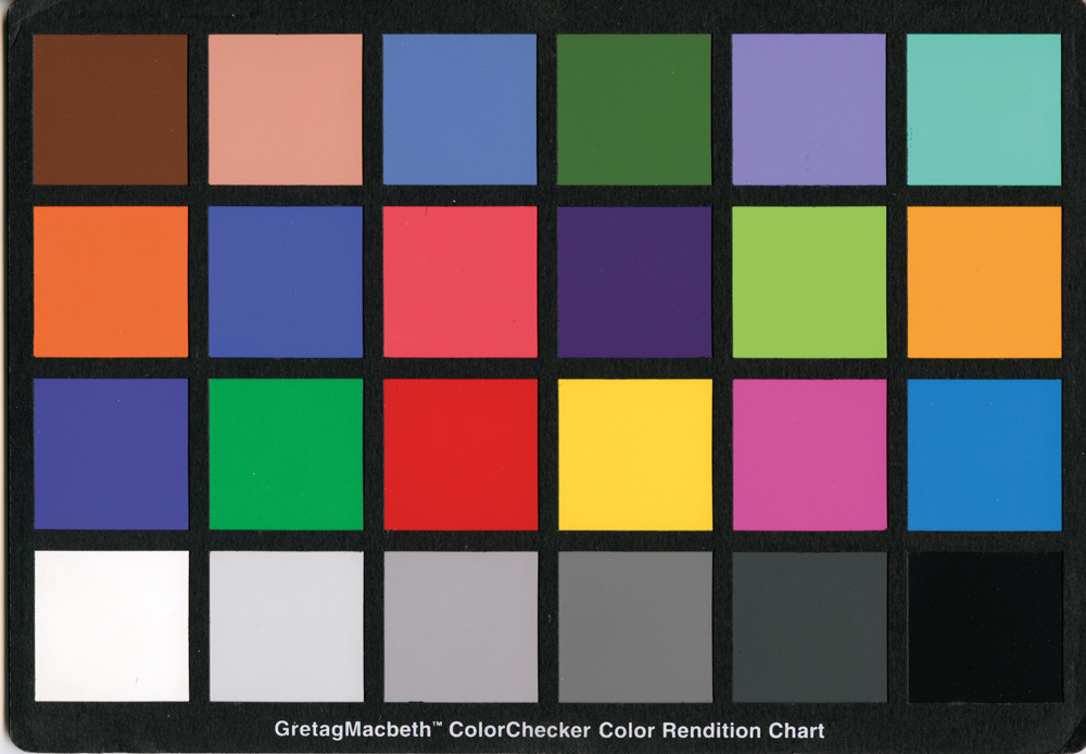
Colour is one of the most powerful compositional tools available to a photographer.
We often take it for granted because we see in colour all the time. But colour can do much more than make an image look attractive. It can create mood, guide the viewer’s eye, establish harmony, separate a subject from its surroundings and even change our perception of what we are looking at.
Learning to see colour deliberately can therefore make a significant difference to your photography.
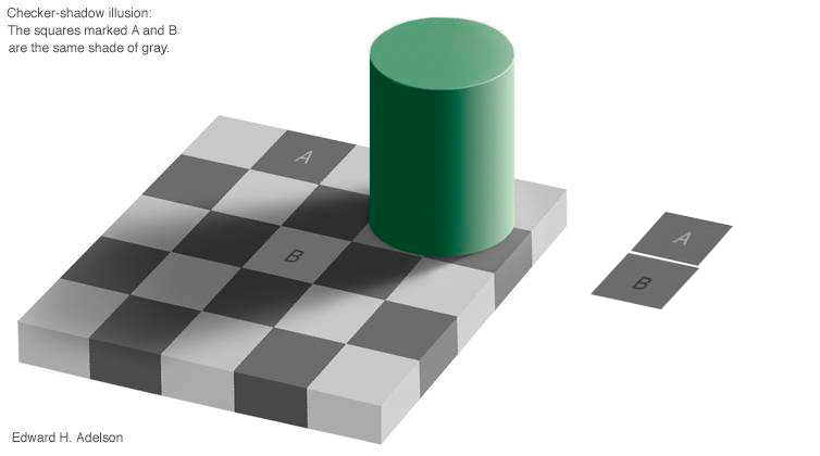
Colour can change the way we see an image
Our perception of colour isn’t fixed.
The colours surrounding an object can influence how we perceive its colour, brightness and even its apparent intensity. Put the same colour against different backgrounds and it can appear remarkably different.
This is one reason colour can be such an effective compositional tool.
A relatively dull colour can appear much stronger when surrounded by a contrasting colour. Conversely, a strong colour can become less dominant when placed amongst other intense colours.
Artists have understood this for centuries.
Rembrandt, for example, frequently surrounded faces with darker tones. Part of the effect was practical — his palette had limitations — but the result was also highly effective visually. The lighter subject appears to emerge from the darker surroundings.
The same principle can be applied to photography.
Instead of simply asking whether the colours in a photograph are accurate, ask what those colours are doing.
Use colour to guide the viewer’s eye
One of the simplest ways to use colour compositionally is to give your main subject a colour that stands out from its surroundings.
Imagine a predominantly blue or green scene containing a person wearing a red coat.
The red is likely to attract attention.
That doesn’t mean red is inherently more important than every other colour. It is the relationship between the red and the colours surrounding it that creates the effect.
This can work particularly well in street photography, travel photography and environmental portraits.
Look for:
- a single bright colour amongst muted surroundings
- warm colours against cool colours
- a brightly coloured subject against a neutral background
- repeated colours that lead the eye through the frame
- small areas of strong colour that provide visual accents
The key is to notice these relationships before you press the shutter.
Think about the mood of colour
Colour can influence the emotional response to a photograph.
Red might suggest warmth, energy, passion or danger.
Green can suggest nature, freshness, growth or calm.
Blue might suggest coolness, tranquillity, water or sadness.
Yellow can feel bright, optimistic and energetic, while darker or more muted colours can create a more subdued atmosphere.
But these aren’t fixed rules.
Context matters.
A red flower doesn’t necessarily suggest danger. A blue photograph isn’t automatically sad. The meaning of a colour depends on the subject, the surrounding colours, the light and the story being told.
Rather than memorising a list of meanings, it can be more useful to develop your own awareness of how different colours make you feel.
Try making a simple list for yourself.
What does red suggest to you?
What about blue, green, yellow, orange or purple?
Then look at photographs and paintings and see whether your reactions change according to the context.
Use complementary colours for contrast
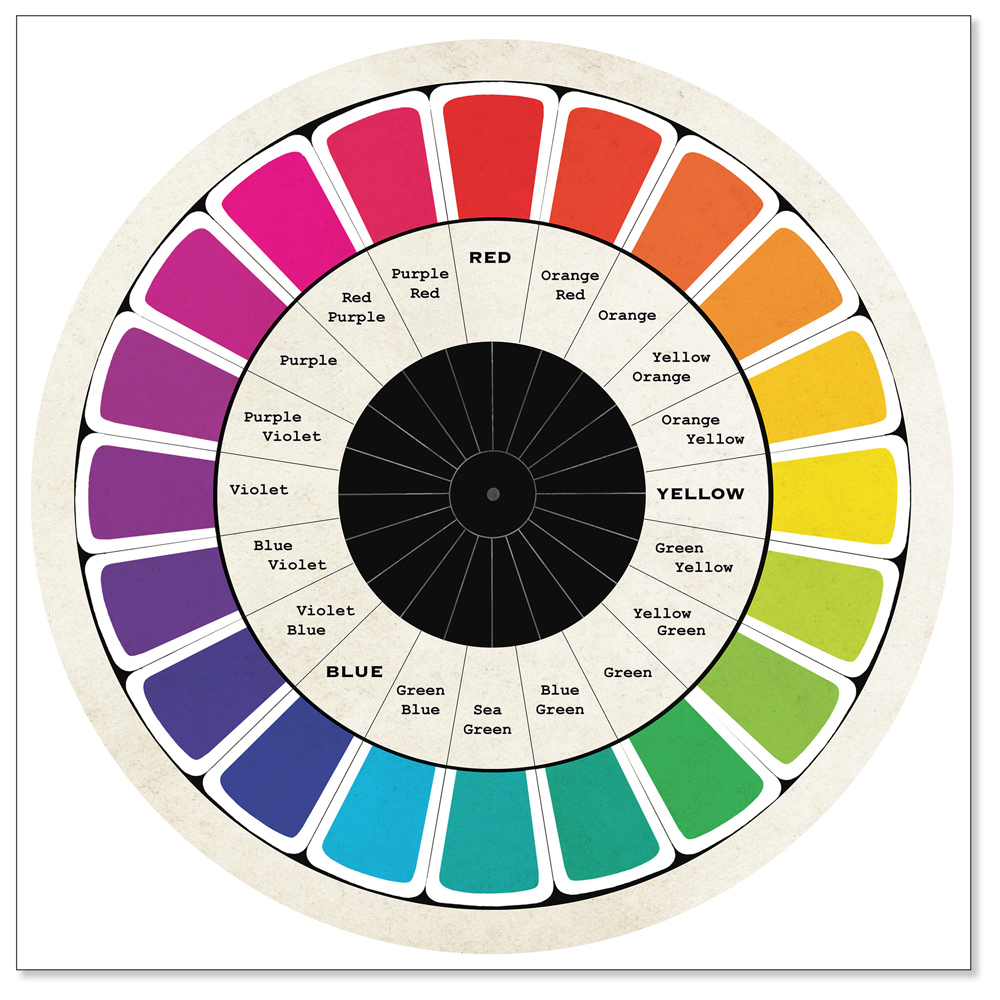
The colour wheel is a useful tool for understanding relationships between colours.
Complementary colours sit opposite one another on the wheel. Familiar examples include:
- red and green
- blue and orange
- yellow and purple
Putting complementary colours together creates strong visual contrast.
This is one reason a blue subject against an orange background can be so effective.
You don’t necessarily need two large areas of colour, either. A small splash of a complementary colour can provide a powerful accent.
This can be particularly useful in photography because real-world scenes often contain naturally occurring complementary relationships.
Look for blue skies against warm buildings, orange light against blue shadows, or red clothing against green surroundings.
Once you start looking for these combinations, you will begin to see them everywhere.
Try analogous colours for harmony
Not every photograph needs strong colour contrast.
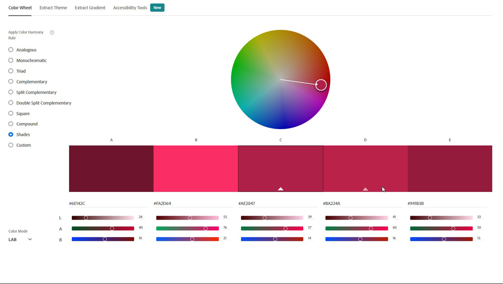
Analogous colours sit close together on the colour wheel and can create a more harmonious, unified appearance.
For example, an image dominated by blues, greens and blue-greens can feel very different from one built around reds, oranges and yellows.
This can be particularly effective for landscapes, interiors, still life and lifestyle photography.
Instead of looking for the strongest possible colour contrast, you are deliberately building a restricted palette.
The result can feel calmer and more cohesive.
Warm and cool colours can create depth
Colour can also help create the impression of depth.
Warm colours such as reds, oranges and yellows often appear to advance visually, while cooler blues and blue-greens can appear to recede.
This isn’t an absolute rule, but it can be a useful compositional device.
For example, a warm-coloured subject against a cooler background can help separate the subject from its surroundings.
Atmospheric conditions can reinforce this effect. Distant objects often become less distinct and shift towards cooler, bluer tones as atmospheric haze increases.
You can therefore combine colour with perspective and atmospheric depth to create a stronger sense of space.
Don’t be afraid of a restricted palette
Photographers sometimes assume that a successful colour photograph needs lots of different colours.
It doesn’t.
A restricted palette can be extremely effective.
Look at the work of many painters and photographers and you will find images built around just a few dominant colours.
A limited palette can make an image feel more deliberate and can prevent competing colours from distracting the viewer.
This is particularly useful for portraits, still life and graphic compositions.
Before taking a photograph, look around the scene and ask yourself:
How many colours actually need to be in this picture?
Sometimes removing an unwanted colour from the frame is more effective than adding another.
Use colour to separate your subject
Colour can help bring a subject forward without relying entirely on depth of field.
There are several ways to do this.
You could place a brightly coloured subject against a muted background.
You could reduce the saturation of surrounding colours during editing.
You could choose warmer colours for the subject and cooler colours for less important areas.
Or you could combine colour contrast with differences in brightness and detail.
The important point is that colour is working alongside other compositional elements.
You don’t have to rely on one technique.
Learn to see hue, saturation and brightness separately
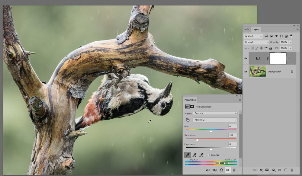
When working with colour, it helps to understand three basic characteristics.
Hue describes the colour itself — red, blue, green and so on.
Saturation describes the intensity or purity of that colour.
Brightness or luminance describes how light or dark it appears.
These can be adjusted independently during editing.
If a colour looks too weak, you might increase its saturation.
If a particular colour is distracting, reducing its saturation may allow the subject to become more prominent.
If the colour itself is wrong, you may need to adjust its hue.
But don’t automatically reach for the global saturation control.
One of the most useful developments in modern editing is the ability to make selective adjustments.
Instead of increasing the saturation of everything, you might increase the saturation of one colour or one part of the image.
That gives you much greater control.
Don’t make everything equally colourful
One of the easiest ways to weaken a colour photograph is to make every colour equally strong.
If everything is shouting, nothing gets heard.
A photograph often benefits from having a dominant colour, supporting colours and perhaps a small accent.
This is similar to the way you might compose a piece of music. Not every note has the same importance.
Look at your photograph and ask:
Which colour is the main character?
Then consider whether the other colours are supporting it or competing with it.
Colour can tell a story
Colour isn’t simply decoration.
It can contribute to the narrative of an image.
A cold, desaturated palette can suggest isolation.
Warm colours can create a sense of comfort.
A restricted palette can make an image feel controlled or nostalgic.
Strong complementary colours can make a photograph feel energetic.
A single bright colour can draw attention to a person or object that is important to the story.
Think about the emotional response you want from the viewer and then consider whether the colours are helping you achieve it.
Look at paintings to improve your photography
One of the best ways to learn about colour composition is to study artists.
Painters have been thinking about colour relationships for centuries, and they have had to make deliberate decisions about every colour they put onto a canvas.
Gerrit van Honthorst’s dramatic use of light and shadow is a good example of how limiting information around a subject can make the important elements stand out.
Caravaggio and other Baroque painters frequently used restricted palettes and strong tonal contrasts.
Vincent van Gogh took a very different approach, often using powerful relationships between complementary colours. His Café Terrace at Night, for example, contains striking blues alongside warm oranges and yellows.
And then there is Claude Monet.
Monet’s changing eyesight and cataracts provide a fascinating reminder that colour perception is not necessarily the same for everyone. His paintings and his own observations have been studied extensively in relation to the effects of his deteriorating vision.
You don’t need to become an art historian to benefit from studying paintings.
Simply ask:
Why did the artist put that colour there?
Then consider whether you could achieve a similar effect with a photograph.
Try colour grading with a purpose
Colour grading can be another way to reinforce the mood of a photograph.
A familiar approach is to introduce cooler tones into shadows and warmer tones into highlights.
The attraction is partly that these colours are complementary, creating separation while retaining an overall sense of colour harmony.
But you don’t have to copy a particular cinematic look.
Experiment with different complementary colour combinations and see what they do to your images.
The important word is purpose.
Don’t colour grade an image simply because a preset looks impressive.
Ask what the colour treatment is adding.
If it doesn’t improve the photograph, don’t use it.
Watch for distracting colours when you shoot
Colour can also work against you.
A small, bright object at the edge of the frame can attract more attention than the main subject.
A red sign, bright yellow jacket or intensely coloured piece of litter can become the first thing the viewer sees.
Before pressing the shutter, scan the edges and corners of the frame.
Ask yourself:
Is there a colour here that is competing with my subject?
Sometimes the solution is as simple as moving your position.
Sometimes you can remove the object.
Sometimes you can wait.
And sometimes you can deal with it later during editing.
But spotting the problem at the shooting stage is usually preferable.
Don’t forget that colour is part of composition
Composition is often taught through concepts such as leading lines, rule of thirds, negative space, symmetry and depth.
All of these can be useful.
But colour deserves to be considered alongside them.
A photograph can be perfectly composed according to a set of traditional rules and still fail because the colours are fighting one another.
Equally, a photograph with a relatively simple composition can be extremely powerful because the colour relationships are so strong.
The next time you’re out with your camera, deliberately look for colour.
Don’t just record it.
Use it.
Look for complementary colours, harmonious palettes, warm and cool relationships, isolated accents and opportunities to make your subject stand out.
And when you edit, ask the same question:
Is the colour helping the photograph say what I want it to say?
Once you start thinking about colour in this way, it stops being something that simply happens in your photographs.
It becomes one of the tools you use to create them.