What Do Vibrance and Saturation Really Do? A Colour Analysis
By Mike McNamee
The difference between Vibrance and Saturation in Lightroom is often explained in simple terms: saturation makes all colours more intense, while vibrance makes a more selective adjustment.
But what actually happens to the colours when you move those sliders?
To investigate, we carried out a colour analysis using a Macbeth ColorChecker Classic, Photoshop, BabelColor and numerical colour data. The results reveal some interesting differences in how Vibrance and Saturation affect individual colours.
Colour can be described numerically
Colour can be represented in several different ways, each designed for particular purposes.
Common colour models used in photography and image editing include:
- RGB – Red, Green and Blue
- CMYK – Cyan, Magenta, Yellow and Black
- Lab – Lightness, plus colour information along red/green and yellow/blue axes
- HSL – Hue, Saturation and Lightness
Each colour model describes and manipulates colour differently.
For example, changing one component of an RGB value can alter more than just the perceived colour. It may also affect brightness and saturation.
HSL provides a more intuitive way of thinking about colour because it separates three characteristics:
Hue describes the basic colour — red, green, blue, orange and so on.
Saturation describes the intensity or purity of that colour.
Lightness describes how light or dark the colour appears.
Reducing saturation to zero produces a neutral, monochrome result.
Vibrance is not a separate physical property of colour
There is an important distinction when discussing Vibrance and Saturation in Lightroom.
Saturation is a measurable characteristic of colour. Vibrance is not.
Vibrance is the name Adobe gives to a particular image-editing adjustment. It changes colour saturation according to the characteristics of the starting colour and the direction of the adjustment.
In other words, both sliders affect colour saturation, but they don’t apply the adjustment in the same way.
Adobe’s Julianne Kost has explained that the Saturation slider makes an absolute adjustment, while Vibrance makes a relative adjustment that takes the existing saturation of a colour into account.
Vibrance also applies a bias that reduces its effect on orange, red and yellow tones compared with many other colours. This can be useful when increasing colour in an image containing skin tones.
Putting the sliders to the test
Rather than relying entirely on visual impressions, we decided to measure what happens to individual colours.
We used the Macbeth ColorChecker Classic (CC24) as our test subject.
The ColorChecker contains 24 colour patches representing a range of colours found in the real world, along with several primary and neutral colours.
It is not an especially highly saturated target, particularly when compared with larger-gamut colour charts such as the ColorChecker SG, but it provides a useful and consistent reference for comparing colour changes.
An electronic version of the chart was created in Photoshop.
We then produced versions with:
- Vibrance -20
- Saturation -20
- Vibrance -40
- Saturation -40
Each version was analysed using BabelColor and compared with the original colour values.
The results were then exported for further analysis.
What did the measurements show?
When all 24 colour patches were considered, the average reduction in chroma was relatively similar between Vibrance and Saturation.
However, looking only at the average doesn’t tell the whole story.
Some individual colours changed much more than others.
The measurements showed:
| Adjustment | Average chroma change | Largest 10% change | Maximum change |
|---|---|---|---|
| Vibrance -20 | -7.33 | -15.36 | -16.19 |
| Saturation -20 | -7.85 | -25.35 | -29.89 |
| Vibrance -40 | -13.35 | -26.92 | -28.36 |
| Saturation -40 | -15.05 | -44.35 | -49.82 |
The important point isn’t simply that Saturation produced a larger average change.
The more interesting finding is the difference between the average response and the response of individual colours.
This supports the idea that Vibrance is not simply a weaker version of Saturation. Its effect varies according to the colour being adjusted.
Vibrance behaves differently around the colour wheel
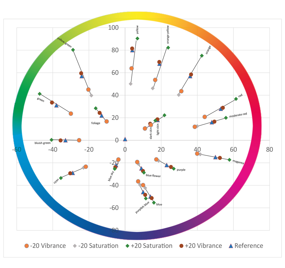
We then looked at the colour changes using a Lab colour plot (above).
Lab is particularly useful for this type of analysis because colour information can be examined separately from Lightness.
The starting positions of the colour patches could therefore be compared with their positions after applying the Vibrance and Saturation adjustments.
The results showed that some colours were affected considerably more than others.
The strongest changes occurred around:
- Yellow
- Orange-yellow
- Orange
The effect then reduced progressively as the colours moved around the colour wheel.
This is important because it demonstrates that Vibrance does not simply move every colour by the same amount.
What happens when Vibrance is increased?
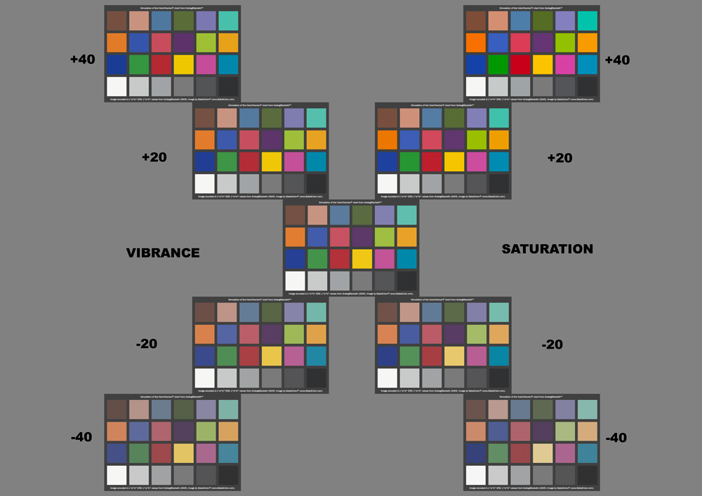
One of the more interesting findings was the relatively modest effect of a +20 Vibrance adjustment.
Compared with the changes produced by reducing Vibrance, the positive adjustment was surprisingly restrained in some of the colours tested.
This illustrates an important characteristic of the Vibrance adjustment.
It is designed to increase colour while taking the existing saturation of the pixels into account rather than simply applying the same increase everywhere.
As a result, already-strong colours are treated differently from muted colours.
This is one reason Vibrance can be useful when an image needs more colour without immediately pushing its strongest colours towards excessive saturation.
What happens when Vibrance is reduced?
Reducing Vibrance doesn’t simply produce a weaker version of a monochrome conversion.
If you reduce Saturation to -100, the result is effectively a neutral monochrome image.
Reducing Vibrance to the same extreme can produce something quite different: a pastel image containing a range of delicate hues.
This is an important visual demonstration of the different algorithms behind the two controls.
The Saturation slider is making an absolute adjustment, whereas Vibrance is responding to the existing colour information.
What about skin tones?
Skin tones are one of the most important practical reasons photographers care about the difference between these sliders.
We therefore carried out a more detailed examination of one of the ColorChecker’s skin-tone patches.
The skin-tone patch was tested at:
- Vibrance +40
- Vibrance +20
- Vibrance -40
- Vibrance -20
- Saturation +40
- Saturation +20
- Saturation -40
- Saturation -20
The results demonstrated that Vibrance and Saturation do not affect the skin-tone colour in identical ways.
This is consistent with the design of Vibrance, which applies less adjustment to orange, red and yellow tones than it does to many other colours.
For portrait photographers, this can be extremely useful.
A global Saturation increase can quickly make skin appear unnaturally intense, while Vibrance may allow other colours in the scene to become stronger without producing the same immediate effect on skin.
Of course, Vibrance can still be pushed too far.
No adjustment should be considered completely safe simply because it is labelled Vibrance.
Why colour swatches can be misleading
There is another important lesson from this experiment.
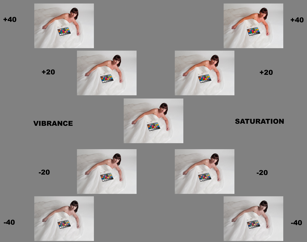
When you look at small colour patches next to one another, differences can sometimes appear surprisingly subtle.
But those same numerical changes can become much more obvious when they are applied to a complete photograph.
This is particularly noticeable with portraits.
A small change in skin colour may appear insignificant when viewed as an isolated colour patch, yet produce a noticeably different impression when that colour covers a person’s face.
This is one reason photographers should judge colour adjustments in the context of the complete image rather than relying entirely on numerical measurements or isolated swatches.
Colour measurement and visual judgement work together
Colour measurement can tell us precisely what has changed.
It doesn’t necessarily tell us whether the change has made the photograph better.
That remains a creative judgement.
A colour difference that looks significant numerically may be desirable in one photograph and distracting in another.
Similarly, a technically small change to a skin tone can have a considerable visual effect when viewed in a portrait.
This is why colour science and visual judgement should work together.
Measure when you want to understand what is happening. Look at the photograph when deciding whether you like the result.
What does this tell us about Vibrance vs Saturation?
The experiment reinforces several useful principles.
Saturation is the broader adjustment
The global Saturation slider applies a more uniform change to the colours in an image.
Increasing it pushes colours towards greater saturation, while reducing it moves them towards neutral.
This makes it powerful, but also relatively easy to overdo.
Vibrance is relative
Vibrance takes the existing colour information into account.
Its effect therefore depends on the starting saturation of the colours rather than applying exactly the same change everywhere.
Different colours respond differently
The measurements show that the sliders do not produce identical changes around the colour wheel.
Some colours are affected much more strongly than others.
Vibrance has a colour bias
Vibrance deliberately reduces its effect on some warm colours, particularly orange, red and yellow tones.
This helps explain why it can be useful when increasing the apparent colour intensity of an image containing skin tones.
Neither slider is automatically “better”
Vibrance isn’t simply a safer Saturation slider, and Saturation isn’t a bad Vibrance slider.
They are different tools intended to produce different types of colour adjustment.
The practical lesson for photographers
The numbers are interesting, but the practical conclusion is straightforward.
If you want to understand what Vibrance and Saturation are doing to your photographs, don’t simply watch the overall image.
Look closely at individual colours.
Look at:
- Skin tones
- Blue skies
- Green foliage
- Reds and oranges
- Highly saturated objects
- Subtle pastel colours
- Neutral areas
Then compare the result with the original.
You may find that an adjustment which initially looks attractive has pushed one particular colour further than you intended.
A useful way to approach colour editing
A sensible workflow is to make your colour adjustments gradually.
Start by correcting exposure and white balance.
Then consider whether the photograph actually needs more colour.
If it does, try a modest Vibrance adjustment and examine the result.
If a particular colour still needs attention, use the HSL/Color controls for more precise adjustments.
Use global Saturation when you genuinely want to change the overall colour intensity of the photograph.
Finally, compare the edited version with the original.
The objective isn’t to maximise saturation.
It is to make the colours work for the photograph.
Colour is more complicated than a slider
Colour terminology can become confusing very quickly.
Terms such as hue, saturation, chroma, colourfulness, lightness and brightness don’t always mean exactly the same thing in everyday photographic conversation as they do in colour science.
For practical image editing, however, the important distinction is relatively simple:
Both Vibrance and Saturation affect colour saturation, but they do so differently.
Vibrance is an editing algorithm rather than an independently measurable physical dimension of colour.
Understanding that distinction helps explain why the two sliders can produce noticeably different results even when they appear to be controlling the same basic property.
Final thoughts
The experiment with the ColorChecker demonstrates something photographers can often see for themselves when editing:
Vibrance and Saturation are not interchangeable controls.
Saturation applies a broad adjustment, while Vibrance responds to the existing colour information and treats different colours differently.
The numerical analysis gives us a way of seeing exactly how those changes occur.
But the final test remains the photograph itself.
As with so many aspects of image processing, the best approach is to understand the technology — and then use your eyes.