How to Check and Perfect a Photo Before Printing or Submission
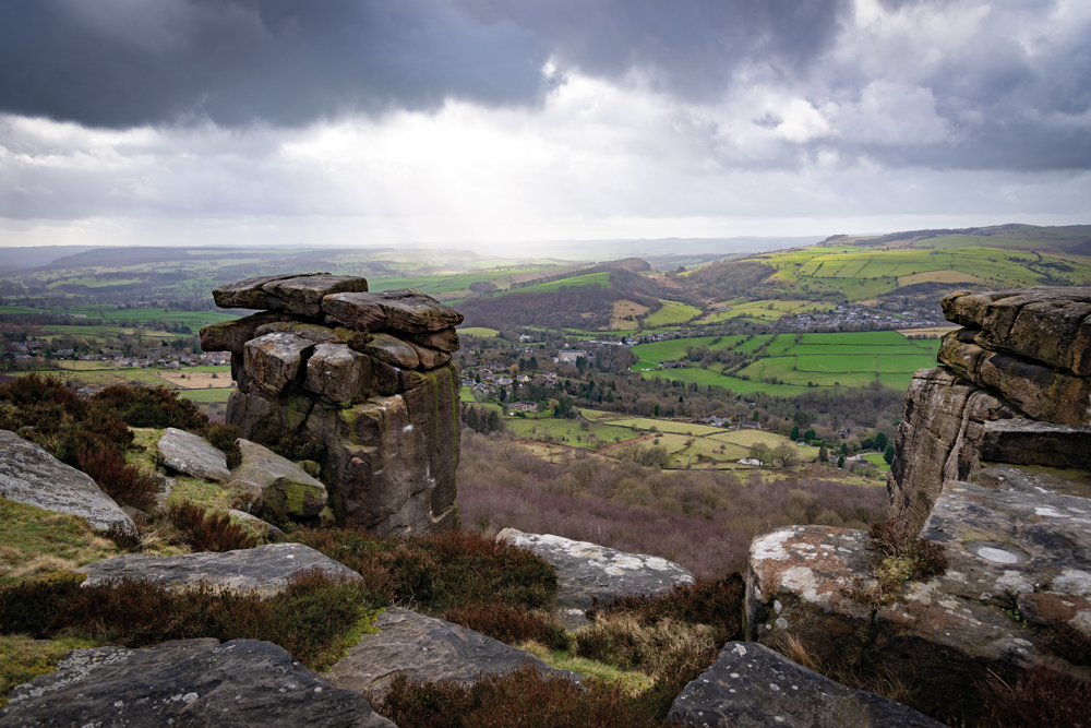
Getting an image to the point where you think it is finished can be one of the most satisfying stages of photography.
It can also be where mistakes happen.
After spending hours photographing, editing, retouching and fine-tuning an image, it is surprisingly easy to become so familiar with it that you stop seeing obvious problems. A stray masking edge, dust spot, sharpening halo or tiny distraction can disappear into the background simply because you’ve looked at the photograph too many times.
Those mistakes become much more important when the image is going to be printed, delivered to a client or entered into a photography competition.
Before you press the final button, it pays to stop and carry out a systematic quality check.
Why the final check matters
The closer an image gets to being finished, the more carefully it is likely to be examined.
A client may look closely at an image before approving it. A competition judge may spend considerably more time examining a strong entry than a mediocre one. A large print can reveal faults that were almost invisible on your monitor.
There is also the simple cost of getting something wrong.
You don’t want to produce an expensive exhibition or competition print only to discover a dust spot, typo, masking error or obvious sharpening halo.
The solution is straightforward: don’t rely on your memory or your overall impression of the image. Use a repeatable checklist.
1. Step away from the image
Before examining pixels, look at the photograph as a whole.
Move away from the monitor or reduce the image on screen so that you can see the complete composition.
Ask yourself:
- Does the image still work?
- Is the viewer’s eye going where you want it to?
- Is anything distracting?
- Does the tonal balance feel right?
- Is there an area that suddenly looks too bright or too dark?
- Does the image still communicate what you intended?
This is surprisingly effective.
When working at high magnification, it is possible to spend ten minutes correcting a tiny detail while completely overlooking an obvious problem elsewhere in the composition.
2. Change the way you look at it
One useful test is to turn the image upside down or otherwise change its orientation.
When you see a photograph normally, your brain quickly becomes accustomed to the composition. Changing its orientation can disrupt that familiarity and make tonal or compositional problems easier to spot.
You can also view the image against a neutral background rather than allowing a busy Photoshop or editing interface to surround it.
The aim is to remove distractions and make the photograph itself the thing you are judging.
3. Check your dodge and burn
Dodging and burning is not simply an old darkroom technique.
It remains an extremely useful part of digital image finishing.
Dodging selectively lightens areas of an image, while burning darkens them. Used carefully, the process can:
- direct the viewer’s attention
- improve local contrast
- emphasise shape and texture
- balance areas of the composition
- strengthen three-dimensional form
- reduce distracting highlights or shadows
The important word is carefully.
A common mistake is to become too enthusiastic with local tonal adjustments. If the viewer notices the dodge and burn before noticing the subject, the effect has probably gone too far.
Use a non-destructive approach
Modern editing software provides several ways to dodge and burn without permanently altering the original pixels.
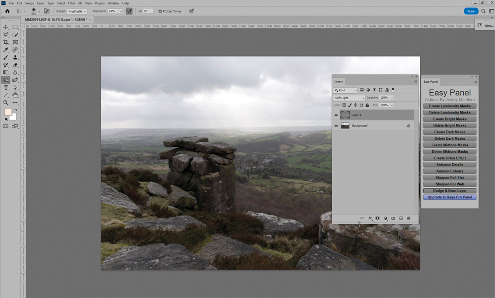
One popular Photoshop technique is to create a neutral mid-grey layer and set its blending mode to Soft Light. Painting with white can lighten areas while black can darken them.
Working at low brush opacity allows the effect to build gradually.
Another approach is to use Curves or Levels adjustment layers with masks, allowing individual tonal changes to be controlled independently.
The advantage of a non-destructive workflow is that you can reduce the layer opacity, modify the mask or remove the adjustment altogether if you later decide that you’ve gone too far.
4. Check the histogram and clipping
The histogram is a useful warning system.
Look for areas where important highlight or shadow information has been clipped.
A photograph doesn’t necessarily need to contain detail at every point between pure black and pure white. High-key and low-key images may deliberately contain clipped areas.
The question is whether the clipping is intentional.
A large area of an important subject that has become featureless white or solid black may indicate that you’ve pushed an adjustment too far.
Use your editing software’s highlight and shadow clipping warnings where available. They provide a quick way of identifying pixels that have reached the limits of the image’s tonal range.
Don’t automatically “fix” every clipped pixel. Specular highlights, deep shadows and other naturally extreme areas may be perfectly appropriate.
5. Check sharpening carefully
Sharpening should normally be one of the final stages of image preparation.
The correct amount depends on the image, its resolution, its intended viewing size and where it will ultimately be displayed or printed.
Too little sharpening can make a photograph appear soft.
Too much can introduce:
- bright or dark halos
- crunchy edges
- exaggerated texture
- noise
- unnatural micro-contrast
Pay particular attention to high-contrast boundaries such as:
- mountains against sky
- buildings against a bright background
- hair against a plain backdrop
- tree branches
- architectural edges
- text and graphic elements
A photograph can look excellent at a reduced screen size while revealing obvious sharpening problems at 100%.
6. Examine the image at 100%
For detailed quality control, 100% viewing is particularly useful because one image pixel corresponds directly to one screen pixel.
At this magnification, inspect the photograph for technical problems that may disappear at smaller viewing sizes.
Look for:
- dust spots
- stray pixels
- cloning mistakes
- mask edges
- halos
- unnatural transitions
- unwanted texture
- excessive sharpening
- blending errors
- colour problems
- accidental objects
- retouching artefacts
This is also where complex composites need particularly careful attention.
Don’t just inspect the centre
A common mistake is to zoom to 100% and look at whatever happens to be in the middle of the screen.
Instead, inspect the entire photograph systematically.
Start in one corner and work across the image, then move down to the next area. Continue until you have examined every part of the frame.
This removes the possibility of repeatedly checking the same interesting area while missing a problem elsewhere.
7. Check your masks
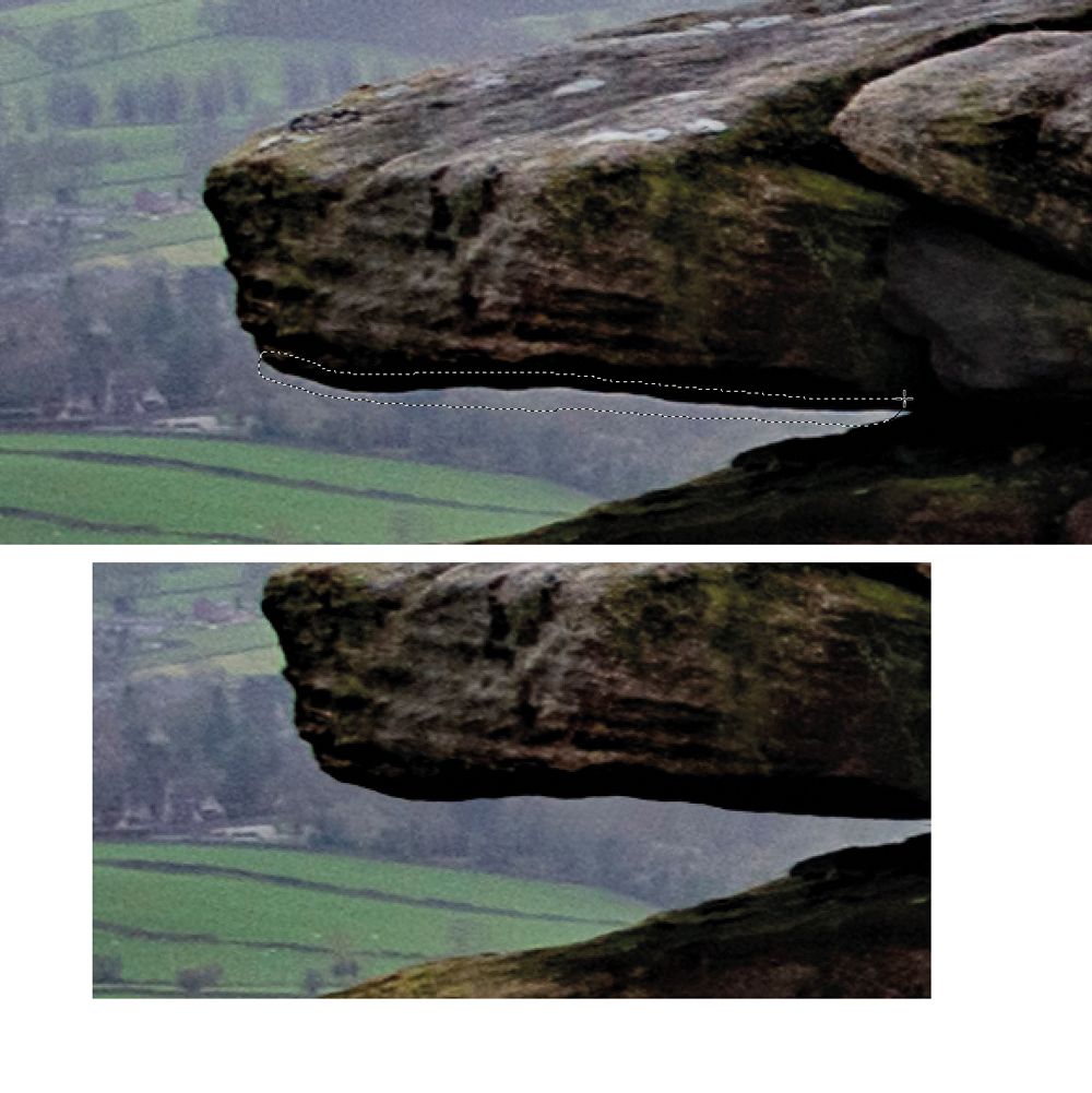
Layer masks are incredibly powerful, but they are also a common source of small errors.
Look carefully around the edges of objects that have been cut out or blended into another image.
Watch for:
- white or dark fringes
- remnants of the original background
- straight lines left by incomplete masks
- overly soft edges
- jagged edges
- semi-transparent areas that shouldn’t be there
- halos around hair, foliage or buildings
If something looks suspicious, temporarily disable the mask or the layer itself.
This helps establish whether the problem is actually in the mask or in the underlying image.
On a complicated project, naming layers properly and keeping related layers inside organised groups makes this process considerably easier.
8. Look for cloning and retouching mistakes
Retouching can produce some very subtle errors.
At 100%, look for repeated patterns caused by cloning, unnatural textures, duplicated objects and areas where the surrounding detail no longer makes sense.
Dust spots are particularly easy to overlook because your eye becomes accustomed to them during editing.
A final inspection against a plain background can make these defects much easier to identify.
9. Check the colour
Colour errors aren’t always obvious when you have been staring at an image for hours.
Compare areas that should have consistent colour and look for unexpected casts or abrupt transitions.
Be particularly careful with:
- skin tones
- neutral whites and greys
- skies
- shadows
- blended layers
- areas affected by selective colour adjustments
If an image contains multiple source photographs, make sure their colour balance and overall rendering work together.
10. Check the image’s colour profile
Before sending an image for printing or delivery, make sure it is using the appropriate colour profile for the intended workflow.
This should ideally have been considered at the beginning of the editing process rather than left until the end.
If a printer, publication or client has supplied specific colour-management requirements, follow those requirements rather than relying on a generic setting.
Don’t convert profiles simply because a particular profile sounds more appropriate. Understand what the destination workflow expects first.
11. Check resolution and dimensions
For printing, the important starting point is the number of pixels available.
Check the final pixel dimensions and make sure they are sufficient for the physical print size you require.
Be careful about unnecessarily reducing the resolution of your master file.
A sensible workflow is to keep a full-resolution working file safely archived and create a separate print-ready version when required.
This gives you the flexibility to produce different sizes or versions later without repeatedly degrading the original.
12. Check the final crop
Cropping can sometimes introduce problems that weren’t apparent earlier in the workflow.
Look at the final image exactly as it will be delivered or printed.
Check that:
- the composition is balanced
- important subjects aren’t accidentally cropped
- edges don’t contain unwanted objects
- the intended aspect ratio is correct
- the image fits the required print or submission dimensions
Don’t assume that a crop which looked right during editing is still right after all the other adjustments have been made.
13. Check titles, borders and captions
If the image is being entered into a competition or produced as a finished print, don’t forget the information surrounding the photograph.
Check:
- title
- spelling
- captions
- photographer name
- competition category
- file name
- borders
- keylines
- print dimensions
A technically excellent photograph can be let down by something as simple as a spelling mistake.
If you add a title or other text late in the process, check it again before final output.
14. Watch for sharpening halos
Sharpening halos deserve particular attention because they can be surprisingly obvious in a print.
A common example is a pale or dark outline appearing where land meets sky.
The problem is often caused by excessive sharpening or other high-contrast processing around an edge.
The best solution is usually to revisit the sharpening rather than attempting to disguise the problem afterwards.
If a small halo remains, careful cloning, healing or masking can sometimes repair it, but always check the surrounding detail afterwards.
Any repair should blend naturally with the original image.
15. Make your final adjustments, then check again
This is an important part of the process.
If you find a problem and make a correction, don’t simply save the image and assume the job is finished.
Go back through the relevant checks.
An adjustment made to fix one problem can easily create another.
For example, increasing local contrast might reveal a masking edge. Increasing saturation might introduce clipping. Sharpening might create halos that weren’t previously visible.
Every significant final adjustment deserves another inspection.
16. Create a dedicated print version
Keep your editable working file intact.
Once the image has been fully checked, create a separate version specifically for output.
A sensible file structure might include:
Master file
Your full-resolution, layered working document.
Print version
A version prepared for the particular print size, profile and output requirements.
Web version
A version resized and sharpened specifically for online display.
This approach means you don’t have to repeatedly alter your master file every time you need to produce another version.
It also gives you a useful archive of what was actually sent to the printer or client.
17. Print a proof when it matters
A monitor and a physical print are not the same thing.
A large print can reveal problems that weren’t obvious on screen, while some screen effects may disappear completely on paper.
For an important image, a proof print can therefore be invaluable.
Look at:
- shadow detail
- highlight detail
- colour balance
- sharpening
- local contrast
- skin tones
- borders
- overall visual impact
A full-size print is particularly useful when the final image is going to be judged at full size.
18. Take a break before the final submission
Perhaps the most effective quality-control technique is also the simplest:
walk away.
If circumstances allow, leave the finished image for a few hours or even several days.
When you return, you are much more likely to see the photograph rather than the hundreds of editing decisions you made while creating it.
This is particularly valuable for competition images.
Once an image has been submitted, you may not get the opportunity to correct a technical fault. A final independent inspection before submission can therefore be worth far more than another hour of editing.
The final image checklist
Before printing, delivering or submitting a photograph, run through this quick checklist:
Composition
- Does the image work as a whole?
- Is anything distracting?
- Is the crop correct?
Tonal range
- Is important highlight or shadow detail clipped?
- Is the dodge and burn subtle and purposeful?
- Does the tonal balance direct the viewer’s eye?
Detail
- Have you checked at 100%?
- Are there dust spots or stray pixels?
- Are there cloning or retouching mistakes?
Masks and composites
- Are the edges clean?
- Are there halos or remnants of previous backgrounds?
- Do the layers and blending make sense?
Sharpening
- Is the image appropriately sharpened for its destination?
- Are there halos or crunchy edges?
Colour
- Is the colour balance correct?
- Are there unwanted colour casts?
- Is the appropriate colour profile being used?
Output
- Is the resolution sufficient?
- Is the final size correct?
- Is the correct file format being used?
- Have you created the correct print, web or delivery version?
Text
- Is the title correct?
- Is everything spelt correctly?
- Are captions, names and other details accurate?
Final inspection
- Have you looked at the image from a distance?
- Have you viewed it in a different orientation?
- Have you checked the entire image systematically?
- Have you taken a break before submitting it?
Don’t let a great photograph be ruined at the finish line
The final stage of image editing isn’t the time to become complacent.
A photograph can be technically excellent and still be undermined by a tiny mistake that takes only seconds to find once you know where to look.
Professional photographers, competition entrants and serious enthusiasts all benefit from treating the final inspection as part of the creative process rather than an afterthought.
Edit carefully. Check systematically. Step away. Check again. Then submit or print.
That final few minutes could be the difference between a photograph that is merely good and one that is ready to stand up to close examination.