How to Design a Book in Affinity Publisher: A Beginner’s Guide
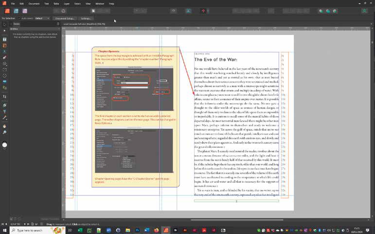
Creating a book can sound like a daunting project, particularly if you have never used professional page-layout software before. But once you understand a few fundamental concepts, designing a book in Affinity Publisher becomes surprisingly straightforward.
Affinity Publisher is designed for creating multi-page publications containing text, photographs, illustrations, diagrams, tables and other page elements. Unlike a word processor, it gives you precise control over where those elements appear on every page.
For photographers, that makes it particularly useful for creating photobooks, portfolios, photography guides, brochures, annual reports and other image-rich publications.
This guide takes you through the basic process of creating your first book, from planning and document setup to typography, grids, images and exporting the finished publication.
What makes Affinity Publisher different from Word?
If you are accustomed to Microsoft Word, one of the first things you will notice is that Affinity Publisher works differently.
In Word, you normally click into the document and start typing. Text flows automatically down the page, and images are generally positioned in relation to the surrounding text.
Publisher works more like a professional page-layout application. Text, photographs, graphics and other elements are objects that can be positioned precisely on the page.
Text is normally placed inside a text frame. When the frame becomes full, any remaining text becomes overset text. You can then link that text frame to another frame, allowing the story to continue onto another page.
This is one of the most important concepts to understand when creating a book.
Linked text frames
Linked text frames allow a continuous story to flow through multiple pages.
For example, you might have two text frames on a double-page spread. The first frame contains the beginning of the text and the second continues it. Further frames on subsequent pages can continue the same story.
You can also make changes to the text later. Because the frames are linked, adding or removing paragraphs can automatically reflow the text through the publication.
This is enormously useful when designing a book because you don’t have to manually reposition every paragraph whenever you make an amendment.
You can display the connections between text frames using the text-flow controls in Publisher.
Plan your book before opening Publisher
The most important part of designing a book happens before you start designing the pages.
First decide what the book is supposed to achieve.
Ask yourself:
- Who is going to read it?
- Is it a portfolio, photobook, guide, novel, brochure or business publication?
- Will it be printed, distributed as a PDF, or both?
- Will you need a digital edition?
- How much text will it contain?
- How important are photographs and other graphics?
- What size should the finished book be?
- Who will print it?
These decisions will influence almost every aspect of the design.
Think about your audience
A portfolio designed to attract commercial photography clients is likely to need a very different approach from a family photobook.
If you are approaching an automotive company, for example, the portfolio should concentrate on relevant automotive imagery rather than showing every type of photography you have ever produced.
One of the advantages of creating a digital publication is that you can tailor it to a particular audience.
You could even maintain a master publication and create different versions for different clients, changing the pages or images included in each version.
Choose the size and orientation
Before setting up the document, consider the physical shape of the finished publication.
Common choices include:
- Portrait
- Landscape
- Square
The choice should be driven by the content.
A landscape format can work particularly well for some photography portfolios, while portrait is a natural choice for text-heavy publications. Square formats can work particularly well for photobooks.
Think about the final physical object as well as how it will look on screen.
A large portfolio may look impressive, but if it is awkward for the client to store or transport, that can become a disadvantage.
If you are printing the book commercially, it is also worth checking your printer’s available sizes before committing to a design.
Create a new document in Affinity Publisher
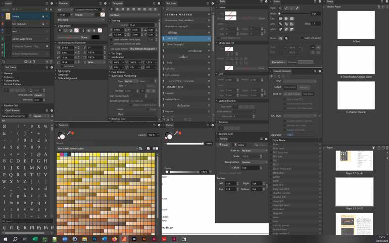
Once you have a plan, open Affinity Publisher and create a new document.
The exact interface may change as Affinity develops, but the important decisions remain broadly the same.
You will need to consider:
- Page size
- Orientation
- Measurement units
- Number of pages
- Facing pages
- Colour format
- Margins
- Bleed
Facing pages
For a conventional printed book, enable facing pages so that the document represents the left and right pages of an open book.
This makes it much easier to design double-page spreads and account for the gutter between pages.
For a document intended purely for digital viewing, single-page layouts may sometimes be more appropriate.
Colour
Your colour requirements depend on the final output.
For a printed publication, follow the colour requirements supplied by your printer.
For digital publications, RGB workflows are generally appropriate.
Don’t simply assume that one colour setting is suitable for every project. Your printer’s specifications should always take precedence.
Bleed
If images, colours or graphics extend to the edge of a printed page, you will normally need to include a bleed.
A common print requirement is 3mm, but always check with your printer before setting the document up.
Digital publications do not normally require a print bleed.
Set up your master pages
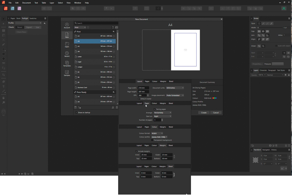
Master pages are one of the most useful features when creating a book.
A master page allows you to create elements that should appear consistently throughout a group of pages.
Typical examples include:
- Page numbers
- Running headers
- Running footers
- Logos
- Decorative elements
- Background graphics
Instead of manually adding these elements to hundreds of pages, you create them once on the master page.
Adding page numbers
Create a text frame on the master page where you want the page number to appear.
Publisher can insert a page-number field so that the correct number is automatically displayed on every page using that master.
For a book using facing pages, you can create corresponding elements on both the left and right master pages.
This is much more reliable than typing page numbers manually.
Create your text frames
Once the master pages are established, create the text frames that will contain your main text.
For a simple book, you might have one text frame per page.
For a more complex publication, you might use several columns or different frame sizes for:
- Main text
- Captions
- Pull quotes
- Side notes
- Supporting information
Link the frames together so that your text can flow naturally through the document.
If you already have your manuscript, you can place the text into the first frame and allow it to flow through the linked frames.
Don’t worry if the pagination isn’t perfect at this stage.
The first version of a book is rarely the final version.
Choose your typography
Typography can make or break a book design.
The body typeface needs to be comfortable to read for long periods. Decorative or highly unusual fonts may work for a title, but they can quickly become tiring when used for several pages of continuous text.
Consider creating a small, consistent typographic system containing styles for:
- Main title
- Chapter title
- Heading
- Subheading
- Body text
- Caption
- Pull quote
- Bullet points
Use paragraph and character styles
One of the biggest mistakes a beginner can make is formatting every piece of text manually.
Instead, create paragraph styles and character styles.
For example, you might create a paragraph style called:
Body Text
Then another called:
Heading 1
And another:
Caption
If you later decide that all your headings should be slightly smaller, changing the style can update every heading throughout the document.
This becomes increasingly important as the publication grows.
Choosing fonts and font pairings
You don’t necessarily need dozens of typefaces.
In many cases, two complementary fonts are more than enough.
For example, you might use one typeface for body text and another for headings.
The important thing is that they work together and remain readable.
Before committing to a font, check that it contains all the characters you need.
This becomes particularly important if your publication includes:
- Accented characters
- Foreign languages
- Currency symbols
- Special punctuation
- Mathematical symbols
Free and commercial fonts can vary considerably in their character support.
Also check the licensing terms before using a font in a commercial publication.
Set up your margins
Margins are more important than they might initially appear.
In a printed book, the inside margin — the gutter — generally needs to be larger than the outside margin because part of the page disappears into the binding.
You also need sufficient space for:
- Page numbers
- Running headers and footers
- Fingers holding the book
- Binding
- Decorative elements
For a digital publication, these considerations are different because there is no physical gutter.
Don’t be tempted to make the margins as small as possible simply to fit more text onto a page.
White space is an important part of good design.
Use a baseline grid
A baseline grid helps align text consistently across a page.
Imagine invisible horizontal lines running across the document. The baselines of your text sit on those lines.
This becomes particularly useful when you have multiple columns or pages containing a mixture of text and graphics.
For example, if your body text uses 10pt type with 12pt leading, you can establish a 12pt baseline rhythm and align other text elements to it.
The result is a cleaner and more professional-looking page.
You don’t need to master complex grid theory before creating your first book. Start with a simple baseline grid and develop your understanding as your designs become more sophisticated.
Build a column grid
A column grid gives you another level of control over the page.
A simple novel might use a single column of text.
A magazine-style publication containing photographs, captions, diagrams and sidebars may benefit from several columns.
The advantage of a grid is flexibility.
For example, a photograph might span four columns while a caption occupies one. A text block might occupy two columns and a supporting graphic another two.
You don’t necessarily have to fill every column.
White space is valuable and should be considered part of the design rather than wasted space.
Adding photographs and graphics
Photography is likely to be one of the most important elements in a photographer’s book.
Use the Place command to add an image to your document.
You can then resize and reposition the image as required.
Think carefully about image resolution before sending a book to print. A photograph that looks perfectly sharp on screen may not be suitable for a large printed page.
Give photographs room to breathe
Don’t feel compelled to fill every available space.
A strong photograph can sometimes have more impact when surrounded by generous white space.
Consider:
- Full-page photographs
- Double-page spreads
- Smaller supporting images
- Image grids
- Cropped details
- Photographs combined with text
Try several approaches before deciding on the final design.
Text wrapping and pinned objects
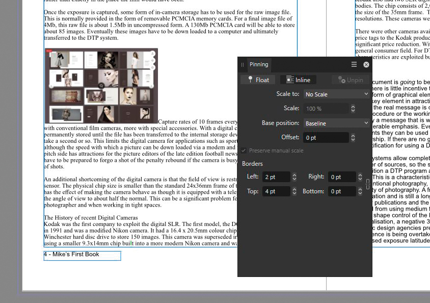
When an image sits alongside text, you may want the text to flow around it.
Publisher provides text-wrapping controls that allow you to determine how surrounding text interacts with an image or other object.
You can also pin objects to text when you need the object to move with a particular passage.
This can be particularly useful for illustrations, diagrams and photographs that belong to a specific section of the text.
However, don’t automatically wrap text around every image.
Sometimes a simple image and text arrangement produces a much cleaner page.
Create captions and supporting styles
If your book contains photographs, captions are likely to be important.
Create a dedicated caption style rather than formatting every caption individually.
You might also create styles for:
- Image credits
- Pull quotes
- Tips
- Notes
- Sidebars
- Lists
Once these styles are established, the publication becomes much easier to maintain.
Create a table of contents
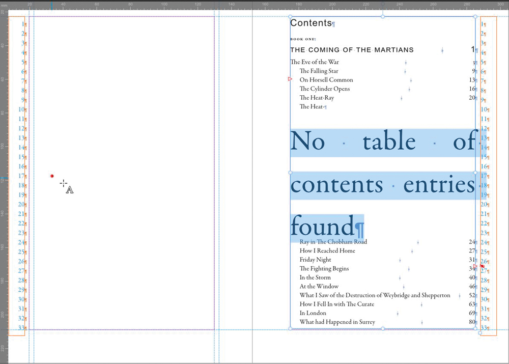
For a substantial book, a table of contents is essential.
The best approach is to build it from your heading styles rather than manually typing the chapter titles and page numbers.
This means that if the text changes and chapters move to different pages, the table of contents can be updated.
A well-structured document can also provide useful navigation when exported as a PDF.
Think about accessibility
Accessibility should be considered before you get too far into a project.
If the publication is being produced for an organisation, educational institution, government body or other environment with formal accessibility requirements, check those requirements before you start.
Don’t assume that a visually attractive PDF is automatically an accessible PDF.
If accessibility is a contractual or legal requirement, establish the required workflow before committing to Affinity Publisher for the project.
Export a test PDF early
One of the best pieces of advice for a first book is:
Don’t wait until the end to export your PDF.
Create a small test publication and export it early.
Then check:
- Are all pages present?
- Are photographs displaying correctly?
- Are fonts working as expected?
- Are page numbers correct?
- Are hyperlinks working?
- Is the file size reasonable?
- Does the design look correct when viewed at normal size?
- Does anything disappear near the page edge?
If the book is going to print, send a proof to the printer before committing to the full production run.
Finding a problem on page five of a ten-page test document is considerably better than finding it after producing 500 copies.
Designing for print versus digital
A book designed for print is not automatically suitable for every digital format.
Print gives you precise control over page dimensions, typography and image placement.
Digital publications can introduce different considerations because readers may view them on different screen sizes and orientations.
If your primary objective is to preserve your carefully designed layout, a fixed-layout PDF may be appropriate.
If you need a reflowable ebook, the design requirements are considerably different.
Before starting, decide whether you are creating:
- A printed book
- A fixed-layout PDF
- A reflowable ebook
- Or multiple versions
That decision can influence the entire design process.
Don’t rely too heavily on templates
Templates can be useful, particularly when you are learning.
They can demonstrate how margins, grids, master pages and styles have been organised.
But don’t assume that a template automatically produces a professional publication.
A template still needs to be adapted to your content.
A design that works beautifully for somebody else’s book may be completely wrong for yours.
Use templates as a starting point and learn from the decisions behind them.
The best long-term investment is understanding why the layout works rather than simply replacing the placeholder text and photographs.
The most important design rule: consistency
A professional book doesn’t necessarily need a complicated design.
In fact, many of the strongest publications are relatively simple.
Consistency is more important than complexity.
Keep consistent:
- Margins
- Typography
- Heading hierarchy
- Caption treatment
- Image spacing
- Colours
- Page numbering
- Alignment
- White space
Readers should be able to concentrate on the content rather than constantly noticing changes in the design.
Refine the pages
Once the basic structure is working, the real design process begins.
Try different combinations of:
- Photographs
- Text sizes
- White space
- Columns
- Colour
- Headings
- Captions
- Graphic elements
Don’t be surprised if the design changes considerably during this stage.
A page that looked good in isolation may not work when viewed alongside the pages before and after it.
Always review the book as a complete publication rather than judging individual pages alone.
Start small
Creating your first book doesn’t mean you have to start with a 300-page publication.
Begin with something manageable.
A small photography portfolio, company brochure or short guide is an excellent way to learn the principles of page layout.
You’ll quickly discover how text flow, master pages, styles, grids and image placement work together.
Once you’ve created one successful publication, a much larger project becomes far less intimidating.
Final thoughts
Affinity Publisher gives photographers considerable control over the design and production of multi-page publications.
The key is not to try to learn every feature before you begin.
Start with the fundamentals:
- Plan the publication.
- Choose the correct page size and format.
- Set up your master pages.
- Establish margins and grids.
- Create your text and heading styles.
- Link your text frames.
- Add photographs and graphics.
- Refine the typography and page design.
- Build your table of contents where appropriate.
- Export and proof the finished publication.
The more publications you create, the more naturally these decisions will become.
And if your first book isn’t perfect, that’s fine. The first publication is as much a learning exercise as it is a finished product.
The important thing is to start.
Affinity and Canva
Affinity has evolved considerably since earlier versions of this guide were written. The Affinity suite is now part of Canva, and the current Affinity application brings photo editing, vector design and page-layout capabilities together. Canva says the current Affinity product is available free of charge.
That makes Affinity an especially interesting option for photographers who want professional page-layout capabilities without committing to a traditional subscription-based creative software workflow.
This article is adapted and substantially expanded from a feature originally published in Professional Imagemaker.