Erté and Art Deco: What Photographers Can Learn from His Visual Style
Art Deco is instantly recognisable. Bold geometry, elegant figures, dramatic poses, rich colours, metallic finishes and a fascination with fashion and luxury all combine to create one of the most distinctive visual styles of the 20th century.
Few artists are more closely associated with that aesthetic than Erté, the Russian-born French artist, illustrator and designer whose extraordinary career spanned almost the entire 20th century.
For photographers, Erté’s work offers far more than an interesting glimpse into the history of Art Deco. His approach to shape, colour, composition, fashion and visual storytelling provides plenty of inspiration for creating images today.
Who was Erté?
Born Romain de Tirtoff in 1892, Erté became known professionally by the French pronunciation of his initials, R.T.
He lived until the age of 98 and built an extraordinary career encompassing illustration, fashion, stage and costume design, jewellery, sculpture, painting and printmaking.
He became particularly well known for his work for Harper’s Bazaar, where he created more than 240 covers during his long association with the magazine.
His designs appeared in magazines, theatre productions, films and haute couture, helping bring his distinctive visual language to a huge audience.
Although his career began during the Art Nouveau period, his work became strongly associated with the emerging Art Deco movement of the 1920s and 1930s.
His influence continued for decades, with renewed interest in his work helping to bring his distinctive style to new audiences during the Art Deco revival of the 1960s.
What makes Erté’s style so distinctive?
Look at an Erté design and several characteristics immediately stand out.
Elegant figures.
Long, flowing lines.
Geometric forms.
Strong silhouettes.
Stylised poses.
Rich, often contrasting colours.
Metallic elements.
Fashion and theatricality.
His work rarely attempts to reproduce reality exactly as we see it.
Instead, he exaggerates and simplifies.
That is one of the most interesting lessons for photographers.
Photography is often described as a medium for recording reality, but great photographers understand that the camera can also be used to construct a visual interpretation of reality.
Learning composition from Erté
One of the most useful things photographers can take from Erté’s work is his approach to composition.
His figures and objects are carefully arranged within the frame, with flowing lines leading the eye through the image.
There is rarely anything accidental about the positioning of the subject.
This is particularly relevant to portrait and fashion photographers.
Before pressing the shutter, consider the overall shape created by the subject.
Where are the arms?
Where do the legs lead?
What direction is the body facing?
How does the clothing interact with the background?
Where does the viewer’s eye enter the image?
These questions can turn an ordinary portrait into a much more deliberate composition.
Using shape as a photographic tool
Erté’s illustrations are filled with sweeping curves, geometric shapes and strong silhouettes.
Photographers can use the same principles.
Instead of concentrating exclusively on the subject itself, look for the shapes created by the subject.
A model’s arm can become a diagonal line.
A dress can create a sweeping curve.
A hat can become a geometric element.
A shadow can create an abstract shape.
Architecture can provide strong verticals and horizontals.
Once you begin looking at photography in terms of shapes, composition becomes much more deliberate.
Art Deco and fashion photography
Erté’s close relationship with fashion makes his work particularly relevant to photographers working in fashion, portraiture and editorial photography.
His figures are often highly stylised, elegant and theatrical.
This doesn’t mean photographers need to recreate an Art Deco illustration literally.
Instead, the underlying ideas can be used as inspiration.
Try exaggerated poses.
Experiment with symmetry.
Use strong silhouettes.
Introduce geometric backgrounds.
Look for dramatic clothing shapes.
Use lighting to emphasise contours.
Think about the relationship between the model and the surrounding negative space.
The result can be an image that feels influenced by Art Deco without becoming a simple pastiche.
Colour inspired by Art Deco
Colour is another important part of the Art Deco aesthetic.
Erté frequently used strong blocks of colour alongside metallic tones.
His limited-edition prints were often produced using serigraphy, or silk-screen printing, which naturally lent itself to bold blocks of colour rather than subtle photographic gradients.
Photographers can translate this idea into modern image-making in several ways.
A portrait could be built around a deliberately restricted colour palette.
A background could provide a strong block of colour against a contrasting outfit.
Lighting gels can introduce controlled colour into a studio portrait.
Post-production can also be used to strengthen a carefully chosen palette.
The key is restraint.
Rather than using every colour available, choose a small number of colours that work together.
Metallics, highlights and contrast
Metallic finishes are another recurring feature of Erté’s work.
For photographers, this can be explored through lighting.
Specular highlights on jewellery, metallic clothing, reflective surfaces or polished objects can introduce a sense of luxury into an image.
Hard light can produce crisp highlights and defined shadows, while carefully positioned soft light can reveal the texture and shape of reflective materials.
This is particularly useful in fashion, beauty and product photography.
The important lesson is that light doesn’t simply illuminate a subject — it describes its surface.
Creating elegance through pose
Many of Erté’s figures appear elongated, poised and almost impossibly elegant.
That exaggerated sense of elegance can be translated into portrait photography through posing.
Instead of asking a subject simply to “stand naturally”, think about the lines created by their body.
Small adjustments to posture can dramatically change an image.
A slight turn of the shoulders.
An extended neck.
A carefully positioned hand.
A change in the angle of the head.
A longer line through the body.
These subtle adjustments can create a more sophisticated and stylised portrait.
Negative space matters
Another lesson photographers can take from illustration is the importance of negative space.
Erté’s compositions frequently allow areas of the image to remain relatively uncluttered.
This gives the main subject room to breathe and allows the eye to concentrate on the important elements.
Photographers sometimes feel compelled to fill the frame.
But empty space can be just as important as the subject.
Negative space can:
- Emphasise a subject
- Create balance
- Introduce a sense of luxury
- Direct the viewer’s attention
- Make text placement easier in editorial photography
- Create a stronger graphic composition
When composing your next portrait, try deliberately leaving more space around the subject.
From illustration to photography
Perhaps the most interesting thing about Erté’s work for photographers is that his images were never simply photographic.
He remained an illustrator.
That distinction matters.
Photography can sometimes become overly concerned with realism — sharpness, accurate colour, perfect exposure and technically precise reproduction.
Those things are important, but they aren’t the whole of visual communication.
Erté’s work demonstrates how powerful stylisation can be.
A photographer can take reality and deliberately simplify, exaggerate or reinterpret it.
That might mean unusual lighting, dramatic posing, unusual colour grading, carefully designed sets or deliberately artificial compositions.
The camera becomes a tool for creating an image rather than simply recording one.
Finding inspiration outside photography
Photographers don’t need to look exclusively at other photographers for inspiration.
Painters, illustrators, graphic designers, sculptors, architects and fashion designers can all provide ideas that can be translated into photographic work.
Studying Erté is a good example.
You could take one of his compositions and ask:
How would I create this as a photograph?
What lighting would I need?
How would I pose the model?
What background would I create?
What colours would I use?
What lens would give me the desired perspective?
How would I finish the image in post-production?
You don’t need to reproduce the original artwork.
The exercise is about understanding the visual decisions behind it.
Why photographers should study the masters
Studying the work of artists from other disciplines can help photographers develop a stronger visual vocabulary.
Rather than simply asking whether you like an image, ask why you like it.
Is it the composition?
The colour?
The lighting?
The pose?
The use of negative space?
The geometry?
The emotion?
The contrast?
Once you identify those elements, you can start experimenting with them in your own photography.
This is particularly valuable when developing a personal style.
Erté’s enduring influence
Erté’s career demonstrates the longevity that can come from developing a distinctive visual language.
His work moved through different eras, media and commercial applications while retaining a recognisable identity.
From fashion and magazine illustration to theatre, sculpture, jewellery and limited-edition prints, the same fundamental characteristics remained visible.
That consistency is something photographers can learn from.
A personal style doesn’t necessarily mean using exactly the same lighting setup or editing technique in every photograph.
It can mean developing a consistent approach to shape, colour, composition, subject matter or storytelling.
Take inspiration, don’t simply copy
The most useful way to study an artist like Erté is not to copy their work.
Instead, identify the principles that make it effective and experiment with those principles in your own photography.
Try creating a portrait using only a limited colour palette.
Build a composition around geometric shapes.
Use hard light to create graphic shadows.
Experiment with exaggerated posing.
Introduce metallic materials.
Use negative space deliberately.
Look for architectural lines.
Create a fashion portrait that feels theatrical rather than naturalistic.
These exercises can help you discover new possibilities within your own style.
A lasting lesson from Erté
Erté’s extraordinary career is a reminder that visual creativity doesn’t have to be confined to one medium.
His work crossed illustration, fashion, theatre, sculpture, jewellery and printmaking while maintaining a distinctive visual identity.
For photographers, that is perhaps the most valuable lesson.
Look beyond photography.
Study art.
Study fashion.
Study architecture.
Study graphic design.
Visit galleries and museums.
Look at old magazine covers.
Study colour palettes.
Analyse compositions.
Then take those ideas back to your camera.
You may find that the next great idea for your photography isn’t hiding in another photography tutorial at all.
It might be hanging on a gallery wall.
Further reading
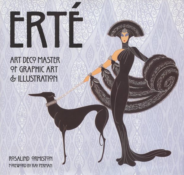
Rosalind Ormiston’s book on Erté provides a detailed, heavily illustrated exploration of the artist’s life and work, including his contribution to Art Deco, fashion, illustration and graphic design.