What Makes a Good Monitor for Photography?
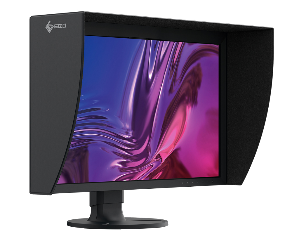
Your monitor is one of the most important pieces of equipment in a digital photography workflow.
It is where you make decisions about exposure, colour, contrast, sharpening and retouching. If the screen isn’t displaying those things accurately, you can spend hours correcting an image that wasn’t actually wrong in the first place.
For photographers who print their work, the monitor becomes even more important. You need confidence that what you’re seeing on screen bears a meaningful relationship to the eventual print.
So what should you actually look for when choosing a monitor for photography?
The answer goes considerably further than resolution and screen size.
Colour accuracy matters more than resolution
A high-resolution display can look impressive, but resolution isn’t the most important specification for photographic work.
A monitor could have an enormous number of pixels and still display colour inaccurately.
For photography, you want a display that can reproduce colours consistently and accurately, particularly if you’re working with a managed colour workflow.
This becomes particularly important when you’re working with images in wider colour spaces such as Adobe RGB, or when preparing files for professional printing.
A monitor designed for photographic work will typically provide much greater control over colour reproduction than an ordinary office or consumer display.
Look at the colour gamut
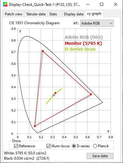
Colour gamut describes the range of colours a display can reproduce.
Many everyday monitors are designed around sRGB, which is perfectly adequate for general computing and much web work.
Photographers working with high-quality cameras, professional printing or wider-gamut workflows may benefit from a display capable of covering a larger colour space.
Adobe RGB is particularly relevant to photography and print workflows.
For example, the EIZO CG2700S used in the original testing was specified to cover 99% of Adobe RGB, alongside a very wide gamut suitable for other professional applications.
A wider gamut doesn’t automatically make a monitor better.
What matters is whether the display can reproduce that gamut accurately and whether it fits into the rest of your colour-managed workflow.
A wide gamut isn’t enough
This is an important distinction.
Manufacturers can quote impressive gamut figures, but gamut volume tells you how many colours a monitor can potentially reproduce. It doesn’t tell you how accurately it reproduces them.
That’s where measurement becomes useful.
In testing the CG2700S, the measured gamut volume in its Adobe RGB mode was slightly larger than that of the reference Adobe RGB system being used for comparison.
More importantly, actual colour patches were measured to see how closely the displayed colours matched their reference values.
The results were extremely good.
That distinction — range versus accuracy — is something worth remembering when comparing monitors.
A huge gamut is not particularly useful if the colours within it are inaccurate.
What does Delta E mean?
If you’ve looked into colour management, you’ll probably have encountered the term Delta E (ΔE).
In simple terms, Delta E is a way of expressing the difference between a reference colour and the colour that has actually been measured.
The lower the number, the smaller the difference.
There are several Delta E formulas, including CIE76 and the more sophisticated CIEDE2000 used in many modern colour measurements.
You don’t necessarily need to become an expert in colour science to choose a monitor.
But if you’re looking at professional displays, published measurements using a recognised colour-difference metric can tell you considerably more than a manufacturer’s claim that a monitor is simply “colour accurate”.
Calibration is essential
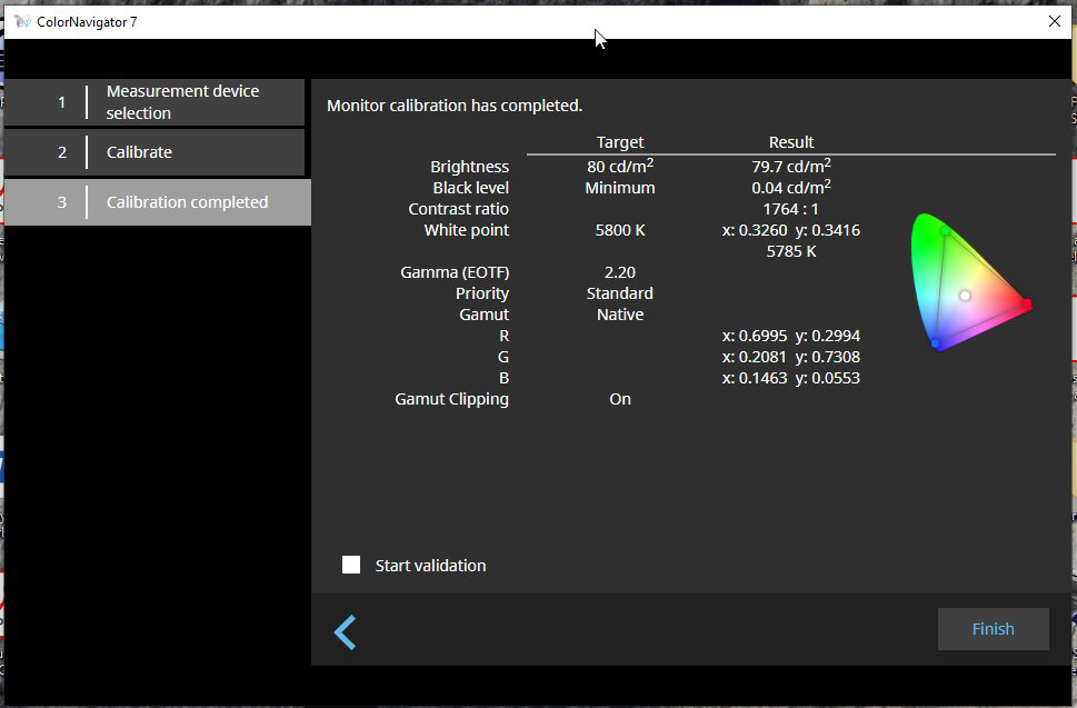
Even a very good monitor needs to be calibrated.
Displays change over time. Their luminance can drift and their colour characteristics can change.
Professional photographic monitors can make this much easier.
The EIZO CG2700S, for example, has a built-in calibration sensor that sits inside the monitor and automatically comes into position when required.
That means calibration doesn’t necessarily involve attaching an external device to the front of the screen every time.
The monitor can also be scheduled to recalibrate automatically, helping to keep its display characteristics consistent.
This is one of the advantages of buying a monitor designed specifically for colour-critical work.
Do you still need a separate calibration device?
It depends on your workflow.
If all you need is a well-calibrated display, an integrated calibration system can be extremely convenient.
If you’re also profiling printers and measuring papers, however, you’ll still need appropriate measurement equipment for those jobs.
A monitor calibrator and a spectrophotometer aren’t interchangeable simply because both are involved in colour management.
Don’t ignore luminance
Brightness is another area where photographers can get caught out.
A monitor capable of producing 400 cd/m² may sound impressive, but that doesn’t mean you should run it at maximum brightness when editing photographs.
In fact, a display that’s far brighter than your working environment can encourage you to make your photographs too dark when preparing them for print.
The appropriate luminance depends on your environment and your workflow.
This is one reason professional monitors give you precise control over luminance rather than simply offering a generic brightness slider.
The original CG2700S testing illustrates the point nicely. One of the formal proofing tests recorded a luminance of 94 cd/m², below the certification requirement being tested.
That wasn’t because the monitor couldn’t produce the required brightness. It had deliberately been set lower for the workflow.
The test therefore recorded a technical “Fail” even though the monitor was performing exactly as intended for that particular setup.
A specification and a real-world working setting aren’t always the same thing.
Screen uniformity matters
Imagine editing a photograph where the left side of the screen is subtly brighter than the right.
You might compensate for what you’re seeing without realising that the variation is coming from the display rather than the photograph.
Professional monitors are therefore tested for uniformity.
The requirement used in the testing of the CG2700S specified how much luminance could vary across different parts of the screen.
The monitor met those uniformity requirements.
This is one of those characteristics that you may not notice until you use a display that isn’t particularly uniform.
A good black level is important
Photographers need to see detail in both the shadows and highlights.
A display that crushes the darkest tones can make you believe that important shadow detail has disappeared. One that clips highlights prematurely can cause you to make unnecessary corrections.
The CG2700S performed particularly well in a simple screen test using a photographic print-audit target.
The testing could distinguish RGB values down to 10 in the shadows and up to 254 in the highlights.
That gave a very useful indication of the monitor’s ability to display subtle tonal differences.
For photographic editing, this can be more important than simply having an impressive maximum brightness figure.
Think about your colour-managed workflow
The monitor doesn’t work in isolation.
Your camera, operating system, editing software, monitor profile, printer, paper and viewing conditions all form part of the colour workflow.
That’s why colour management can sometimes seem like a black box.
In the original testing, a complicated multi-monitor setup caused problems with the measurement software. Different versions of calibration software were involved, and the system initially produced results that were clearly wrong.
Once the test system was simplified and the CG2700S was operated on its own in its calibrated Adobe RGB mode, the measurements became reliable.
It’s a useful reminder that colour management isn’t simply about buying an expensive monitor.
The entire chain needs to be understood.
Multi-monitor setups can complicate things
Many photographers now work with two or three displays.
That’s convenient, but it can introduce additional complications into a colour-managed workflow.
Different monitors may have different capabilities, calibration software or profiles. Graphics cards and operating systems also have to manage the displays correctly.
If you’re measuring or profiling your system, adding more screens can make troubleshooting considerably harder.
If something looks wrong, simplify the setup.
Disconnecting additional monitors and testing one display at a time can sometimes tell you far more than repeatedly changing settings and hoping the problem disappears.
Presets can be useful
Professional displays often provide presets for different working environments.
A monitor such as the CG2700S can switch between modes designed for standards such as Adobe RGB, sRGB, broadcast and digital cinema, alongside user-calibrated settings.
That can be useful if your work crosses different disciplines.
A photographer preparing images for a high-quality print workflow may want a different display configuration from someone checking how an image will appear on a typical web display.
The important thing is to understand what the preset is actually doing rather than assuming that one setting is universally “best”.
Soft proofing is where the monitor really earns its keep
If you print your photographs, one of the biggest benefits of a colour-managed monitor is the ability to use soft proofing.
Soft proofing allows you to simulate aspects of how an image may reproduce using a particular printer, paper and colour profile.
It isn’t a guarantee that the physical print will be identical to the screen.
The viewing environment, paper surface, inks and human vision all play a part.
But a good monitor gives you a much better starting point.
This is particularly useful when working with papers that have distinctive surfaces or colour characteristics.
What about 4K?
It’s tempting to assume that 4K must automatically be better for photography than a 2560 × 1440 display.
It isn’t quite that simple.
A 4K display gives you more pixels, which can be useful for viewing very detailed images, working with large files and fitting more interface elements onto the screen.
But resolution doesn’t determine colour accuracy.
A well-calibrated, colour-accurate 2560 × 1440 display can be a much better photographic tool than a cheap 4K screen with poor colour reproduction.
Choose resolution according to your working habits.
Choose colour performance according to your workflow.
Connectivity can make a difference
Professional monitors increasingly do more than display an image.
The CG2700S, for example, includes USB-C connectivity that can carry video and USB data while also supplying power to a connected laptop.
It can deliver up to 92W to a compatible computer.
That means a single cable can potentially connect a laptop to the monitor while also charging it and providing access to connected peripherals.
This isn’t directly related to image quality, but it can make a significant difference to a modern photography workstation.
The same is true of built-in USB hubs and network connectivity.
Think about the monitor as part of your workspace rather than simply a large rectangle that displays photographs.
Do photographers really need a reference monitor?
Not necessarily.
If you’re mainly sharing photographs online, a good-quality, properly calibrated monitor may be perfectly adequate.
If you’re producing fine art prints, commercial work, publications or other colour-critical output, the case for a professional display becomes much stronger.
The more important colour accuracy is to the job, the more valuable the additional control and consistency of a reference-class monitor become.
And there is another consideration: how much is your time worth?
If an inaccurate monitor causes you to repeatedly correct images, make unnecessary test prints or chase colour problems that aren’t actually present in your files, a more capable display can quickly become much less expensive than it initially appears.
What should you look for in a photography monitor?
When comparing monitors for photography, don’t get distracted by a single impressive specification.
Look at the whole picture.
Colour accuracy
How closely does the display reproduce known colours?
Colour gamut
Does it cover the colour space you actually work in?
Calibration
Can it be calibrated accurately and consistently?
Luminance control
Can you set the display to an appropriate brightness for your environment and workflow?
Uniformity
Does the screen display brightness and colour consistently across its surface?
Black level and tonal range
Can you see subtle detail in both shadows and highlights?
Colour management
Does the monitor work properly with your operating system, graphics hardware and profiling software?
Soft proofing
Can you confidently use it as part of a print workflow?
Connectivity
Will it fit conveniently into your existing workstation?
Build quality and longevity
How long is the monitor likely to remain reliable and colour-consistent?
A good monitor is an investment in your decisions
The most important thing a photographic monitor does isn’t make your photographs look impressive.
It helps you make better decisions.
When you adjust the colour of a skin tone, you want to know that the change you’re seeing is real.
When you recover shadow detail, you want confidence that the monitor isn’t hiding information.
When you prepare an image for print, you want your soft proof to give you a meaningful indication of what you’re likely to see on paper.
And when you spend hours retouching a photograph, you don’t want to discover later that your display was misleading you.
The EIZO CG2700S demonstrated just how capable modern reference-class monitors can be. Its combination of colour gamut, calibration, uniformity, tonal performance and proofing capability made it an impressive tool for colour-critical work.
But the wider lesson is more useful than the particular model.
The best monitor for your photography is not necessarily the one with the highest resolution or the biggest specification sheet. It’s the one that gives you accurate, repeatable information and fits properly into the way you work.
For photographers who care about colour, that can make a far greater difference than another megapixel or another camera upgrade.