What Are Pantone Colours? A Photographer’s Guide to Spot Colours
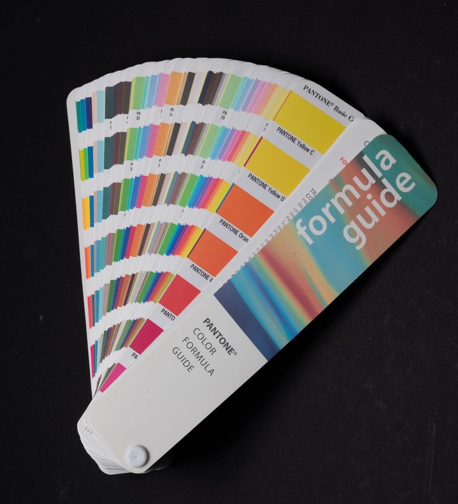
If you’re primarily a photographer, there’s a good chance you’ve come across the word Pantone without ever needing to think too deeply about what it means.
You may have seen a Pantone reference when designing a business card, choosing a colour for a logo or preparing artwork for print. You may also have encountered spot colours when working with a printer or preparing photographs for a publication.
But what exactly is a Pantone colour, and how is it different from the colours we normally work with in Photoshop and Lightroom?
The answer becomes particularly important when accurate colour reproduction matters.
What is a Pantone colour?
Pantone is a colour standardisation system used to specify and communicate colours consistently.
Rather than simply saying that something should be “orange” or “dark blue”, a designer can specify a particular Pantone reference. The printer can then use the corresponding colour specification to reproduce that colour as accurately as the printing process allows.
This is particularly useful for brand colours.
For example, a company may have a particular shade of blue in its logo. If that colour is important to the identity of the business, simply asking different printers to reproduce “blue” using their own interpretation of CMYK could produce noticeably different results.
A defined colour reference gives everyone a common target.
This is one reason Pantone swatch books have traditionally been such an important tool in graphic design and commercial printing.
Pantone colours and spot colours are not quite the same thing
The two terms are often used together, but they describe different things.
A spot colour is a printing colour that is applied as a separate ink rather than being created from the standard four-colour process of cyan, magenta, yellow and black.
Pantone provides colour standards that can be used when specifying these colours.
By contrast, CMYK printing creates colours by combining varying amounts of cyan, magenta, yellow and black.
Most magazines, brochures and other everyday printed material use CMYK printing because it is a practical and cost-effective way of reproducing a huge range of colours.
A spot colour requires an additional printing process, and therefore usually adds cost.
How does CMYK printing work?
In conventional four-colour printing, the image is separated into four components:
- Cyan
- Magenta
- Yellow
- Black
These are commonly referred to as CMYK.
Each colour is printed as a pattern of tiny dots. When viewed at normal distance, our eyes combine those dots and perceive a continuous range of colours.
This process is extremely versatile, but it has limitations. The range of colours that can be reproduced using a particular CMYK printing process is restricted by the inks, paper and printing conditions being used.
This is known as the colour gamut.
That’s one reason why a colour that looks bright and saturated on a monitor may not be reproducible in exactly the same way using standard CMYK inks.
So why use a spot colour?
A spot colour can be useful when a particular colour needs to be reproduced very consistently or when the desired colour falls outside what can be achieved satisfactorily using the normal CMYK process.
Imagine a company with a very specific colour in its logo.
Rather than asking the printer to approximate that colour using CMYK, a spot colour can be specified separately. The printer then uses the appropriate ink for that colour.
Spot colours can also be useful for colours that are difficult to reproduce using ordinary CMYK inks, including some very bright, metallic or fluorescent colours.
There is a trade-off, though: additional inks mean additional preparation and printing costs.
For many jobs, CMYK is perfectly adequate. For others, the additional control provided by a spot colour is worthwhile.
Why does the type of paper matter?
One of the things that can catch photographers and designers out is that colour isn’t determined by the ink alone.
The paper makes a significant difference.
The same ink can appear different when printed on a coated glossy stock compared with an uncoated or more absorbent paper.
This is why professional colour systems provide different references for different printing conditions and paper types.
It also explains why printed colour should not simply be judged from what you see on a computer monitor.
A calibrated monitor is extremely useful for digital work, but it cannot completely predict the physical appearance of every printed combination of ink and paper.
What about Pantone swatch books?
Physical colour swatch books have traditionally been an important part of the Pantone system.
They give designers and printers a physical reference against which colours can be compared.
This is particularly useful because screens vary. Two people looking at the same colour on different monitors may not see exactly the same thing.
A physical reference gives everyone something more concrete to work towards.
There is still an important limitation, however: printed swatches can themselves change with age, light exposure and handling. For critical colour work, current and appropriate reference materials are important.
Where might a photographer encounter Pantone colours?
You might be surprised how often photographers come across spot colours without actually using them in the camera.
For example, you may encounter them when producing:
- Business cards and stationery
- Photography brochures
- Packaging
- Promotional material
- Exhibition graphics
- Corporate publications
- Magazine advertising
- Branded products
- Album or book designs
- Logos and other identity material
If you’re producing artwork for a commercial client, the client may already have specified brand colours that need to be maintained across different pieces of printed material.
Understanding the difference between CMYK and spot colours can therefore save a lot of confusion when dealing with a professional printer.
What are duotones?
Photographers may also encounter spot colours in another context: duotone images.
A traditional duotone uses two printing inks rather than the four inks used for a standard CMYK image.
One of these is commonly black, while the second provides the colour.
The technique can produce a very distinctive look and was historically popular for photographic reproduction. A warm second ink, for example, can produce something resembling a traditional sepia treatment.
The additional ink can also provide tonal and density characteristics that aren’t necessarily achievable by simply adding colour to a digital RGB or grayscale image.
Modern digital printing and image editing have made it possible to recreate many of these effects without necessarily using two physical spot inks, but the traditional technique remains useful to understand.
Spot colour doesn’t mean “better colour”
It’s tempting to assume that if spot colours are more specialised, they must always produce better results.
That’s not necessarily the case.
CMYK printing is capable of producing excellent results and is appropriate for the vast majority of photographic publications.
The question is really about what the job requires.
If you’re printing a photographic portfolio containing thousands of different colours, CMYK may be the most practical solution.
If you’re printing a company’s brochure where an exact brand colour is particularly important, a spot colour may be worth considering.
There are also situations where a carefully managed CMYK workflow can reproduce a colour sufficiently well without the cost and complexity of an additional ink.
Why this matters to photographers
Most photographers don’t need to become experts in commercial printing.
But understanding a few basic principles can make life much easier when your photography moves from the screen to the printed page.
The important points to remember are:
- RGB is primarily associated with digital displays and many digital photography workflows.
- CMYK uses four process colours to reproduce a wide range of colours in print.
- A spot colour is printed separately rather than being created from the standard CMYK process.
- Pantone provides colour standards that can be used to specify particular colours.
- The appearance of printed colour is affected by the ink, paper and printing process.
- A colour that looks one way on your monitor may not reproduce identically in print.
- Spot colours can provide additional control, but they can also increase printing costs.
For photographers who occasionally design their own marketing material, work with commercial clients or prepare images for professional publication, understanding these differences is well worth the effort.
The next time a printer asks whether a particular colour needs to be CMYK or a spot colour, you’ll at least know what they’re talking about.