How to Create a Strong Visual Brand for Your Photography Business
Your photography brand is much more than your logo.
It is the impression people get when they see your website, social media posts, business cards, brochures, emails or advertising. Ideally, they should begin to recognise your business before they even read your name.
That recognition comes from consistency.
Once you have established what your photography business stands for, who you want to work with and what makes you different, the next step is to develop a visual identity that supports it.
Your colours, fonts, logo, photography and graphic style should all feel as though they belong to the same business.
Your visual identity should reflect your business
There is no single colour, font or logo that will make a photography business successful.
The right choices depend on the type of photography you offer and the clients you want to attract.
A children’s photography business might comfortably use brighter, more playful colours. A corporate photographer may want something more restrained and professional. A luxury wedding photographer might choose an entirely different visual approach.
The important thing is that the design supports the message you want to communicate.
Ask yourself:
What do I want someone to feel when they see my brand?
Professional? Relaxed? Creative? Sophisticated? Friendly? Modern? Traditional?
Your visual identity should help reinforce that impression.
Keep your brand consistent
One of the most valuable things a visual identity can do is make your business recognisable.
Think about major brands. You often recognise them from their colours, shapes, typography or overall visual style before you consciously read the words.
You can achieve the same principle on a much smaller scale.
If someone sees your website one day, an Instagram post the next week and a printed leaflet a month later, they should still feel that all three came from the same business.
That doesn’t mean every piece of marketing has to look identical.
It means there should be a recognisable visual thread running through everything you produce.
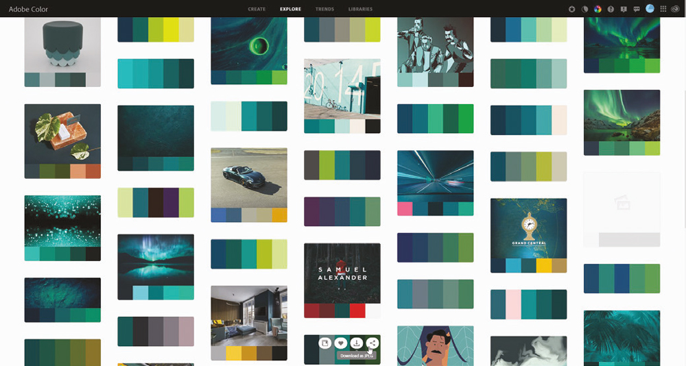
Start with a small colour palette

Colour is one of the most obvious elements of a visual brand.
But you don’t need dozens of colours.
In fact, keeping your palette relatively small usually makes it easier to maintain consistency.
You might have:
- A primary brand colour
- One or two supporting colours
- A neutral background colour
- A text colour
- An accent colour for buttons or important information
The exact combination will depend on your business.
Don’t choose colours simply because you like them personally. Think about whether they work with your photography, your target audience and the type of business you are trying to build.
A colour that looks fantastic on a mood board might not work particularly well when used for text, buttons, backgrounds and printed material.
Test your choices in real situations before committing to them.
Don’t rely too heavily on colour psychology
There is plenty of advice online claiming that particular colours automatically create particular emotions.
Some associations are culturally familiar, but human responses to colour are considerably more complicated than a simple chart saying that one colour means “trust” and another means “excitement”.
Don’t feel that you have to choose blue because somebody says blue means professionalism, or pink because you are photographing babies.
Instead, consider the complete visual combination.
How do the colours work together?
Do they complement your photography?
Do they provide enough contrast?
Do they still work when used with different photographs?
Do they look good on screen and in print?
These practical questions are often more useful than trying to assign a single psychological meaning to every colour.
Make sure your colours are usable
A beautiful colour palette isn’t much use if you can’t actually use it effectively.
Test your colours in:
- Website headers and backgrounds
- Text and headings
- Buttons and links
- Social media graphics
- Business cards
- Brochures
- Exhibition displays
- Signage
- Email communications
Also check what happens when your design is viewed in monochrome or printed differently from how it appears on your screen.
Contrast is particularly important.
Text needs to be easy to read and important information needs to remain visible against its background. Your branding should never come at the expense of accessibility or usability.
Choose your fonts carefully
Typography is another major part of your visual identity.
You don’t need lots of fonts.
In most cases, one or two carefully chosen typefaces are enough.
You might use one font for headings and another for body text, or use different weights of the same family to create hierarchy.
The important thing is to decide how you are going to use them.
For example:
Heading: Bold
Subheading: Medium
Body text: Regular
Highlight: Italic or another weight
Once you’ve made those decisions, stick with them.
Changing fonts randomly from one piece of marketing to another quickly makes a brand look inconsistent.
And don’t choose a font simply because it looks interesting.
Ask whether it suits your business and remains easy to read.
A highly decorative typeface might work beautifully for a particular wedding photographer, but be completely inappropriate for a commercial photography business.
Your logo is only one part of the brand
Photographers sometimes spend enormous amounts of time worrying about their logo.
Of course, a good logo is useful, but it isn’t going to rescue an otherwise confusing brand.
Your logo should work alongside your colours, fonts and photography rather than trying to do all the work itself.
Make sure it works at different sizes.
A logo that looks great across the top of your website may become almost unreadable when reduced to a small social media profile image.
Ideally, you should have versions that work in different situations, including:
- Full colour
- One colour
- Light and dark backgrounds
- Large and small applications
- Square or compact formats where required
Test everything before committing to a final design.
Think about where your brand will appear
Your visual identity shouldn’t be designed only for your website.
Think about everywhere your potential clients might encounter you.
That could include:
- Website
- Business cards
- Brochures
- Packaging
- Studio signage
- Exhibition displays
- Printed photographs and products
- Advertising
A logo or graphic that works beautifully in one environment may not work in another.
Social media is particularly important because profile pictures, cover images and posts are often viewed at relatively small sizes.
Make sure your branding remains recognisable when reduced.
Your photography is part of your visual identity
For photographers, there is one huge difference between your brand and that of most other businesses.
Your product is visual.
Your photography is therefore one of the most important parts of your brand identity.
If your website has a sophisticated, high-end design but the photographs appear completely unrelated in style, the overall impression can become confusing.
Think about the images you use to promote your business.
If you are producing a brochure, for example, don’t simply throw in every good photograph you have ever taken.
Choose images that support the type of work you want to attract.
Your portfolio should help reinforce the message your branding is communicating.
Don’t let your branding restrict you
What happens if you work in more than one genre?
This is where a flexible visual identity becomes particularly useful.
You may photograph weddings as well as portraits, or commercial work as well as personal branding.
You don’t necessarily need completely separate brands for everything.
Instead, consider whether the same underlying visual identity can work across different areas of your business.
You might use the same logo, typography and graphic elements while allowing different colours or imagery to distinguish particular services.
The key is that there should still be a connection between them.
Test before you commit
One of the biggest mistakes you can make is falling in love with a design before seeing how it actually works.
Test it.
Look at your proposed branding:
- On a desktop website
- On a mobile phone
- As a social media profile image
- On a social media post
- On a business card
- In black and white
- Against light and dark backgrounds
- At very large and very small sizes
- In print
Ask other people for their opinions, particularly people who resemble your target clients.
But remember that you don’t need to accept every suggestion.
Ultimately, the branding needs to work for your business and your audience.
Give your brand some longevity
Your visual identity is something you may live with for years.
That doesn’t mean you can never change it. Businesses evolve and sometimes a rebrand is exactly what is needed.
But constantly changing your logo, colours and fonts makes it difficult to build recognition.
Give your initial choices proper thought.
There is a balance between creating something distinctive and creating something so fashionable that it quickly looks dated.
Trends can provide inspiration, but your brand needs to work beyond the current design trend.
Create your own brand guide
You don’t need a huge corporate brand manual.
Even a simple document can make a big difference.
Record:
Your colours
Include the exact colour values you use rather than relying on memory.
Your fonts
Record the typefaces and the weights you use for headings, body text and other elements.
Your logo
Keep the correct versions together and make sure everyone using the brand has access to the right files.
Your photography style
Make a note of the visual characteristics you want your images and marketing photographs to communicate.
Your graphic style
Record any recurring shapes, borders, icons or other design elements.
This becomes a useful reference whenever you create something new.
Don’t forget the details
Consistency comes from lots of small decisions.
The exact shade of your brand colour.
The amount of space around your logo.
The font used for a heading.
The way an image is cropped.
The style of your social media graphics.
Individually, these things may seem insignificant.
Together, they create a recognisable visual identity.
Your brand should grow with your photography business
Your visual identity shouldn’t become a prison.
As your business develops, you may discover that your original branding no longer represents the photographer or business you have become.
That’s fine.
You can evolve it.
The important thing is to make changes deliberately rather than constantly changing direction.
A strong brand is built over time through repetition, consistency and the quality of the experience you provide.
Your logo, colours and fonts help people recognise you.
Your photography, service and reputation give them a reason to remember you.
So take the time to get the visual side right, but remember where the real value comes from.
Your brand isn’t the logo. Your brand is the reputation behind it.